

WordPress Website Examples: 7 Inspiring Sites for 2026
You're staring at a blank homepage, a shortlist of platforms, and a client who wants the site to look sharp without becoming a maintenance headache. That's where WordPress website examples earn their keep, not as a gallery of pretty screenshots, but as proof of how real sites organise content, guide attention and push visitors towards action. WordPress remains the dominant CMS, with W3Techs-based reporting putting it at 43.5% of all websites worldwide and 61.3% of CMS-based sites, while BuiltWith lists 41,188,720 websites using WordPress, including 37,365,862 live sites and 3,822,858 redirects WordPress market share reporting. For UK owners, that scale matters because it means a mature ecosystem, a large talent pool and fewer surprises when a site needs to grow, change or integrate with other systems. The useful question isn't whether WordPress can do the job. It's which kind of site structure helps your business sell, explain and stay manageable.
Table of Contents
- 1. 7 WordPress eCommerce Website Examples for 2026
- 2. WordPress.org Showcase
- 3. Awwwards WordPress Websites
- 4. SiteInspire Platforms filter WordPress
- 5. One Page Love WordPress Examples
- 6. WPBeginner Excellent WordPress Website Examples Curated Article
- 7. Webdesign-Inspiration Filter Tool Select WordPress
- Comparison of 7 WordPress Website Examples (2026)
- Turning Inspiration Into Your Next WordPress Build
1. 7 WordPress eCommerce Website Examples for 2026
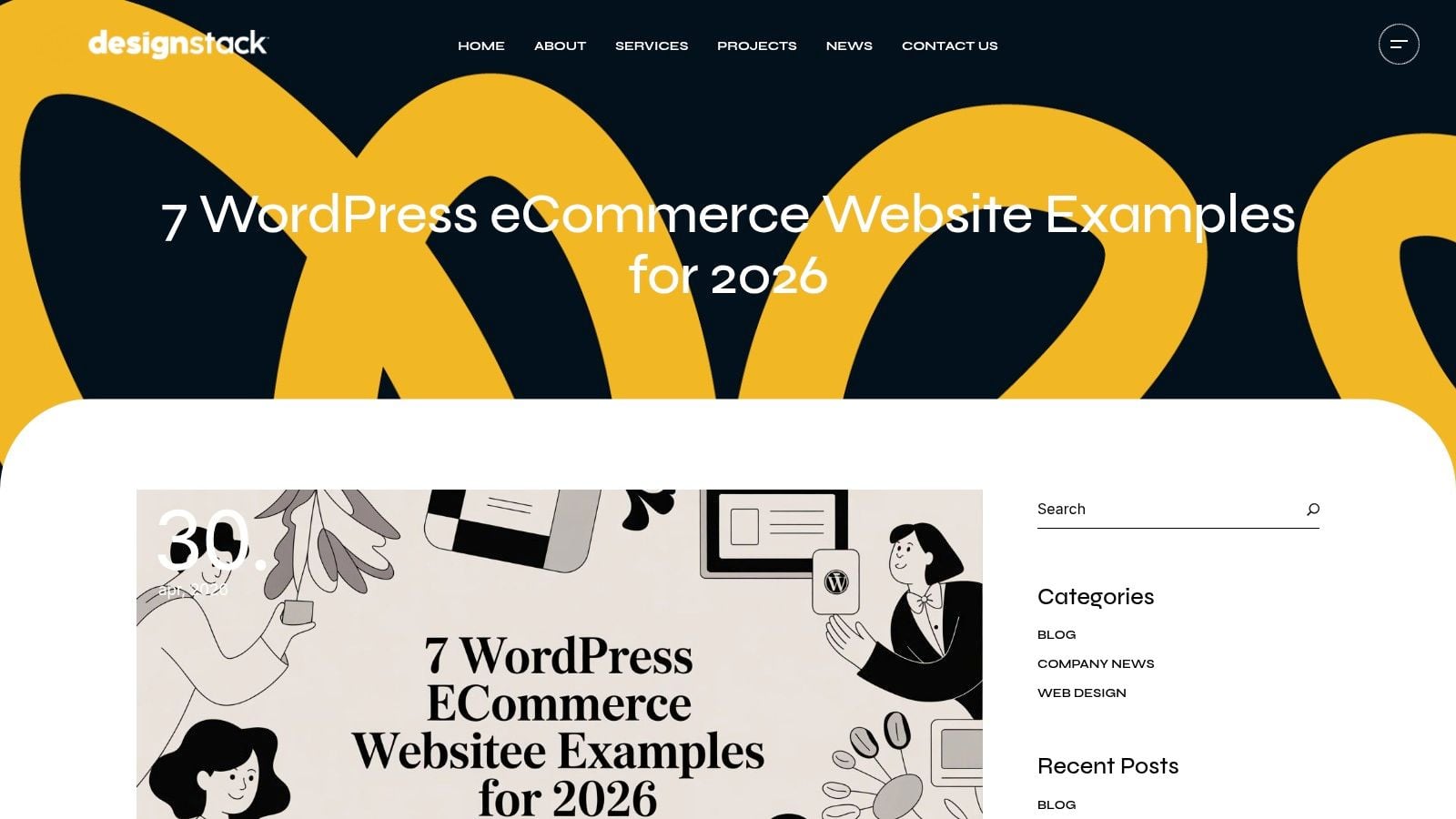
DesignStack's roundup works because it doesn't stop at visual inspiration. It looks at product architecture, checkout flow, stock handling, shipping workflows and the mechanics that turn browsing into fulfilment, which is what most owners need from a store. That makes it much more useful than a typical inspiration gallery, especially for small businesses trying to decide whether WordPress and WooCommerce give them the control they need over content, SEO and merchandising.
The strength of this kind of list is that it helps you compare store logic, not just colours and spacing. If a site sells fashion, the product categories need to be simple enough for customers to scan quickly. If it runs subscriptions or repeat-order purchasing, the site needs frictionless account flows and obvious recurring-purchase cues. Those choices matter more than a polished homepage, because they shape conversion and fulfilment from the first visit onward.
What to study in the roundup
Practical rule: judge an eCommerce site by how quickly a customer can understand the offer, find the right product, and complete the next step without second-guessing the process.
A good store example should make these things obvious:
- Product hierarchy: Are collections grouped in a way that reflects how people shop, not how the business is organised internally?
- Checkout simplicity: Does the path to purchase stay short, clear and low-friction?
- Operational clarity: Can stock, shipping and repeat orders be managed without turning every update into a developer job?
- Content control: Can the team still publish guides, lookbooks, FAQs or campaign pages without breaking the shop?
The page sits neatly alongside DesignStack's WordPress eCommerce theme guidance, which is the right next stop if you want to turn inspiration into an actual build rather than just a mood board. For UK businesses, that practical angle is the value. It helps you decide whether your store needs a lean WooCommerce setup, a richer merchandising layer or a more specialised platform entirely.
The downside is straightforward. It's strictly WordPress and WooCommerce, so it won't help if you've already committed to Shopify, BigCommerce or a hosted stack. Even so, for brands that want ownership, flexible content and SEO control, it's one of the most implementation-ready examples online.
2. WordPress.org Showcase
The official WordPress.org Showcase is useful because it filters out a lot of the noise that clogs commercial inspiration galleries. You're looking at reviewed submissions from across the WordPress ecosystem, so the examples tend to feel credible when you need to explain choices to a client, stakeholder or internal team. The range matters too, because the gallery includes businesses, publishers, nonprofits, education sites and government pages.
That variety makes it easier to see how WordPress handles different content loads. A small service business might use it for a clean brochure site, while a larger organisation can use the same platform for dense information, multi-section navigation and more complex publishing needs. That's also why it's a strong source when you need to show that WordPress isn't just for hobby blogs.
Why it's worth bookmarking
The showcase is best when you want signal over style. It isn't trying to impress you with heavy animation or trend-chasing effects. Instead, it gives you a quieter but more useful view of how real organisations use the CMS for publishing, membership, commerce and public information.
Useful filter: use this gallery when the question is “Will WordPress hold up in our context?” rather than “What visual style should we copy?”
A few things stand out when you use it well:
- Reviewed examples: Submissions are curated, which helps keep the quality baseline high.
- Multiple site types: You'll find publishing, eCommerce, education and public-sector builds in one place.
- Stakeholder-friendly proof: It's easier to justify WordPress when the examples come from recognisable, practical organisations.
If you're budgeting a new site, the showcase pairs well with DesignStack's WordPress website development cost guidance. That's the missing step many teams skip. They collect inspiration first, then discover too late that the scope, template structure and content workload don't match the budget.
The one limitation is that the gallery is smaller than the big commercial inspiration databases. You won't get the same breadth of visual experimentation, and you won't see much detail on motion or interaction trends. For many UK businesses, that's fine. It's a cleaner reference point when the brief is reliability, not novelty.
3. Awwwards WordPress Websites
The Awwwards WordPress gallery is where you go when a client wants the site to feel premium and current. The WordPress tag pulls in award-nominated builds, so the focus is usually on bold art direction, custom interactions and polished motion work rather than everyday SME practicality. That's not a criticism. It's exactly why the gallery is valuable.
The upside is obvious. You get strong references for typography, transitions, hero sections and unusual layout decisions. You also get direct access to the agencies and studios behind the builds, which makes the gallery useful for competitive research. If you need to show a stakeholder what “best in class” can look like on WordPress, this is one of the strongest sources.
Where Awwwards helps and where it doesn't
Awwwards is best treated as an ideas engine, not a blueprint. Many showcased sites are designed to win attention, not necessarily to minimise maintenance or support the kind of buying process that a local business needs. That means you should borrow structure and interaction patterns carefully, then test them against your own operational reality.
How to improve website user experience becomes the more useful lens here, because the prettiest site in the gallery can still create confusion if the navigation, spacing or CTA hierarchy is weak.
Some award sites look effortless because a team has spent a lot of time solving the hidden problems behind the interface.
A few trade-offs show up quickly:
- Strong for art direction: Great if you need inspiration for custom visuals, scroll effects or motion-led storytelling.
- Good for agency research: Useful when you want to see which studios are producing standout WordPress work.
- Weak for SME budgets: The more experimental the site, the less likely it is to map neatly onto a lean UK business brief.
- Mixed for accessibility and speed: Some entries are visually impressive but not necessarily the safest benchmark for inclusive, lightweight delivery.
Use Awwwards when the conversation is about ambition, brand theatre and visual differentiation. Use it less when the conversation is about content governance, straightforward sales journeys and operational simplicity. Both matter, but they are not the same brief.
4. SiteInspire Platforms filter WordPress
SiteInspire is one of the better UK-based inspiration galleries because it tends to favour clean, resolved design over gimmicks. When you apply the Platforms filter and narrow it to WordPress, you get examples that are often more relevant for production work than the louder award galleries. That makes it especially handy for SMEs that want a tasteful site without an overbuilt concept piece.
The strength here is balance. You'll find good typography, sensible spacing and layouts that look like they were built to be used, not just admired. For agency teams, that matters because clients often respond better to examples that feel achievable. A polished but restrained reference usually does more to win approval than a radically experimental one.
Why production-ready examples matter
A lot of WordPress website examples look attractive in isolation, then fall apart once you ask practical questions. Can the client edit the pages? Does the content still work when the team adds new services? Is the navigation clear on mobile? SiteInspire's curation style tends to push you towards those questions naturally.
The gallery is especially useful if you're planning the information structure of a small business site. What is information architecture is the right idea to keep in mind, because the best inspiration here usually succeeds through clarity rather than novelty.
If a layout only works when the hero image is perfect, it isn't a reliable benchmark for most real projects.
Use it for:
- Typography references: Good examples of readable, brand-appropriate type pairing.
- Layout restraint: Useful when you need a site to feel premium without becoming cluttered.
- UK/EU relevance: Helpful when you want examples that feel close to local agency standards.
- SME-friendly inspiration: A strong source for businesses that need tasteful, conversion-aware design.
The main drawback is metadata. Compared with WordPress-specific databases, you often get less technical context, and the platform labels aren't always easy to surface on every visit. Even so, for teams that care about design quality and usability in roughly equal measure, SiteInspire is one of the most dependable starting points.
5. One Page Love WordPress Examples
One Page Love is the gallery to use when the brief is compact and conversion-led. It focuses on single-page sites, so it's particularly useful for local services, events, campaigns and lean product launches where the job is to present one offer clearly and move the visitor toward action. If a client says they want “simple but polished”, this is often where the best pattern library starts.
The WordPress platform category keeps the examples relevant to teams that want editing control without overcomplicating the build. You'll see a lot of sharp hero sections, condensed content sequences and obvious calls-to-action. That's valuable because one-page sites live or die on hierarchy. If the offer, proof and CTA are not obvious within the scroll, the page has already lost momentum.
What one-pagers teach you
One-page examples are not about cramming less into the screen. They're about arranging the right information in the right order, with enough visual rhythm to keep people moving. That's why they're so good for smaller businesses that don't need a sprawling information architecture.
You can learn a lot by checking:
- Hero clarity: Does the first screen explain who the site is for and what action to take?
- Section sequencing: Does each block earn the scroll, or is it just filler?
- CTA placement: Are calls-to-action repeated naturally, without feeling forced?
- Speed of comprehension: Can a visitor understand the offer in seconds, not minutes?
The best one-page WordPress sites are short because the business is focused, not because the designer ran out of ideas.
The gallery's limitation is just as clear. It isn't the right source for complex navigation, deep content libraries or multi-audience sites. Some older entries also vary in quality, so you still need to judge each example on its own merits. But for service businesses that need a clean landing page, it's one of the most useful reference points around.
6. WPBeginner Excellent WordPress Website Examples Curated Article
WPBeginner's excellent WordPress website examples roundup is a strong middle-ground resource for non-designers and decision-makers. It groups examples by category, which makes it easier to review with a founder, marketing lead or client who doesn't want to sift through a huge visual database. The examples are mainstream and functional, which is often exactly what a UK business needs when it's trying to make a practical platform decision.
That editorial style also helps when you need to move the conversation from “What looks nice?” to “What kind of site do we need?” The article format can't match a database for filtering, but it compensates by framing examples in a way that's easier to discuss in a meeting. That matters more than people admit.
Why editors still matter in inspiration research
Curated articles help you compare like with like. A blog, a business site, a portfolio and an eCommerce store all ask different things of WordPress, so an editor's grouping can save a lot of wasted browsing. It also keeps the examples anchored to real use cases rather than abstract aesthetics.
If you're buying a site for a business rather than building a design portfolio, that's useful. You can pull out the features that matter, then decide whether the site needs a custom plugin stack, a template-led build or a more focused theme choice. A well-curated article often gets you to that decision faster than a huge gallery.
A few practical benefits stand out:
- Category-based browsing: Easier for stakeholders to review by site type.
- Functional references: Better for business owners who want to see how successful sites work.
- Plugin and feature ideas: Useful as a springboard for implementation planning.
- Easy to revisit: Handy when you need something familiar for non-technical conversations.
The drawback is that examples can change as brands relaunch, so the page needs periodic revisits. Still, as a practical review tool, it gives decision-makers an accessible way to benchmark WordPress beyond design hype.
7. Webdesign-Inspiration Filter Tool Select WordPress
Webdesign-Inspiration is one of the quickest ways to find WordPress examples that are close to your actual brief. Its multi-facet Filter Tool lets you combine industry, style, type and platform, which is ideal when you need sector-specific references instead of a random stack of attractive sites. That makes it especially useful for agencies, because the search process maps well to discovery and RFP work.
The platform is broad, but that breadth is part of the value. If you're researching a restaurant, a local service business or an eCommerce brand, you can narrow the results enough to spot useful patterns fast. You're not just collecting pretty pages. You're comparing how different businesses solve the same structural problems.
Why filter-driven research saves time
A good filter tool forces you to define the brief before you fall in love with a visual. That sounds obvious, but it's where many website projects go wrong. Teams collect inspiration from unrelated industries, then wonder why the final site feels generic or impractical.
The more useful way to work is to compare websites that share the same goals. Look at how they handle menu depth, proof points, product cards, form placement and conversion cues. That gives you a better foundation for a sitemap, a wireframe and a theme decision.
Strong inspiration research always starts with a business problem, not a colour palette.
Use this gallery for:
- Industry matching: Find examples that feel close to your own sector.
- Style alignment: Filter by mood and visual approach without losing practical relevance.
- Platform focus: Narrow to WordPress so the reference stays buildable.
- RFP support: Bring filtered examples into client or stakeholder conversations quickly.
The trade-off is depth. Some entries don't expose much technical detail, and because the gallery casts a wide net, quality does vary. Even so, for fast, production-minded research, it's one of the most efficient tools on the list.
Comparison of 7 WordPress Website Examples (2026)
| Example | Implementation Complexity 🔄 | Resource & Speed ⚡ | Expected Effectiveness ⭐ | Ideal Use Cases 💡 | Key Advantages / Impact 📊 |
|---|---|---|---|---|---|
| 7 WordPress eCommerce Website Examples for 2026 | Moderate, requires WooCommerce and operational knowledge 🔄 | Moderate resources; moderate time to adapt tips ⚡ | High for small eCommerce & subscription stores ⭐⭐⭐⭐ | UK small businesses, fashion, subscriptions 💡 | Actionable operational guidance; implementation-ready; agency-backed 📊 |
| WordPress.org Showcase | Low, browse vetted examples; little setup 🔄 | Low effort; fast to reference ⚡ | High credibility for stakeholder demonstration ⭐⭐⭐ | Broad industry examples for proofs-of-concept 💡 | Curated, reviewed sites across use-cases; trustworthy examples 📊 |
| Awwwards – WordPress Websites | Low to view, high to reproduce advanced interactions 🔄 | Resource-intensive to replicate animations/UX; slower ⚡ | Excellent for cutting‑edge visuals; less practical for SMEs ⭐⭐⭐⭐ | Agency portfolios, high‑end design inspiration 💡 | Highlights top agencies, interactions and visual trends 📊 |
| SiteInspire (Platforms filter → WordPress) | Low, curated, production-ready selections 🔄 | Moderate resources; relatively quick to adapt ⚡ | Strong for typography, layout and conversion-minded design ⭐⭐⭐ | SMEs seeking tasteful, production-ready sites 💡 | Clean curation with UK/EU agency representation; polished references 📊 |
| One Page Love – WordPress Examples | Low, single‑page focus simplifies implementation 🔄 | Fast to execute; many themes/templates available ⚡ | Effective for one-pagers and clear CTAs ⭐⭐⭐ | Landing pages, events, local services, lean launches 💡 | Clear hero/offer patterns and quick template links for rapid builds 📊 |
| WPBeginner – “Excellent WordPress Website Examples” | Low, editorial roundup, easy to read 🔄 | Low effort; practical tips speed adoption ⚡ | Practical and business-friendly for mainstream sites ⭐⭐⭐ | Non‑designers, decision‑makers, feature/plugin planning 💡 | Category breakdowns with actionable tips and plugin suggestions 📊 |
| Webdesign‑Inspiration – Filter Tool (select “WordPress”) | Moderate, multi‑facet filters require exploration 🔄 | Efficient for targeted searches; quality varies ⚡ | High for sector‑specific pattern discovery ⭐⭐⭐ | SMEs sourcing sector-specific examples, RFPs and sitemaps 💡 | Powerful multi-facet filters and a large, frequently updated library 📊 |
Turning Inspiration Into Your Next WordPress Build
The smartest way to use WordPress website examples is to stop treating them like a mood board and start treating them like a diagnostic tool. Look at the pages that work and ask why they work. Is the content hierarchy obvious? Does the navigation match the user's intent? Are the page templates flexible enough for future updates, or are they only convincing on day one? Those answers tell you much more than a homepage screenshot ever will.
For UK businesses, the biggest mistake is copying the surface and ignoring the system underneath. A sharp hero section is useful, but only if the supporting pages, plugin choices, performance budget and content governance all support it. The sites that last are usually the ones where structure comes first and decoration follows. That's where you should also test with real users before launch, because assumptions about clarity and conversion rarely survive first contact with actual customers.
If you're choosing between a template-led build and a custom WordPress site, copy the structural idea, not the visual trick. A strong one-page flow can become a multi-page service site. A simple product grid can become a better category architecture. A clean CTA pattern can improve enquiries without changing the brand identity at all. The goal is not imitation. It's adaptation.
DesignStack's Dorset team builds fixed-cost WordPress, eCommerce and branding projects for businesses that want something practical, polished and easy to maintain. If you're ready to move from research to a site that fits your brief, explore DesignStack and see how they can turn the right WordPress pattern into a working website.
DesignStack helps UK businesses turn WordPress inspiration into sites that are built to sell, inform and stay manageable. If you want a Dorset agency that understands WordPress, eCommerce and brand-led web design, visit DesignStack and start a conversation about your next build.

Leave a Reply