
How to Improve Website User Experience: An SMB Playbook
Your website probably isn't short of effort. It's short of clarity.
Most SMB owners we speak to have already invested in a decent-looking site, added service pages, uploaded photos, and written copy that feels “good enough”. But leads still feel patchy, enquiries come from the wrong people, and too many visitors arrive, scroll a bit, then disappear. That's usually not a traffic problem first. It's a user experience problem.
Good UX doesn't mean a flashy redesign. It means helping the right person do the right thing with less friction. If you want to know how to improve website user experience without wasting budget, start with the pages and journeys that affect sales, bookings, and enquiries. That's where the return sits.
Table of Contents
- Find Quick Wins with a 10-Minute UX Audit
- Measure What Matters with Key UX Benchmarks
- Refine Your Site's Navigation and Content Flow
- Key UX Fixes for WordPress and eCommerce Sites
- Use Simple Testing to Validate Design Changes
- Build Your Prioritised UX Implementation Plan
Find Quick Wins with a 10-Minute UX Audit
A quick audit catches problems that often hurt conversions before anyone opens analytics. You don't need a workshop or a full redesign brief. Open your homepage on your phone, then act like a new visitor who knows nothing about your business.
Check what a first-time visitor sees
Start with the headline. Does it say what you do, who it's for, and what the next step is? If the top of the page only says something vague like “Welcome to our website” or “Cutting-edge solutions for modern businesses”, most visitors still won't know whether they're in the right place.
Then check speed. Google's UK/Ipsos research found that 53% of mobile users will leave a site if it takes more than 3 seconds to load, which makes speed a first-order UX issue for any business trying to generate leads or sales through mobile traffic (Google UK/Ipsos research summary). If the page hesitates, jumps about while loading, or makes you wait for large images and scripts, fix that before spending money on visual polish.
Practical rule: If a visitor can't understand your offer and find the next action within a few seconds, the page isn't doing its job.
Run a simple six-point review
Use this checklist on your homepage, main service page, and contact page.
- Check your primary call to action: One action should stand out. “Get a quote”, “Book a call”, or “Shop now” works better than giving equal weight to five different buttons.
- Test perceived load speed: Don't just ask whether the page eventually loads. Ask whether it feels immediate enough to trust.
- Review the mobile layout: Buttons should be easy to tap, headings should fit naturally, and forms shouldn't feel cramped.
- Click every key link: Broken links damage trust fast, especially on menus, buttons, and footer contact links.
- Scan the navigation: A new visitor should be able to find your services, pricing cues, about page, and contact details without thinking.
- Look for contact friction: Phone, email, enquiry form, and location should be easy to find without hunting around.
A lot of SMB websites fail this test in familiar ways. The menu mirrors internal company structure instead of customer intent. The homepage opens with a stock image and no useful message. The contact page is buried. The mobile version technically works, but the experience is clumsy.
That's why we usually recommend fixing the obvious blockers first. Compressed images, lighter plugins, cleaner above-the-fold copy, and a more focused menu often do more for results than a complete reskin. If you want a useful reference point for what should be present on a business site, this guide on what makes a good business website is a solid sense check.
Run a simple six-point review
If you only have one hour this week, spend it here:
- Rewrite the homepage headline so it clearly states your offer.
- Promote one main action above the fold.
- Remove clutter from the menu and footer.
- Optimise heavy images on the highest-traffic pages.
- Shorten forms where possible.
- Test the whole journey on mobile from landing page to enquiry or checkout.
That's the fastest route to visible improvement. It isn't glamorous, but it works.
Measure What Matters with Key UX Benchmarks
A site can attract steady traffic and still miss the commercial mark. We see this often with UK SMBs. Analytics look healthy at first glance, but enquiry forms go unfinished, product pages leak buyers, or high-intent visitors never reach contact.
The fix is to measure actions tied to revenue, not activity for its own sake.
Focus on business outcomes first
Start with one primary goal for the website. For a local service firm, that may be quote requests. For a consultant, it may be booked calls. For an eCommerce business, it is usually completed checkouts. Everything else sits underneath that goal.
UX work gets expensive when every issue feels equally important. A clear benchmark gives you a way to rank fixes by likely return. If a change helps more people complete a profitable task, it moves up the list. If it only improves a soft metric with no visible effect on leads or sales, it can wait.
At DesignStack, we usually advise clients to pick one main conversion and two or three supporting measures. That keeps reporting manageable and makes decision-making faster.
Track a short list of benchmarks you can act on
A practical SMB dashboard does not need dozens of charts. It needs a handful of numbers you can review monthly and connect to real site changes.
| Metric | What It Tells You | Goal |
|---|---|---|
| Conversion rate | Whether visitors complete the action you care about | Improve the percentage of visitors who enquire, buy, or book |
| Task completion quality | Whether users finish a key journey cleanly, with hesitation, or not at all | Increase successful completion of high-value tasks |
| Drop-off by funnel step | Where people stall in a form, checkout, or lead journey | Find the exact point that needs fixing |
| Bounce rate on key pages | Whether landing pages fail to hold attention | Reduce exits on high-intent pages |
The second metric matters more than many owners realise. A completed task with confusion still carries a cost. It often means extra sales calls, poorer lead quality, abandoned baskets on a second visit, or support requests your team should never have to answer.
If your website includes search, review that behaviour separately. Search terms often expose gaps in navigation, content, or product findability. For online shops, it is worth reading how to uncover site search UX best practices and using those lessons to spot missed revenue opportunities.
Set up reporting that helps you choose what to fix next
Google Analytics 4 can do the job if it is configured with care. Mark key conversions properly. Build funnels around high-value journeys. Separate landing pages with commercial intent from blog traffic. Review mobile and desktop performance on their own, because user behaviour often differs sharply between the two.
Keep the reporting simple enough that someone in the business will indeed use it.
One common mistake is releasing too many UX changes at once. If you rewrite service pages, shorten forms, change button labels, and alter templates in one go, attribution becomes guesswork. Smaller rounds of change take a bit more discipline, but they protect budget and make it easier to see what improved results.
If you want a clearer framework for tying UX reporting to leads, sales, and commercial performance, our guide on how to measure website success is a useful next reference.
Refine Your Site's Navigation and Content Flow
Navigation problems don't always look dramatic. Often they show up as hesitation. People pause, scroll back up, open the wrong page, or abandon a task because the route feels unclear.
Simplify the menu around user goals
The main menu should reflect what visitors want to do, not how your team talks internally. If you run a service business, users usually want to understand what you offer, whether you're credible, what it costs or what affects price, and how to contact you. Build the menu around that.
A typical “before” menu might include Home, Solutions, Insights, Sectors, Resources, About, News, and Contact. That looks extensive, but it creates work for the visitor. A better “after” version might be Services, Work, About, FAQs, and Contact.
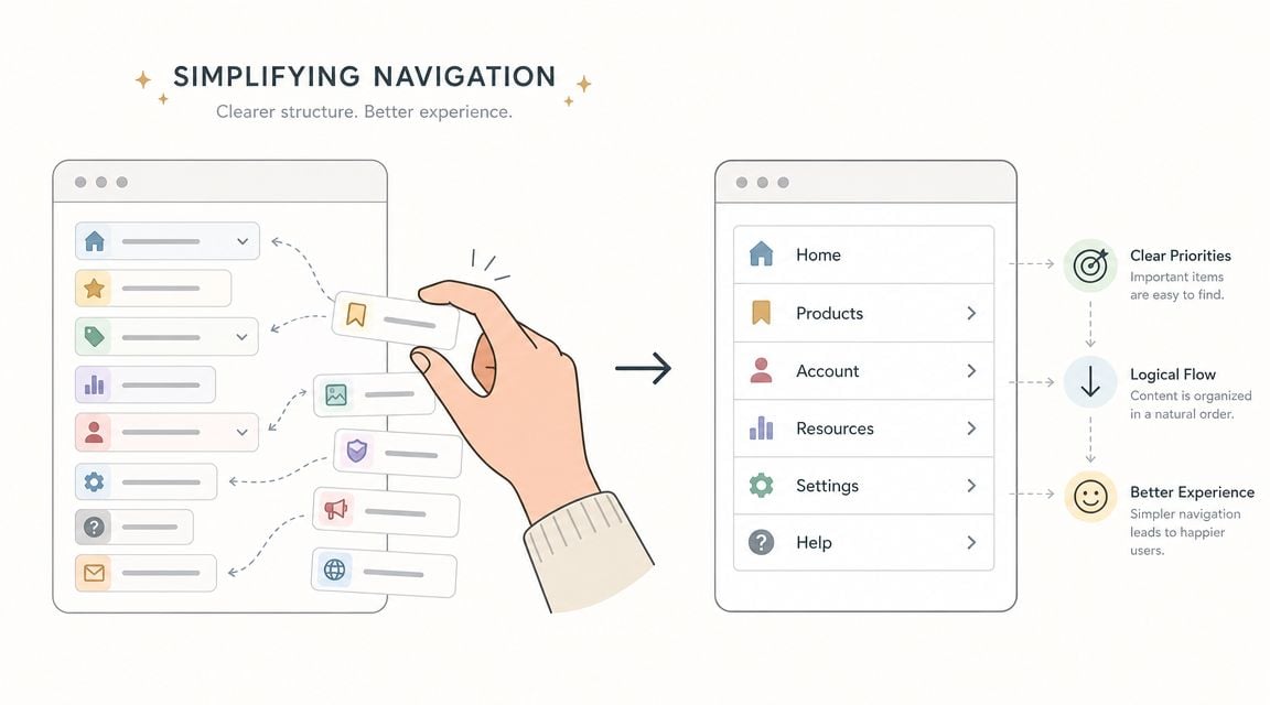
With smartphones central to internet access in the UK, a mobile-first approach isn't optional. Baymard found that users are five times more likely to abandon a task if a site isn't optimised for mobile, which is why responsive navigation should be treated as a baseline requirement rather than a nice extra (mobile UX guidance).
For larger sites, start with structure before visual design. A simple sitemap helps you strip duplication, combine weak pages, and make paths cleaner. If your site has grown messily over time, use this guide on how to create a website sitemap to organise it before changing templates.
Write pages for scanning, not for reading line by line
Website users don't read web pages the way they read brochures. They scan for relevance, proof, and next steps. That changes how content should be written.
Use short paragraphs. Put benefit-driven headings above each section. Replace blocks of brand language with useful specifics. “We deliver bespoke integrated solutions” tells the user almost nothing. “WordPress websites for Dorset businesses that need more enquiries” is clearer and easier to judge.
Try this pattern on service pages:
- Lead with the outcome: State what the service helps the customer achieve.
- Explain the process: Show what happens next in plain language.
- Add proof close to the claim: Portfolio examples, sectors served, or recognisable project types help reduce doubt.
- Give one sensible next step: A call, quote request, or product category link is enough.
If your site includes search, product filtering, or large catalogues, navigation quality becomes even more important. Retailers in particular should uncover site search UX best practices because poor search behaviour often hides behind “low conversion” when the underlying problem is that users can't narrow options fast enough.
Good navigation doesn't show users everything. It removes the need to think about where to go next.
Key UX Fixes for WordPress and eCommerce Sites
A lot of UK SMB sites do not have a design problem first. They have a stack problem.
WordPress is flexible and cost-effective, which is why we recommend it often. It also lets businesses add features quickly without always checking the effect on speed, usability, or maintenance. Heavy themes, overlapping plugins, oversized images, and page builders layered on top of each other create friction that users feel straight away.

Keep WordPress lean
For a service business or brochure site, the best return usually comes from simplifying what is already there rather than adding more tools. Every plugin, animation effect, and template option has a cost. Sometimes that cost is page speed. Sometimes it is harder updates, more conflicts, or a clumsy mobile experience.
Focus on fixes with a clear payoff:
- Choose a lightweight theme: Use one that loads quickly, works well on mobile, and does not depend on decorative effects to feel modern.
- Set up caching and image optimisation properly: Faster page loads help users reach content and forms without delay.
- Review plugin value: Remove plugins that duplicate features or add scripts across the whole site for one minor function.
- Check key templates on a phone: Headers, contact forms, pop-ups, and sticky bars often create the biggest usability issues on smaller screens.
Theme choice matters even more for online shops because every layout decision affects product discovery and checkout flow. If you are comparing options, our guide to the best WordPress themes for eCommerce shows what to look for beyond the demo design.
Fix the checkout before redesigning anything else
For eCommerce, the checkout has a more direct effect on revenue than the homepage hero or a new colour palette. We usually advise owners to review the buying journey first, because small points of friction here can waste paid traffic, email traffic, and SEO traffic at the final step.
Amplitude recommends using funnel analysis and controlled testing to find where users drop out, make focused changes, and check whether completion rates improve (funnel analysis and UX testing workflow). That is the right order for most SMBs with limited budget. Diagnose first. Change second.
The highest-value fixes are often straightforward:
- Remove unnecessary form fields: Ask only for information needed to process the order.
- Allow guest checkout where it fits the business: Forced account creation adds friction at the wrong moment.
- Show delivery, returns, and payment information clearly: Buyers should not have to leave checkout to answer basic purchase questions.
- Reduce distractions during payment steps: Competing links, banners, and pop-ups pull attention away from conversion.
- Test mobile form inputs carefully: Postcode fields, date pickers, dropdowns, and payment forms often cause avoidable abandonment.
This video gives a useful walkthrough of the kind of checkout thinking worth reviewing with your team:
Product page UX also affects search visibility and sales. Clear category structures, useful filtering, clean product copy, and fast-loading pages help users compare options with less effort. They also support stronger search performance over time. If SEO is part of the plan, this guide on e-commerce SEO success is a useful companion read.
Where budget is tight, platform-native improvements usually deliver better ROI than a custom rebuild. We see the best results from tightening the existing WordPress setup, simplifying templates, and improving the buying journey in priority order. For businesses that want support with responsive WordPress builds and UX-led updates, DesignStack is one available option alongside other specialist agencies.
Use Simple Testing to Validate Design Changes
A redesign can look sharper in a meeting and still reduce enquiries. We see this often with SMB sites. A stronger visual finish gets signed off, but a key task takes longer, a form causes second thoughts, or users miss the main call to action. Testing protects budget by checking whether a change improves completion, not just appearance.
Use two forms of evidence.
Quantitative testing shows what changed in the numbers. Qualitative testing shows where people hesitate, what they misread, and why a journey breaks down. You need both if you want to make decisions with confidence.
A/B testing suits pages with enough traffic to compare versions properly. Use it for a headline, button copy, page layout, or form step where the business goal is clear. Usability testing suits lower-traffic sites and earlier-stage decisions. Ask someone to complete a realistic task, watch what they do, and record where they pause, backtrack, or give up.
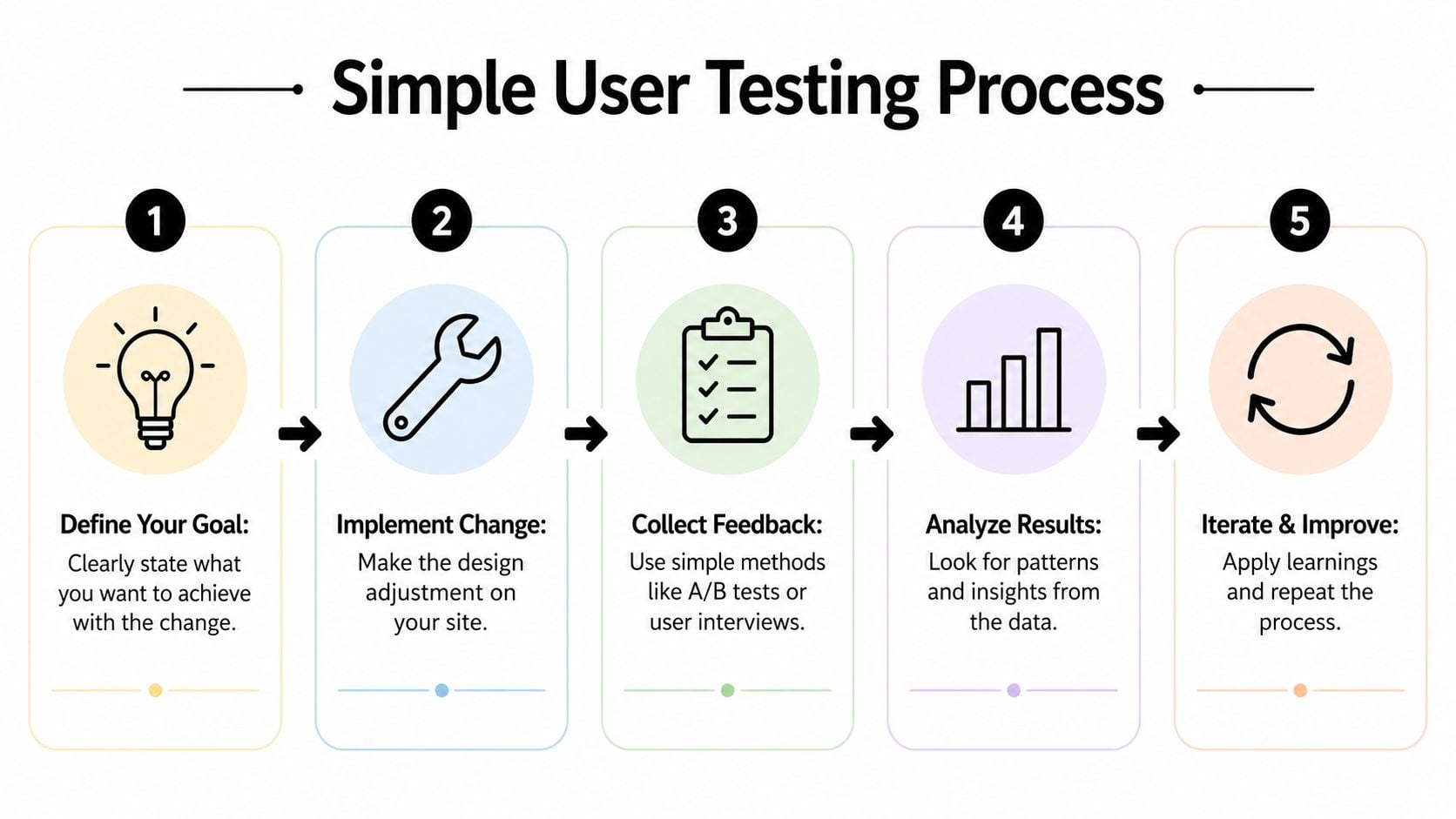
Test one meaningful change at a time. Otherwise you will not know which decision improved the result.
Run a low-cost usability test this week
Keep the scope tight. One journey is enough.
For a local service business, that might be “request a quote for loft conversion design”. For an online shop, it might be “find a product, add it to basket, and reach delivery options”. Specific tasks produce clearer findings because they mirror the actions that lead to revenue.
Use this process:
- Choose one high-value journey. Pick a task tied to leads, sales, or booked calls.
- Write a neutral prompt. Describe the goal without hinting at the route.
- Watch. Let confusion happen so you can see the actual friction.
- Mark the outcome clearly. Completed, completed with difficulty, or failed.
- Look for repeated problems. Three people stumbling in the same place matters more than one personal preference.
The follow-up questions matter as much as the task itself. Ask what they expected to happen next. Ask what felt unclear. Ask whether any point made them question whether to continue. Those answers often reveal copy issues, weak signposting, or trust gaps that analytics alone will miss.
Then match those findings against your reporting. If users hesitate on the same step where your forms or funnels lose people, that fix usually deserves priority. If feedback is mixed and the page already performs well, leave it alone for now and spend time where the commercial upside is stronger.
If your measurement setup still needs work, our guide to Google Analytics for business websites will help you track the journeys and conversion points that matter before you test further.
Build Your Prioritised UX Implementation Plan
Once you've identified issues, the next risk is trying to fix everything at once. That usually leads to long projects, muddy results, and stalled momentum. A better approach is to rank work by business impact and implementation effort.
Sort work by impact and effort
Use a simple matrix with four groups.
High impact, low effort items go first. These are usually headline rewrites, stronger calls to action, contact visibility, menu simplification, image compression, and form clean-up.
High impact, higher effort items come next. That might include restructuring service pages, rebuilding key templates, improving the checkout flow, or replacing a bloated theme.
Lower impact, low effort items are worth doing when they support clarity, but they shouldn't displace more valuable work. That could mean small visual refinements, icon updates, or tidying secondary pages.
Lower impact, high effort items usually wait. If a change takes serious time and doesn't clearly support leads, sales, or user completion, it's probably not urgent.
A practical plan often looks like this:
- Phase one: Fix obvious friction on homepage, service pages, and contact paths.
- Phase two: Improve one major journey such as quote request or checkout.
- Phase three: Test, measure, and refine based on evidence.
- Phase four: Tackle deeper structural or platform issues if the business case is clear.
Treat accessibility and performance as business basics
Accessibility is often pushed to the edge of the backlog. That's a mistake. UK public sector monitoring has shown that many websites still fail basic accessibility standards, which underlines how often fundamentals like keyboard navigation, labels, contrast, and form handling are missed. For businesses, those same improvements make sites easier for everyone to use, not just people using assistive technology (accessibility and usability guidance).
That's why accessible UX tends to overlap with commercial UX. Clearer headings help scanning. Better form labels reduce errors. Stronger contrast improves readability. Cleaner keyboard behaviour often reflects cleaner interaction design overall.
If you're weighing whether to handle UX improvements internally or bring in outside support, it helps to compare process as much as price. This guide on how to choose a web design agency gives a sensible checklist for that decision.
The important part is staying focused. Don't chase trends. Fix friction where it blocks revenue, measure the result, and keep improving from there.
If your website feels harder to use than it should, DesignStack can help you prioritise the fixes that matter most. We work with UK businesses on responsive websites, WordPress builds, eCommerce improvements, and practical UX updates that support enquiries, sales, and long-term growth.


Leave a Reply