
7 Product Page Design Best Practices for 2026
We see the same pattern on UK SMB ecommerce sites every month. A buyer arrives with clear intent from Google Shopping, Instagram, or a paid campaign, then stalls on the product page because the basics are harder to find than they should be. Product photos do not help them inspect the item. Variant choices are hidden. Delivery and returns are unclear. On mobile, the add-to-basket action sits too far down the page.
That costs real money, especially for smaller businesses that cannot afford wasted clicks. If traffic is getting more expensive, every point of friction on the product page reduces the return on the budget you already spent to get the visit. It also makes measurement harder, which is why we usually recommend setting up clean product-page event tracking and reporting in Google Analytics 4 for ecommerce teams before redesign decisions are made.
For UK businesses using WordPress and WooCommerce, product page design is not only a UX exercise. It is a practical checklist that covers conversion, search visibility, maintainability, and compliance. The page needs to help someone make a decision quickly, while also handling structured data, mobile performance, pricing clarity, and the legal expectations around how offers are presented to UK consumers.
This matters even more for local and regional firms. A Dorset retailer shipping nationwide has the same technical demands as a much larger store, but usually with a smaller team, tighter budgets, and fewer development hours to spend on custom fixes after launch. Good product page design closes that gap by using proven patterns your team can maintain in WordPress once the site is live.
At DesignStack, we treat product pages as sales infrastructure. That applies whether you are selling gifts in Weymouth, specialist parts across the UK, or trying to improve an older WooCommerce build that looks acceptable but underperforms. If you're also reviewing broader inspiration around Australian ecommerce store design, the same commercial principle applies. Pages that reduce uncertainty tend to convert better than pages that rely on persuasion alone.
The sources below are the ones worth keeping close. Together, they cover product page UX research, SEO implementation, Core Web Vitals, and UK pricing compliance, with practical value for SMBs that need pages to work in practical settings, not just in a design mockup.
1. Baymard Institute – Product Page UX Best Practices and Research
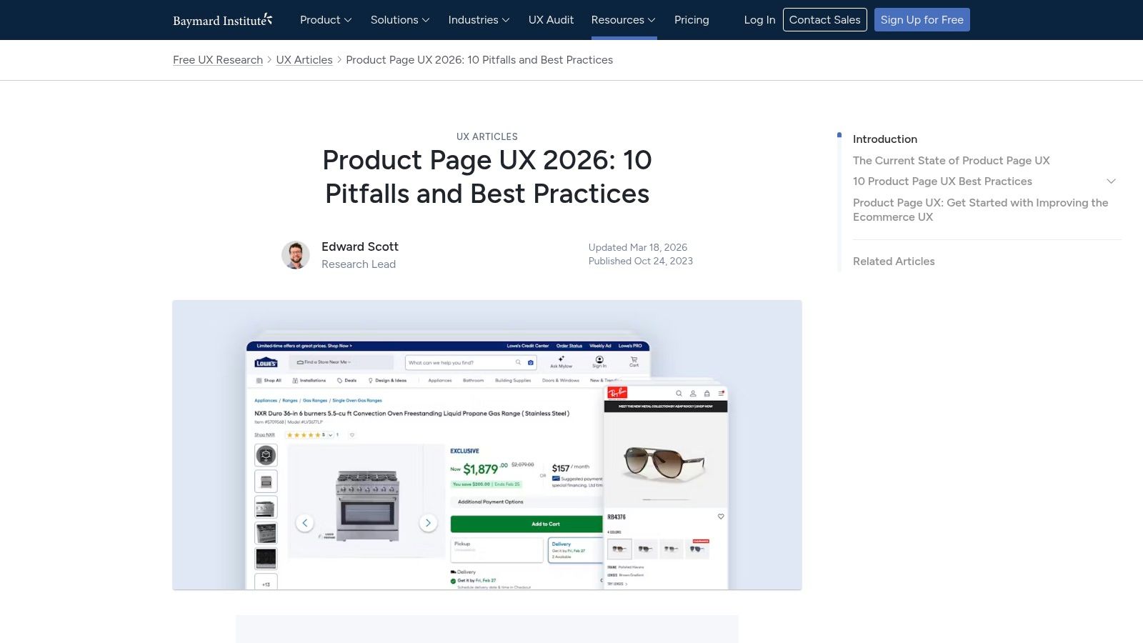
If I had to pick one benchmark for product page design best practices, Baymard is usually where I start. It gives teams something more useful than opinion. It gives tested patterns for the exact parts of a product page that usually break conversion. Variant selectors, image galleries, sticky purchase actions, shipping information, reviews, and cross-sells.
The most useful part for SMEs is that Baymard helps settle internal arguments quickly. You don't need to debate whether hidden size options are “cleaner” if the pattern makes buying harder.
Baymard’s current product page UX benchmark reports that only 48% of leading desktop eCommerce sites achieve “decent” or “good” product page UX, and mobile drops to 38% “decent or better” in its 2026 benchmark of leading sites at Baymard Institute’s product page UX research. That gap is exactly why so many product pages look polished but still leak revenue.
What to lift from Baymard first
For WordPress and WooCommerce builds, these are the fixes that usually matter fastest:
- Expose variants clearly: If you sell sizes, colours, finishes, or pack options, show them as obvious tappable choices rather than hiding them in a generic select field.
- Keep the buying action visible: Sticky add-to-cart on mobile works well when the page is image-heavy or content-heavy.
- Answer objections near the decision point: Delivery, returns, stock status, and review summary belong near the price and CTA, not buried in tabs.
- Make the gallery work hard: Use multiple angles, zoom, and close-up detail shots for texture, fit, and finish.
Practical rule: If a shopper has to open a dropdown to discover basic buying options, the page is already making the sale harder.
Baymard is also useful when briefing third parties. Designers see the layout intent. Developers understand the interaction requirement. Content editors know what information needs to sit near the CTA. That makes projects cleaner from the start.
Where Baymard falls short
Baymard is not a plug-and-play WooCommerce implementation guide. It's platform-agnostic. Someone still has to translate the pattern into your theme, plugin stack, and content model. That's where businesses often stall.
For example, a sticky mobile CTA can conflict with cookie banners, live chat, and third-party review widgets. Exposed variant selectors can become messy if your catalogue data is inconsistent. If your product setup is weak, good UX guidance exposes the data problem rather than solving it.
That’s why we usually pair UX work with analytics review. If you're refining product page interactions, proper event tracking matters just as much as the visual change. Our advice on Google Analytics 4 mastery helps close that loop so you can see whether a page improvement changes behaviour.
2. Shopify – Boost Sales with Product Page Optimisation blog
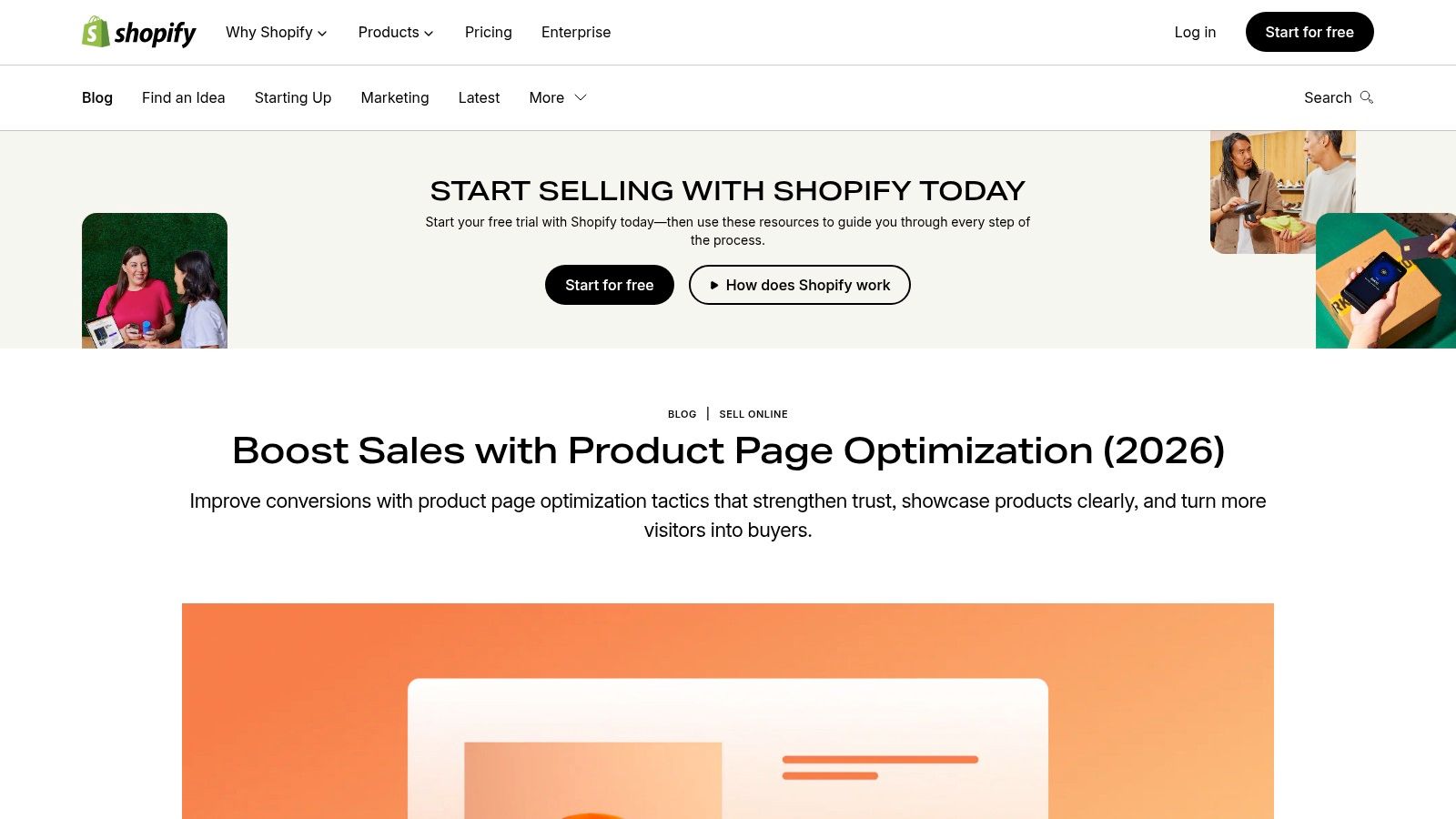
A Dorset retailer does not usually need a full CRO programme to improve a weak product page. More often, they need to fix the page that already gets traffic but still leaves buyers with unanswered questions. That is why Shopify’s guidance earns a place in this list. It is practical, fast to apply, and useful even if your store runs on WordPress or WooCommerce.
You can review the guidance directly in Shopify’s article on improving product pages.
What Shopify does well is push teams toward changes they can make this week, not someday after a redesign. For SMBs, that matters. A better product page often comes from improving content hierarchy, media order, and reassurance around the buying decision, not from adding another app.
What to borrow from Shopify on a WordPress store
From an agency point of view, four ideas usually transfer well across platforms.
- Lead descriptions with buying relevance: Open with what the product is, who it suits, and the practical benefit. Do not bury the useful detail under brand copy.
- Place trust near hesitation points: Reviews, returns information, delivery expectations, and payment reassurance work best near price and CTA areas.
- Sequence media deliberately: Start with the clearest product image, then show detail shots, scale, and real-world use.
- Use light personalisation, not gimmicks: Related products, use-case prompts, and audience-specific copy blocks can help if they are based on real buying intent.
That last point gets mishandled a lot. Smaller retailers often assume personalisation means expensive tooling or aggressive recommendation widgets. In practice, a cleaner version works better. If someone is viewing a refill product, show compatibility guidance. If a visitor is on a made-to-order item, surface lead times and returns terms early. Relevance usually beats complexity.
Useful for momentum, weaker on long-term setup
Shopify writes from inside the Shopify ecosystem, so some advice assumes theme features, app integrations, or native commerce functions that WordPress sites do not have by default. On WooCommerce, copying every feature one for one can create plugin sprawl, slower pages, and a checkout experience that feels patched together.
I see this regularly with UK SMBs. A business adds review widgets, urgency banners, bundles, sticky carts, delivery popups, and recommendation carousels because each tool sounds commercially sensible on its own. The result is a cluttered product page that loads slowly and asks the customer to process too much at once.
The better approach is selective implementation.
Use Shopify’s article as a practical prompt list, then filter each idea through your actual setup. Can your theme handle it cleanly? Can your team maintain the content? Does it support how you trade in the UK, including VAT display, delivery messaging, and returns expectations? Those are the checks that stop a quick win becoming technical debt.
If your store already feels busy or inconsistent, keep the focus on the buyer journey and operational fit. Our guide to running a successful online store for long-term ecommerce growth covers that wider view.
3. IMRG UK – Best Practice for Optimising Your Product Page

A Dorset retailer can have a well-shot product range, fair pricing, and solid traffic, then still lose sales because the product page leaves basic UK buying questions unanswered. Is the price clear? Is VAT included? How fast is delivery to this postcode? What happens if the item needs to go back? IMRG is useful because it keeps those practical questions in focus.
You can access the resource at IMRG’s product page optimisation document.
What I rate about IMRG is its connection between ecommerce design and day-to-day trading reality. That matters for SMBs on WordPress and WooCommerce. A product page is only as reliable as the stock data behind it, the delivery rules in the cart, and the returns process your team can fulfil. We see this gap often in agency work. The design looks polished, but the operational detail is either missing or too vague to support the sale.
What UK SMEs should apply
Use IMRG as a sense check for page content, not just layout polish.
- Make price presentation unambiguous: Show whether the displayed price includes VAT, and keep that wording consistent across product, basket, and checkout pages.
- State delivery terms with enough detail to be trusted: Give realistic dispatch and delivery expectations, including cut-off times or area limits where relevant.
- Place returns information near the buying decision: A short summary close to the CTA usually works better than forcing users to hunt through the footer.
- Use trust cues that match your trading model: Payment methods, review signals, warranty terms, or trade association memberships help more than a random stack of badges.
- Check the mobile version first: On many UK SMB stores, the main commercial losses come from mobile pages where delivery, variation selection, or returns copy is hidden too far down.
For WordPress sites, implementation usually comes down to template discipline. Set standard fields for delivery messaging, returns summaries, stock wording, and tax display, then make those fields part of the product publishing process. If each page is edited differently, consistency breaks fast, especially once several people touch the catalogue.
Real-world trade-offs
Trust matters, but clutter kills pace.
I regularly see product pages where the price area is crowded with payment logos, countdown banners, stock alerts, shipping claims, review stars, and three different reassurance messages. Every element was added for a sensible reason. Together, they compete with each other and weaken the page.
A better hierarchy is usually simple: lead with price and core product choice, then confirm stock or availability, then delivery, then returns. Secondary trust signals can sit nearby, but they should support the decision rather than dominate it. Local credibility also has a place. A Dorset business affiliation or regional service cue can help, especially for smaller brands, but it works best as supporting proof.
IMRG is strongest as a UK filter for product page decisions. It helps SMBs handle the legal and commercial details that broad UX articles often skip, and that is often the difference between a page that looks good and one that converts reliably.
4. Google Search Central – Product Structured Data Rich Results
A Dorset retailer can spend weeks refining product copy, photography, and pricing, then lose visibility because Google cannot read the product details cleanly. That is the practical value of structured data. It helps search engines interpret what the page is selling, what it costs, whether it is in stock, and which review information is valid for display.
For UK SMBs on WordPress and WooCommerce, this is usually less about advanced SEO and more about clean implementation. Google Search Central’s product structured data guidance is the reference point to use, not broad plugin sales pages or old schema tutorials.
What matters on product pages
Google’s documentation is focused on eligibility, accuracy, and consistency. That makes it useful for business owners as well as developers, because the common failures are rarely exotic. They are usually caused by messy catalogue management, conflicting plugins, or product data that is maintained in too many places.
The checklist I use on WooCommerce builds is simple:
- Mark up the main product clearly: The schema should describe the product the customer is viewing.
- Match visible content exactly: Price, availability, title, and review information in the markup should match the page.
- Set up variants carefully: Size, colour, and other options need a clear structure so Google is not left guessing which offer applies.
- Keep offer data current: Old stock status or stale pricing creates trust issues in search and avoidable errors in Search Console.
- Test templates before publishing at scale: Validate key product types first, then spot-check live URLs after theme, feed, or plugin changes.
That last point matters more than many teams expect.
On smaller ecommerce sites, schema often breaks during ordinary maintenance. A reviews plugin adds duplicate markup. A theme update changes product fields. A feed tool outputs different availability wording from WooCommerce. None of that is dramatic on its own, but together it creates a product page Google cannot interpret with confidence.
Where businesses usually go wrong
Partial implementation is the standard failure mode. One plugin handles Product schema, another inserts AggregateRating, and a third modifies price output for promotions. The page still looks fine to a customer, but the underlying signals conflict.
For SMBs, the safest approach is one source of truth for product data and one clear schema method. In practice, that usually means checking what WooCommerce already outputs, deciding whether a dedicated SEO plugin should control the markup, and removing anything redundant. I would rather see a clean, limited schema setup than a bloated one assembled from three tools.
There is a trade-off here. Rich results can improve how a listing appears in search, but they do not fix weak merchandising, poor pricing clarity, or thin product content. Schema supports a strong product page. It does not compensate for a confused one.
That is why this source earns its place in a UK product page checklist. It connects technical SEO to day-to-day catalogue discipline, which is exactly where many WordPress stores struggle once the business grows beyond a handful of products.
5. web.dev Google – Core Web Vitals for Product Pages

A Dorset retailer adds a new gallery plugin, a reviews app, a video block, and a promotion banner to a WooCommerce product page. Each change looks harmless in isolation. On a typical mobile connection, the page now shifts during load, variant selection lags, and the main image arrives later than the customer expects.
That pattern is common on SMB ecommerce sites, especially on WordPress where performance debt builds up one plugin at a time. web.dev’s guidance on Core Web Vitals is useful because it gives store owners and developers a shared standard for what “fast enough” means.
For product pages, the practical focus is simple. The hero image needs to render quickly. The layout needs to stay stable while assets load. The page needs to respond promptly when someone changes a size, colour, or quantity.
What usually improves performance first
A full redesign is rarely the first fix. In our agency work, the fastest gains usually come from cleaning up the existing template and being stricter about what loads on the page.
- Control image weight: Upload product images at sensible dimensions for the template, compress them properly, and use modern formats where supported. Keep the first visible image prioritised. Delay secondary gallery assets until they are needed.
- Prevent layout shift: Set width and height attributes for product media. Reserve space for review snippets, finance widgets, stock messages, and promotional bars so content does not jump as scripts load.
- Trim unnecessary scripts: Review every app, tag manager event, chat tool, upsell widget, and tracking script on the product template. If it does not support conversion, support, or measurement clearly enough to justify its cost, remove it.
- Keep interactions light: Variant pickers, delivery calculators, personalisation tools, and review tabs often hurt responsiveness more than initial load time. Test how the page behaves after the first render, not just how quickly it appears.
There is a real trade-off here. Product pages need strong imagery and enough persuasion to help the sale. They also need restraint. Good performance does not mean stripping the page bare. It means loading the right elements in the right order.
For UK SMBs, this matters beyond lab scores. A slower page increases friction for customers on mobile data, older devices, and patchier rural connections. That is a practical issue for businesses serving shoppers across Dorset and beyond, not a technical nicety.
Performance work usually starts with subtraction.
On WordPress and WooCommerce, that often means replacing bulky plugins with lighter alternatives, disabling scripts on pages where they are not needed, and making sure the theme does not force every enhancement onto every product. A cleaner template is easier to test, easier to maintain, and less likely to break when the site grows.
6. UK Pricing and Online Choice Architecture Compliance CMA and GOV.UK
A Dorset retailer launches a tidy new product page, then starts getting the same support message every week. Why did delivery appear later? Does the price include VAT? Why was the premium option already selected? Those are not cosmetic issues. They sit right on the line between conversion friction and UK compliance risk.
For UK stores, the starting point is GOV.UK’s summary on providing clear and accurate information about prices. It does not tell you how to style a product page, but it does make clear what information needs to be visible before someone commits to buy.
On real client builds, this is usually where high-level UX advice has to become template rules. If you run WooCommerce or WordPress for an SMB, do not leave price presentation to whichever plugin or theme component happens to be active. Set a standard and apply it across the catalogue.
A practical baseline looks like this:
- Show the full selling price clearly: UK shoppers should not need to interpret whether the displayed price includes VAT.
- Disclose extra costs early: Delivery charges, installation fees, or payment-related surcharges should appear before checkout, not after intent is established.
- Keep promotional framing accurate: Countdown timers, low-stock labels, and urgency messages should reflect real availability or real deadlines.
- Make paid upgrades a genuine choice: Add-ons, finance options, warranties, and premium variants should not be preselected in a way that nudges people into a higher spend by default.
- Write conditions in plain English: If a price depends on quantity, postcode, subscription length, or contract terms, say so next to the price, not in buried small print.
Product page design and compliance meet. A cleaner decision path usually converts better because it removes hesitation before it creates complaints.
Accessibility belongs in the same conversation. If the active price does not update clearly when a variant changes, if finance terms are hidden inside a collapsed widget that does not work by keyboard, or if colour alone indicates the selected option, the page creates both usability problems and avoidable legal exposure. The same applies to strike-through pricing and promotional labels that fail contrast checks.
I would treat this as a template governance issue, not a one-off legal check. Standardise one pricing block, one delivery disclosure pattern, one variant selector, and one promotional message style across the site. That gives you something your team can test properly, train staff on, and maintain as products change.
For businesses that want search visibility without creating compliance headaches, this should sit alongside your wider ecommerce SEO work for WordPress and WooCommerce. Better rankings help, but the product page still has to present price and choices in a way that is clear, fair, and easy to use.
Clear pricing and honest choice architecture reduce friction at the same time they reduce risk.
That matters for SMBs in Dorset and beyond because small teams rarely have time to patch inconsistent pricing logic across dozens of product pages after launch. Getting the template right early is cheaper than fixing customer confusion later.
7. Charle UK Shopify agency – How to Optimise Product Pages for Ecommerce SEO
A Dorset retailer can have a product page that looks tidy, loads quickly, and still underperform in search because the copy says almost nothing useful. That is the gap Charle’s article handles well. It connects SEO with the practical job of helping someone decide whether to buy.
You can read it at Charle’s guide to optimising product pages for ecommerce SEO.
What makes this resource worth including is its focus on content quality at product-page level. Many SMB ecommerce sites, especially stores built on WordPress or WooCommerce with off-the-shelf themes, still rely on supplier descriptions, short spec tables, and a few repeated keywords. That setup rarely gives search engines enough context or customers enough confidence.
What good product copy does
Good product copy helps the page rank for the right terms and reduces the questions that stop a sale. It explains fit, materials, compatibility, delivery expectations, care requirements, and the differences between variants in plain language.
In practice, a strong structure usually includes:
- A clear opening summary: State what the product is, who it is for, and the main reason to choose it.
- Useful supporting detail: Add dimensions, materials, technical specs, included items, and compatibility notes where they matter.
- Decision-making content: Cover sizing, lead times, returns, installation, maintenance, or warranty information before the customer has to go looking for it.
- Scannable formatting: Use subheadings, short paragraphs, and bullets so mobile users can find answers quickly.
Better content depth often improves both search relevance and conversion, provided the information is organised well. I see the opposite problem just as often. Teams add more text for SEO, then bury the key buying details halfway down the page.
The trade-off to manage
Longer pages are not automatically better pages.
For SMBs, the goal is not maximum word count. The goal is coverage without clutter. On WordPress and WooCommerce builds, that usually means separating primary selling copy from secondary detail. Keep the main summary, price, variant options, delivery essentials, and trust cues visible near the top. Move lower-priority specs, care notes, and FAQs into structured sections further down the template.
This is also where agency input tends to matter. A copywriter working alone may produce better wording, but significant gains come from combining content structure, schema, internal linking, and template decisions. If product page improvements are part of a wider growth plan, they should sit inside a broader ecommerce SEO service for WordPress and WooCommerce so technical setup and page content support each other.
The product pages that win in search usually answer buying questions clearly, early, and without padding.
That is the useful takeaway from Charle’s piece. For UK SMBs, especially businesses managing small catalogues with limited in-house marketing time, clear product copy is one of the few SEO improvements that can strengthen rankings and conversion at the same time.
Product Page Best Practices: 7-Source Comparison
| Resource | 🔄 Implementation complexity | ⚡ Speed to impact | 📊 Expected outcomes | Ideal use cases | 💡 Key advantages ⭐ |
|---|---|---|---|---|---|
| Baymard Institute – Product Page UX Best Practices and Research | Medium, requires translation to platform and design/dev work; full depth behind Baymard Premium | Medium, improvements take design + dev cycles | Higher UX consistency and conversion; fewer internal debates | Teams needing evidence-led PDP standards and designer/developer briefs | Research-backed, methodologically rigorous, concrete examples and patterns (⭐⭐⭐) |
| Shopify – Boost Sales with Product Page Optimisation (blog) | Low, checklist-style guidance; some tips assume Shopify apps | Fast, quick copy/media and layout changes | Quick conversion uplifts and clearer PDP content | Merchants seeking fast wins or Shopify stores | Actionable checklists and modern examples for rapid implementation (⭐⭐) |
| IMRG (UK) – Best Practice for Optimising Your Product Page | Low–Medium, practical advice but some member-only resources | Medium, content and layout changes + measurement | Improved conversion on UK audiences; better content prioritisation | UK retailers and brands focused on local shopper preferences | UK-market insights and retail-operations context (⭐⭐) |
| Google Search Central – Product Structured Data (Rich Results) | Medium–High, technical schema implementation and testing | Medium, once implemented, search eligibility can change quickly | Eligibility for rich snippets (price, availability, ratings) and higher CTR | Sites aiming to improve organic visibility and SERP appearance | Authoritative, developer-ready examples to avoid errors (⭐⭐⭐) |
| web.dev (Google) – Core Web Vitals for Product Pages | High, requires developer performance work (images, layout shifts, INP) | Medium–Slow, engineering time to remediate and re-test | Better Core Web Vitals, improved UX and potential SEO gains | Image-heavy or interaction-rich PDPs where performance matters | Authoritative, up-to-date remediation guidance and diagnostics (⭐⭐⭐) |
| UK Pricing and Online Choice Architecture Compliance (CMA / GOV.UK) | Medium, legal/UX coordination; may need legal review for edge cases | Fast, many disclosures are quick to update; enforcement risk if ignored | Regulatory compliance, reduced enforcement risk, clearer pricing | UK retailers required to meet consumer protection and pricing rules | Essential legal requirements; prevents misleading choice architecture (⭐⭐⭐) |
| Charle (UK Shopify agency) – How to Optimise Product Pages for Ecommerce SEO | Low, content and heading/FAQ improvements for editors | Fast, content edits and on-page depth yield quick SEO benefits | Improved rankings, reduced pogo-sticking, clearer buying guidance | SMEs and teams needing copy-focused SEO to complement design | Practical copy checklist and editorial guidance for non-technical teams (⭐⭐) |
Build Your Best Product Page, Starting Today
The strongest product pages don’t happen because a business copied a trend. They happen because someone made deliberate decisions about what buyers need to see, when they need to see it, and what could stop them buying. That’s the core value in these resources. Together, they cover the parts many SMEs miss when they build or refresh an online shop.
Baymard gives you the UX benchmark. Shopify gives you momentum and practical page-level ideas. IMRG keeps the UK retail context in view. Google Search Central and web.dev deal with the technical layers that affect visibility and usability. GOV.UK grounds the page in pricing clarity and lawful presentation. Charle helps connect product content with search intent and buyer confidence.
For most small and medium-sized businesses, the right starting point isn’t “redesign everything”. It’s tighter than that. Fix the biggest sources of friction first. If your product page hides buying options, fix the selector pattern. If your pricing is unclear, standardise the price block. If mobile users lose the CTA, keep it visible. If search listings are weak, implement proper product schema. If the page is slow, remove what isn’t earning its place.
A simple priority order often works best:
- Start with clarity: Price, CTA, availability, delivery, and returns should be easy to find.
- Then improve confidence: Better imagery, stronger descriptions, reviews, and relevant trust signals.
- Then support discoverability: Structured data, indexable content, and technically sound templates.
- Then harden compliance: VAT display, fee transparency, accessible interactions, and honest choice architecture.
That order matters because it matches how real projects succeed. Businesses get more value from improving a core template that editors can maintain than from layering on features they won’t manage consistently six months later. On WordPress and WooCommerce especially, maintainability is part of conversion optimisation. If a good pattern is too fiddly to update, it won’t stay good for long.
There’s also a regional advantage for UK businesses that act on this properly. Many competitors still underinvest in the basics. They upload one or two product photos, rely on default theme layouts, bury delivery details, and ignore the mobile purchase flow. The opportunity isn’t mysterious. It’s execution.
If you're rebuilding from an older store, launching a new WooCommerce site, or trying to make an existing catalogue convert better, focus on product page design best practices that your team can sustain. A clean, fast, clear, compliant product page will outperform a clever but chaotic one more often than not.
For broader inspiration around designing high-quality e-commerce sites, the same lesson keeps showing up. Strong commercial websites reduce uncertainty and make action obvious.
If you’d like help translating these standards into a practical WordPress or WooCommerce build, DesignStack can help you do it properly. That means a page structure grounded in UX, built for mobile, aligned with SEO, and realistic for your business to maintain after launch.
If your current product pages look acceptable but don’t convert as they should, that’s usually a design and implementation problem, not a traffic problem. DesignStack helps Dorset and UK businesses build product pages that are clear, compliant, mobile-friendly, and easier to manage day to day. If you want a WordPress or WooCommerce site that doesn’t just look better but sells better, get in touch and let’s turn your product pages into stronger sales assets.


Leave a Reply