Brand Identity Blog: The Definitive SMB Guide (2026)
You know the feeling. Your business does solid work, customers say nice things, and referrals still come in. But when someone searches for what you do, a competitor with a cleaner logo, sharper website, and more consistent presence looks like the safer choice.
That happens every week with local firms. A great trades business can look patchy online. A well-run solicitor can feel dated before anyone reads the copy. A guest house with excellent reviews can lose attention because its website, Facebook page, and printed leaflet don't look like they belong to the same business.
The problem usually isn't the quality of the service. It's the gap between how good the business is and how clearly that quality shows up. That's where a strong brand identity blog should be useful. Not as a design trend report, but as practical guidance on how to become easier to recognise, easier to trust, and easier to choose.
For local businesses, this also affects search performance. If your name, messaging, visuals, and contact details feel fragmented, you make life harder for both customers and search platforms. That's one reason brand work and search engine optimisation for local businesses often need to move together.
Table of Contents
- Why Your Great Business Feels Invisible
- What Brand Identity Actually Means
- The Core Components of a Strong Brand Identity
- How to Develop Your Brand Identity
- Applying Your Brand Identity Consistently
- Brand Identity in Action Dorset Case Studies
- Your Next Steps Finding the Right Design Partner
Why Your Great Business Feels Invisible
A Dorset business owner once described it perfectly. “We're busy enough to know the business works, but online we look smaller than we are.” That's a common position. The company has a decent website, an old logo, a few social profiles, maybe some signage done years apart. Nothing is terrible. None of it adds up.
The customer notices that fragmentation quickly. One version of the logo appears on the van. Another sits on the website. The Facebook banner uses different colours. The tone shifts from professional to chatty to generic. Even before a prospect compares prices, they start deciding whether the business feels established.
The real issue is presentation not quality
This is why weaker competitors sometimes win. They haven't necessarily got better people, better products, or better service. They appear more coherent. That coherence creates confidence.
A customer rarely says, “your typography is inconsistent.” They just leave with the feeling that another business seems more put together.
For local firms, that first filter matters more than people think. Buyers often compare several nearby providers in one sitting. They may open three websites, scan reviews, check a Google Business Profile, and look at a social page before making contact. If your identity changes from touchpoint to touchpoint, you add friction at the exact moment you need clarity.
Visibility is partly a recognition problem
Being invisible doesn't always mean nobody can find you. Sometimes it means people see you but don't remember you. Or they see you and don't feel certain enough to enquire.
A good brand identity helps fix both problems because it creates repeatable cues:
- One recognisable look: the same logo, colours, and type choices wherever people meet the business.
- One clear tone: website copy, emails, and social posts sound like the same company.
- One reliable signal: the business feels stable, organised, and easier to trust.
That's why brand identity isn't cosmetic. It's commercial. It helps local companies stop looking like a collection of disconnected assets and start looking like one dependable business.
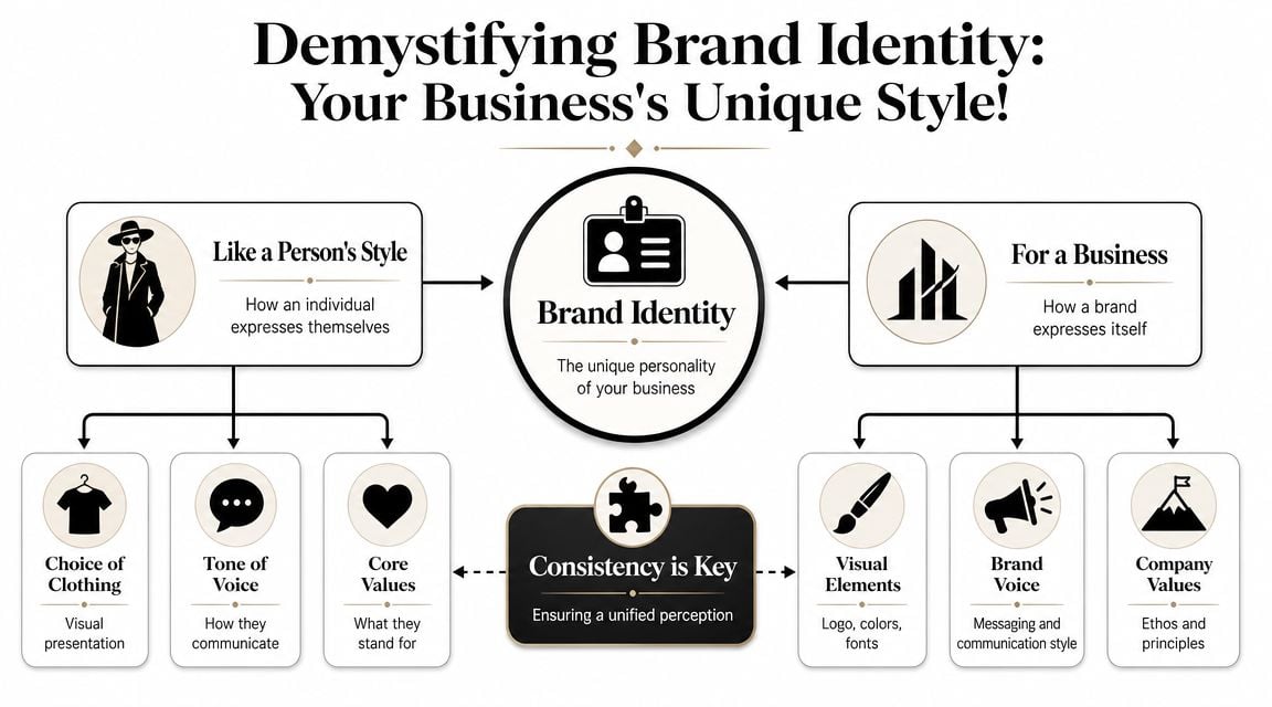
What Brand Identity Actually Means
Brand identity gets used loosely, so it helps to strip it back. Imagine it as a person's style. Someone's clothes, haircut, voice, and manner all shape how they come across before you know them well. A business works in much the same way.
Its brand identity is the set of visible and verbal choices that express who it is. That includes the logo, colour palette, typography, imagery, and the way the business speaks. If those elements work together, the business becomes easier to recognise.
If you want to see how this translates into practical design work, this is the same territory covered in graphic design for growing businesses. The important point is that identity is a system, not a single asset.
Brand identity versus brand versus branding
These terms get mixed together, but they aren't the same.
- Brand identity is what you create. Your logo, colours, type, image style, and voice.
- Brand is what people believe about you. Their impression, trust level, and memory of the business.
- Branding is what you do with the identity. The repeated actions that put it into the world.
That distinction matters because you can control identity directly. You earn brand over time.
A lot of businesses say they need “a brand” when what they really need first is a clearer identity. Once that system exists, every touchpoint gets easier to manage. Website pages look related. Brochures stop drifting. Social templates become practical instead of random.
Why first impressions matter so much
People decide quickly. Tailor Brands says people form a first impression in 7 seconds, and it can take 5–7 impressions for consumers to start recognising a brand, according to Tailor Brands' branding statistics. That's why inconsistent presentation causes more damage than many owners realise.
If the first encounter feels muddled, the business starts from a weaker position. If the next few encounters don't look connected, recognition builds slowly or not at all.
Practical rule: if a stranger removed your business name from your website, social post, leaflet, and email footer, those items should still look like they belong together.
That doesn't mean every piece must be rigid or boring. It means the core cues need to repeat often enough that people remember them. Good identity makes that easy. Weak identity leaves it to chance.
The Core Components of a Strong Brand Identity
A strong brand identity gives a local business a repeatable way to look credible wherever a customer finds it. That might be a Google Business Profile photo, a search result, a van graphic, a quote PDF, or a service page on your site. If those touchpoints feel disconnected, trust drops and enquiries get harder work than they should be.
Hinge Marketing describes brand identity as a visual system made up of elements like logo, colour, typography, and imagery, and notes that digital use also needs accessible colour contrast in its explanation of brand identity. That matters in real use. An identity has to survive small mobile screens, printed materials, social templates, and website components without losing clarity or readability.
For local businesses, this is not only a design issue. Consistent visual and verbal cues help people recognise the same company across branded search, local listings, reviews, and your website. That recognition supports trust, and trust affects conversion.
What each element actually does
Your logo identifies the business quickly. Its job is to be clear, distinctive, and usable at small sizes. If it turns into a blur in a website header or social profile image, it stops doing that job.
Colour helps people recognise you faster, but it also controls hierarchy. On a website, colour choices affect whether buttons stand out, forms feel usable, and service pages are easy to scan. Brand identity and web performance are closely linked, especially once you apply the same system across design, content, and calls to action. effective web design for a cohesive digital experience explains that overlap well.
Typography shapes both tone and usability. A font can make a firm look capable and established, or careless and dated. It also needs to work in everyday tools such as Word, Canva, email signatures, and your website CMS, otherwise staff will substitute random alternatives and consistency will disappear.
Imagery and supporting graphics carry more weight than many owners expect. If one page uses polished team photography, another uses generic stock images, and another uses low-resolution phone shots, the business starts to feel less reliable. That affects perceived quality before a prospect reads a word.
Tone of voice keeps the identity joined up. If the website sounds measured, social posts sound rushed, and sales emails sound overly formal, customers notice the mismatch. Domain Drake on memorable branding makes a similar point. Memorability comes from repeated cues, not one clever logo.
Key Brand Identity Components and Their Purpose
| Component | Primary Role | Key Question to Ask |
|---|---|---|
| Logo | Identifies the business quickly | Does it stay clear and recognisable at small sizes? |
| Colour palette | Builds recognition and visual hierarchy | Are the colours distinctive and easy to use consistently? |
| Typography | Shapes readability and tone | Can people read it comfortably on web and print? |
| Imagery | Sets mood and perceived quality | Do photos and graphics feel like the same brand? |
| Tone of voice | Creates a consistent personality | Does the writing sound like one business across every channel? |
A practical test works better than debating preferences. Put your homepage, your latest social post, your Google Business Profile, and a printed item side by side. If they do not look like the same company, customers will feel that inconsistency too.
- Logo check: test it in a website header, email signature, favicon, and social avatar.
- Colour check: confirm contrast, then make sure the palette still works in forms, buttons, and location pages.
- Typography check: choose fonts your team can use consistently across web, print, and office documents.
- Imagery check: define a clear style, such as location-led photography, team shots, illustration, or a controlled mix.
- Voice check: write sample headings, service descriptions, and enquiry replies so the tone works in day-to-day use.
The strongest identities are easy to apply under pressure. If staff can use the system quickly and keep the business looking consistent across local search touchpoints, you are more likely to earn clicks, enquiries, and trust.
How to Develop Your Brand Identity
Most identity problems start because a business jumps straight to visuals. Someone asks for “a modern logo”, gets three concepts, picks one, and hopes the rest sorts itself out. It rarely does.
A better approach is to treat identity like a business project with stages, decisions, and constraints. That keeps the work practical.
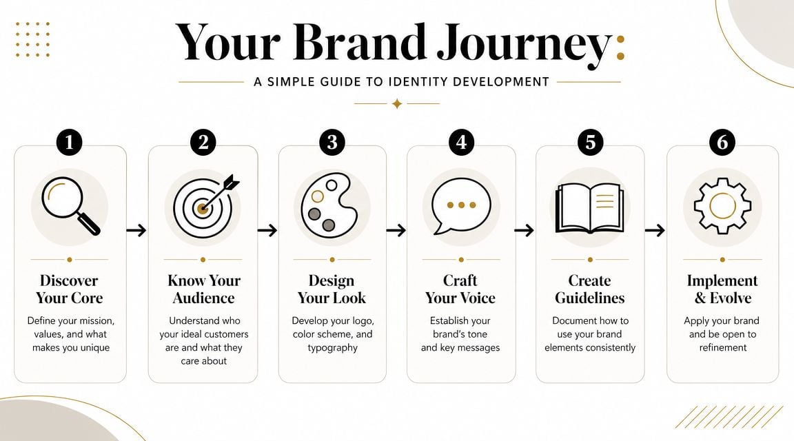
Start with discovery not decoration
The first job is clarity. Before anyone picks colours or fonts, define what the business needs to communicate.
Answer the basics:
- Who are you trying to attract? A local homeowner, a procurement manager, a tourist, a startup founder?
- What do those people need to feel? Reassured, impressed, safe, informed, excited?
- What should make you different? Faster response, local expertise, specialist knowledge, a friendlier buying experience?
- What do you never want to look like? Cheap, corporate, trendy, cold, generic?
Those answers save time later because they narrow the design direction. They also reduce the common problem where owners choose based on personal preference rather than business fit.
This is also where accessibility and compliance need to enter the conversation. The Image Impact Group notes that in the UK there are around 16 million disabled people, and argues that readable colours and fonts are part of growth rather than a niche concern in its article on the commercial importance of accessible brand identity.
The brand has to be usable before it can be persuasive.
That means thinking early about contrast, font legibility, alt text, form clarity, and whether your visual choices still work for people with different needs.
For a broader outside perspective on the process, Domain Drake on memorable branding gives a helpful overview of how strategy and recognition connect.
A lot of firms also benefit from reviewing how the identity will live on the website before they finalise anything. That's one reason guides on finding a website designer who understands your vision matter early, not just at launch.
Build the system then document it
Once the strategy is clear, the design phase becomes more grounded. You're not hunting for “nice ideas”. You're selecting the right identity tools for the job.
That usually means:
- A practical logo set: one main version, one simplified version, and formats for light and dark backgrounds.
- A controlled palette: a few primary colours, supported by neutrals that work across web and print.
- Type rules: headline fonts, body fonts, and spacing choices that non-designers can follow.
- Image direction: examples of the style of photography or graphics the brand should use.
- Voice guidance: sample phrases, headline style, and common wording choices.
The short video below gives a useful visual take on identity development in practice.
The final stage is documentation. Even a one-page guide is better than nothing. Without it, brands drift fast. New social graphics appear in different fonts, brochures use near-matching colours, and staff improvise wording until the business loses shape.
A simple guideline doesn't need to be complicated. It needs to be used.
Applying Your Brand Identity Consistently
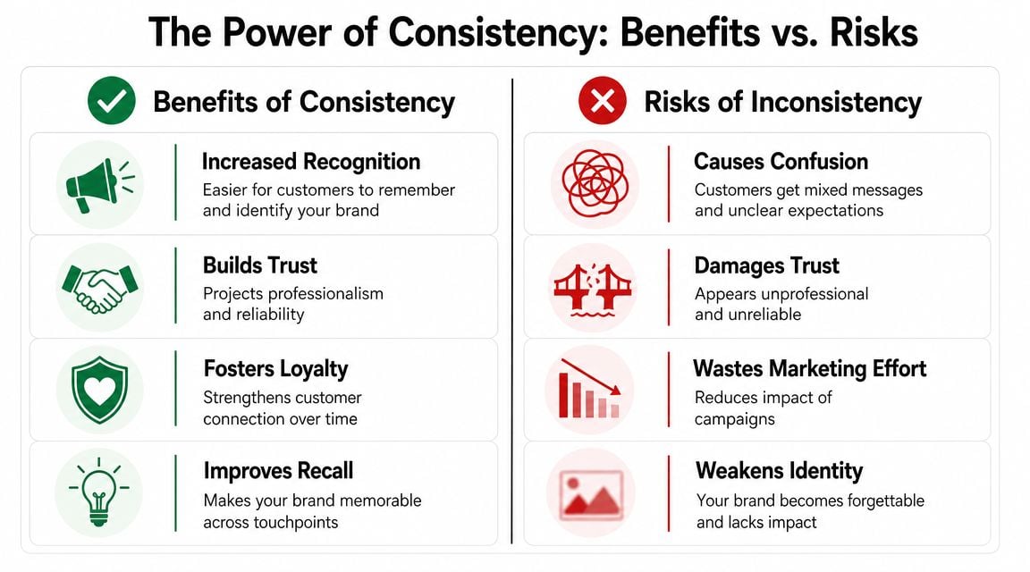
The work starts paying off. A brand identity only becomes valuable when it appears reliably across the places customers see.
Dash reports that 68% of companies say brand consistency adds 10–20% to revenue growth, and also notes that 55% of a brand's first impression comes from visuals alone in Dash's branding statistics roundup. For a local business, that's a practical reminder that consistency isn't just tidiness. It supports commercial results.
Where consistency usually breaks down
It usually breaks in ordinary places, not major campaigns.
A WordPress site gets updated by one person. A leaflet goes to print through another supplier. A staff member creates an Instagram graphic in Canva. Someone changes the Facebook cover image. Bit by bit, the brand starts splitting into versions.
The fix is to decide what must stay fixed and what can flex.
- Fixed elements: logo use, core colours, headline and body fonts, tone, business name format.
- Flexible elements: campaign imagery, seasonal promotions, post layouts, supporting graphics.
That balance matters. If everything is fixed, the brand becomes hard to use. If nothing is fixed, recognition disappears.
How consistency supports trust and enquiries
Think channel by channel.
On your website, the header, buttons, contact forms, and service pages should all feel like part of one system. On a printed flyer, the same colour logic and typography should carry over, even if the layout changes. On Facebook or LinkedIn, profile imagery and post graphics shouldn't look borrowed from another business.
That repetition lowers effort for the buyer. They don't need to re-learn who you are each time they meet you.
What works: the same business name, the same visual cues, and the same tone across website, profiles, print, and email.
For firms where personal reputation matters, this extends to founder and team visibility too. If LinkedIn is part of your lead generation, a guide on how to build your LinkedIn brand can help align personal profiles with the wider company identity.
One practical habit helps more than most. Keep a small asset folder with approved logos, colour values, font details, profile images, and templates. That sounds basic, but it stops a lot of avoidable inconsistency before it starts.
Brand Identity in Action Dorset Case Studies
Generic advice only goes so far, so it helps to look at what this means in a local setting. The examples below are fictionalised, but they're based on the kind of problems Dorset businesses often face.
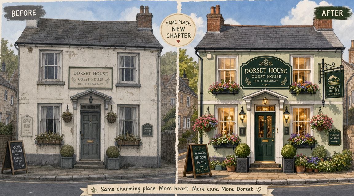
The Weymouth guest house that looked smaller than it was
A family-run guest house in Weymouth had good reviews and repeat visitors, but its presentation told a weaker story. The website looked old, the logo felt dated, and its booking-related pages didn't match the printed materials used in the property. None of this suggested poor service, but it did make the business feel less established than nearby alternatives.
The refresh didn't need to be dramatic. A cleaner logo, warmer coastal colour palette, clearer room photography style, and a more consistent tone across web and email were enough to change perception. The business started looking like a place people could trust before they picked up the phone.
The important shift wasn't “more design”. It was alignment. Every touchpoint started reinforcing the same impression.
The Poole consultancy that needed to look credible fast
A professional services firm in Poole had the opposite issue. The team knew its subject well and had strong client relationships, but online it looked generic. The site copy was competent but flat. The visual identity didn't reflect the level of expertise. Prospects arriving from search had very little to latch onto.
The solution was a more disciplined identity system. Tighter typography, a more confident colour structure, clearer page layouts, and language that sounded precise rather than vague. The team also standardised company details and presentation assets so proposals, profile pages, and directory listings matched.
A service business often wins trust before it wins understanding. People judge credibility first.
That's one reason local organisations invest in joined-up digital presentation. If you want to see an example of local-facing work in this space, the Weymouth Chamber of Commerce portfolio shows how identity and digital experience can support a wider community-facing presence.
Both examples point to the same lesson. A rebrand doesn't have to be loud to be effective. It has to remove doubt, improve recognition, and make the business feel easier to choose.
Your Next Steps Finding the Right Design Partner
A common local business problem looks like this. The service is solid, reviews are decent, referrals come in, but the website feels dated, the signage doesn't match the social profiles, and directory listings use different details. People still find the business, but fewer of them feel confident enough to make contact.
That is the point to hire for. A design partner should help you close the gap between good work and credible presentation.
Start with the job the identity needs to do. It might need to make the business look more established, increase trust on key landing pages, bring print and digital materials into line, or support local search by keeping your business details and presentation consistent wherever customers find you. Those are commercial goals. Design is the method.
Brand identity also functions as a local SEO asset, which matters because Google looks for consistent business signals across your website, Google Business Profile, and directory listings. If your name, address, phone number, visuals, and tone vary from place to place, trust drops for both search engines and human visitors. For a local firm, that can mean lower map visibility, weaker click-through rates, and more hesitation before an enquiry.
Questions worth asking before you hire anyone
A good design partner should answer practical questions without hiding behind jargon.
- How will this identity work in day-to-day use? Ask to see website pages, social profiles, email signatures, printed materials, and simple documents like proposals or invoices.
- How do you handle accessibility? Look for clear answers on colour contrast, readable type, mobile usability, and forms people can complete without friction.
- What gets documented? You need brand guidelines, file formats, logo rules, font choices, colour references, and usage examples your team can follow.
- How will this support local visibility? They should understand consistent business details, profile images, directory presentation, and location-specific pages.
- Who keeps it consistent after launch? If ownership is vague, the identity will drift within weeks.
The best answers are usually plain. If someone cannot explain how a design choice helps your business win more trust or more enquiries, keep looking.
What a sensible process looks like
A sensible process is usually simple. Discovery first. Design second. Guidelines third. Rollout after that.
That order matters because rushing to concepts often creates attractive files that solve very little. The problem is often presentation, not quality. A useful partner will spend time understanding how customers find you, what they see before they enquire, and where inconsistency is costing you leads.
One practical option for Dorset firms is DesignStack, which provides branding, WordPress websites, graphic design, and related digital support from Weymouth. What matters most in any supplier, though, is their ability to connect design choices to day-to-day use, keep the process organised, and leave you with assets your team can maintain without calling for help every week.
Plenty of owners hesitate because they've seen rebrands turn into expensive decoration. That concern is fair. Ultimately, a good identity should reduce confusion, strengthen trust, support local visibility, and make marketing easier to run. If it cannot do those jobs, it is not finished.
If your business is doing good work but still looks harder to trust than it should, DesignStack is worth a look. The studio works with Dorset businesses on branding, websites, and digital assets that need to function in the real world, not just in a concept file.


Leave a Reply