How to Make a Website Accessible: UK Guide
Most websites still get accessibility wrong. A WebAIM survey cited by Acquia found 95.9% of the top 1 million homepages had detectable WCAG failures, with an average of 56.8 errors per page. The most common problem was low contrast text on 81% of homepages.
That should change how you think about accessibility.
For a UK business owner, accessibility isn't a niche design preference or a late-stage technical tidy-up. It's a practical way to make your site easier to use, easier to trust, and less risky from a legal point of view. It also creates a simple commercial advantage. If most competing sites are still frustrating to use, a clearer and more inclusive website stands out quickly.
The good news is that learning how to make a website accessible doesn't mean rebuilding everything from scratch. In most cases, the best results come from fixing the foundations first. Content structure, colour contrast, keyboard access, form labels, image descriptions, and sensible page layouts usually make a bigger difference than expensive redesign flourishes.
Why Web Accessibility is a Business Superpower
A more accessible website usually performs better in the places owners care about first. Enquiries go through. Product pages make sense. Forms stop putting people off. Support requests caused by poor usability fall.
For UK SMEs, that matters commercially and legally.
If someone cannot use your site because text is too faint, the menu cannot be reached by keyboard, or the checkout breaks with basic assistive technology, the problem is not only technical. Under the Equality Act 2010, it can become a discrimination issue if a disabled person is placed at a substantial disadvantage and reasonable adjustments were available. For a Dorset retailer, a local trades business, or a growing eCommerce brand, the practical question is simple. Is the site making it harder for willing customers to buy, book, or enquire?
Accessibility gives smaller businesses an edge
Large brands often carry old design decisions, complex templates, and bloated platforms that are expensive to correct. Smaller businesses can usually fix the biggest issues faster and at lower cost.
That creates an advantage.
A clear heading structure, readable buttons, properly labelled forms, and sensible colour contrast can make a modest site feel far more trustworthy than a glossy one that is hard to use. I have seen small business websites outperform bigger competitors because visitors could complete the task without friction. Accessibility often improves the same basics that drive conversion.
It reduces avoidable legal and commercial risk
Many business owners assume accessibility is only a concern for public sector websites or very large companies. In practice, private businesses in the UK still need to make reasonable adjustments for disabled people. Your website is often part of that service.
The sensible approach is not to chase perfection or commission an expensive rebuild on day one. It is to remove the barriers most likely to block real users. Start with the pages that bring revenue or enquiries. Home, service pages, booking forms, checkout, contact, and account areas usually deserve attention first.
Low-cost fixes often carry the most value:
- Improve contrast so text can be read without strain
- Label form fields clearly so users know what is required
- Make buttons and links obvious so actions are easy to spot
- Support keyboard use so visitors can move through the site without a mouse
- Use clear headings and page structure so content is easier to follow
These are not cosmetic tweaks. They remove points of failure.
Better accessibility usually means better design
Accessibility and usability overlap heavily. A site that is easier to read, easier to understand, and easier to operate tends to feel more professional to everyone, including older customers, mobile users, and people dealing with glare, fatigue, or a poor internet connection.
Good structure helps here. Solid layout choices, clear hierarchy, and predictable interaction patterns all support accessibility. If you are reviewing the wider user journey, these UX design principles are worth keeping alongside your accessibility work so improvements support both inclusion and conversion.
The return is often stronger than expected
Business owners usually notice the same benefits quite quickly:
- More completed enquiries and checkouts
- Fewer usability complaints
- Stronger trust at first glance
- Less risk of costly remedial work later
- A clearer path toward meeting reasonable adjustment expectations
Accessibility is often treated as a specialist add-on. For most SMEs, it works better as practical risk reduction and conversion improvement. Done properly, it helps more people use the site, protects the business from avoidable problems, and makes future updates easier to manage.
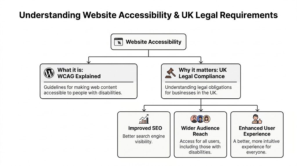
Understanding Accessibility and UK Legal Requirements
A large share of UK adults live with a disability, which means accessibility is not a fringe issue or a public sector concern. For a Dorset trades business, a local retailer, or a growing eCommerce brand, it affects who can book, buy, enquire, and pay without friction.
Accessibility on a website means people can use it with the tools, settings, and browsing methods that suit them. That includes screen readers, keyboards, zoom, captions, clearer wording, and predictable layouts. If a customer has to fight the interface to get a quote or complete a checkout, the site is creating a barrier.
WCAG in plain English
The standard most agencies and developers work from is WCAG, short for Web Content Accessibility Guidelines. For UK SMEs, Level AA is usually the sensible target. It is widely treated as the expected level for a professionally built commercial website because it balances usability, legal defensibility, and cost.
| Level | What it means in practice |
|---|---|
| A | The site avoids some of the more obvious barriers |
| AA | The site works better for a much wider range of users and is the usual target for business websites |
| AAA | A higher standard that can be unrealistic to apply across every page, tool, and transaction |
You do not need to memorise WCAG line by line. You do need to use it as a benchmark when making design, content, and development decisions.
One example is text resizing. If a visitor increases text size and your layout breaks, buttons overlap, or content disappears, that is not a minor visual issue. It is a usability failure. This is one reason I usually advise business owners to review both design choices and their website content management system setup before they spend money on cosmetic changes.
Who accessibility serves
Accessibility covers more than blindness or screen readers. It also affects people with low vision, colour contrast sensitivity, limited dexterity, hearing loss, dyslexia, memory issues, attention-related conditions, and temporary impairments such as an injured hand or post-surgery fatigue.
The practical failures are often ordinary ones. A booking form has no clear labels. A dropdown only works with a mouse. Error messages do not explain what needs fixing. Pale text looks polished in a mock-up and becomes hard work on a phone outdoors.
These are the kinds of problems that subtly reduce enquiries and sales.
The UK legal position for SMEs
For UK businesses, website accessibility sits within the Equality Act 2010. If you provide services to the public, disabled people must not be placed at a substantial disadvantage compared with non-disabled people. Online, that usually comes back to the idea of reasonable adjustments.
For an SME, that does not mean an expensive rebuild every time guidance changes. It means taking proportionate steps to remove avoidable barriers on the parts of the site people use. Contact forms, booking journeys, account areas, product pages, basket and checkout flows carry more legal and commercial risk than a rarely visited archive page.
This matters even if you are a small business. If your website is part of how customers access your services, compare options, submit personal details, or make payment, accessibility is part of service delivery. A complaint can lead to lost business, legal costs, reputational damage, and rushed remedial work that costs more than fixing issues properly in the first place.
What reasonable adjustments usually look like online
For most SMEs, reasonable adjustments online are practical and affordable. They often include:
- Text that stays readable when resized
- Forms with clear labels and usable error messages
- Buttons, menus, and pop-ups that work by keyboard
- Alternative text for meaningful images
- Sufficient colour contrast for text and controls
- Instructions that do not rely on colour alone
- Captions or transcripts where audio and video carry important information
The trade-off is straightforward. Full accessibility perfection across every edge case may not be realistic for every small business in one round of work. A documented plan to fix high-risk barriers on key pages is realistic. In practice, that is often the lowest-cost route to better compliance under the Equality Act, especially for SMEs that need to improve the site without pausing day-to-day marketing and sales.
Your Actionable Website Accessibility Checklist
Around one in five people in the UK lives with a disability. If key parts of your website block them from getting a quote, booking a service, or buying a product, that is not only bad for conversion. It can also become an Equality Act problem.
A practical checklist helps keep the work proportionate. For most SMEs, the aim is to fix the barriers that create the highest legal and commercial risk first, then improve the rest in a planned way.
Start with the pages that do the heavy lifting for the business. That usually means your homepage, primary navigation, core service pages, contact page, lead forms, product pages, basket, and checkout.
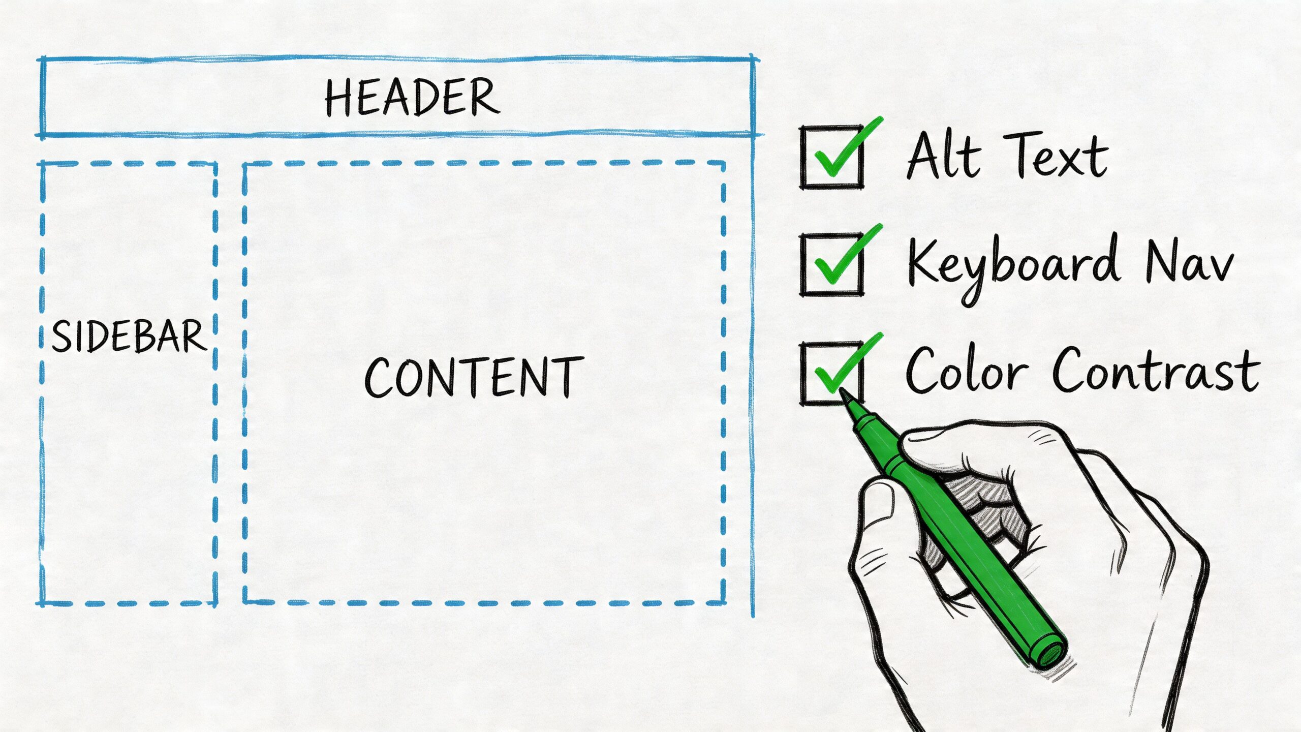
Get the page structure right first
Messy structure causes avoidable problems fast. It affects screen readers, keyboard users, search visibility, and day-to-day content editing.
Use one clear H1 per page. Keep headings in a logical order. Use real lists for list content. Use buttons for actions and links for navigation. Do not style random text to look like a heading and hope for the best.
Screen readers and other assistive tools depend on that structure to explain the page properly.
Check these first:
- Heading order: The page should read as a clear outline.
- Landmarks: Navigation, main content, footer, and search should be properly defined in the code.
- Button and link roles: Clickable elements should behave as users expect.
If your site runs on a CMS, make this part of the publishing process, not a one-off tidy-up. I often see accessibility slip because editors paste content in visually, then nobody spots the structural problems until complaints or poor enquiry rates show up. If your team needs a clearer publishing setup, this guide to website content management systems is useful background.
Make everything work with a keyboard
A visitor should be able to use the site without a mouse. That includes menus, filters, forms, popups, account areas, and checkout steps.
If keyboard users get stuck, the journey breaks. On a brochure site that means lost enquiries. On an eCommerce site it usually means abandoned revenue.
Check for these common faults:
- No visible focus state: Users tab through the page and cannot tell where they are.
- Keyboard traps: Focus enters a menu, modal, or filter panel and will not leave cleanly.
- Wrong tab order: Focus jumps around the page in an order that makes no sense.
- Hover-only interactions: Important options appear only when someone uses a mouse.
On real projects, the usual trouble spots are mega menus, sliders, tabs, popups, cookie banners, and product filters. They often look polished in a design review and still fail basic keyboard use.
Fix colour contrast and text readability
Low contrast is one of the quickest ways to make a site harder to use than it needs to be. It also tends to affect older users, mobile users, and anyone viewing the site in poor lighting, not just people with diagnosed impairments.
Check body text, headings on coloured backgrounds, button labels, form hints, placeholder text, price text, and footer links. Pale grey copy and low-contrast buttons are common problems because they pass internal brand review but fail in real use.
A simple test works well here. Can someone read it easily on a phone, outdoors, without zooming or straining?
Make these changes if needed:
- Darken body text instead of relying on light grey.
- Increase contrast on buttons so labels stay clear.
- Avoid using colour alone for errors, required fields, or status messages.
- Test text resizing to make sure layouts still hold together.
Write alt text that describes purpose, not decoration
Alt text should help someone understand the content or complete a task. It is not there to fill a field for the sake of it.
Good alt text describes what matters in context. Poor alt text either repeats what nearby text already says or adds clutter.
Examples help:
| Image type | Better approach |
|---|---|
| Team photo | Describe who or what matters to the page, if relevant |
| Product image | Name the product and a key visible detail if that supports the buying decision |
| Decorative divider | Use empty alt text so assistive tech ignores it |
| Call-to-action graphic | Describe the action or message, not every visual detail |
If an image adds nothing useful, keep it silent.
Build forms that do not block enquiries or sales
Forms are where accessibility issues become expensive. If someone cannot complete a quote request, booking, or checkout, the loss is immediate.
Every field needs a proper label. Instructions should appear before the user makes a mistake. Error messages should explain what went wrong and how to fix it. If a form clears what someone has already typed after one error, it creates friction that many users will not push through.
Focus on this short list:
- Use persistent labels: Placeholder text should not carry the whole job.
- Explain required formats clearly: Dates, phone numbers, postcodes, and passwords need guidance.
- Write useful errors: "Enter a valid email address" is clearer than "Invalid input."
- Make errors easy to find: Users should be able to move to the problem field and fix it quickly.
For UK SMEs, this is often the best place to start spending time and budget. A perfect archive page matters less than a usable enquiry form.
Support neurodiverse and cognitive needs
This is an area automated accessibility checkers and basic guides often overlook.
A page can pass a lot of technical checks and still be tiring to use. Dense wording, inconsistent layouts, moving elements, vague buttons, and cluttered screens all make tasks harder than they should be. That matters if you want people to understand your offer, trust the business, and finish what they started.
Use this as a working checklist:
- Plain English: Shorter sentences, familiar words, and clear calls to action
- Consistent layouts: Keep navigation, buttons, and content patterns predictable
- Clear hierarchy: Break content with headings, spacing, and lists
- Reduced clutter: Limit competing popups, panels, and motion
- Helpful labels: Visible labels and ARIA labels should support understanding, not just code
To see the difference in practice, it's worth watching an accessibility walkthrough before changing templates or content patterns.
Don't rely on plugins or overlays to solve everything
Plugins can assist with specific fixes. Overlays can add convenience features for some users. Neither one removes the need for proper templates, readable content, usable forms, and testing.
I would treat any "instant accessibility solution" claim carefully. In practice, a low-cost plugin can be useful for small improvements, but it will not remove the legal risk if the underlying barriers remain on your main customer journeys.
The sensible route is usually simpler than people expect. Fix the important pages first. Improve templates so new content starts from a better standard. Keep a short record of what has been fixed, what still needs work, and which issues affect customer access most. For a Dorset or UK SME, that is often the most affordable path to better compliance and a better-performing website.
Accessibility Tips for WordPress and eCommerce Platforms
WordPress can be a very good base for accessibility. It can also become chaotic quickly if the theme is bloated, the plugins are inconsistent, and editors are allowed to build pages with no structure.
The aim isn't to make WordPress "look accessible". The aim is to make publishing accessible content the default.
Make WordPress easier to manage properly
Start with your theme. Choose one that respects heading hierarchy, outputs sensible HTML, and doesn't pack core navigation into awkward custom widgets. Then review your plugins. Every plugin that adds forms, popups, sliders, events, tabs, or filters should be treated as a possible accessibility risk until tested.
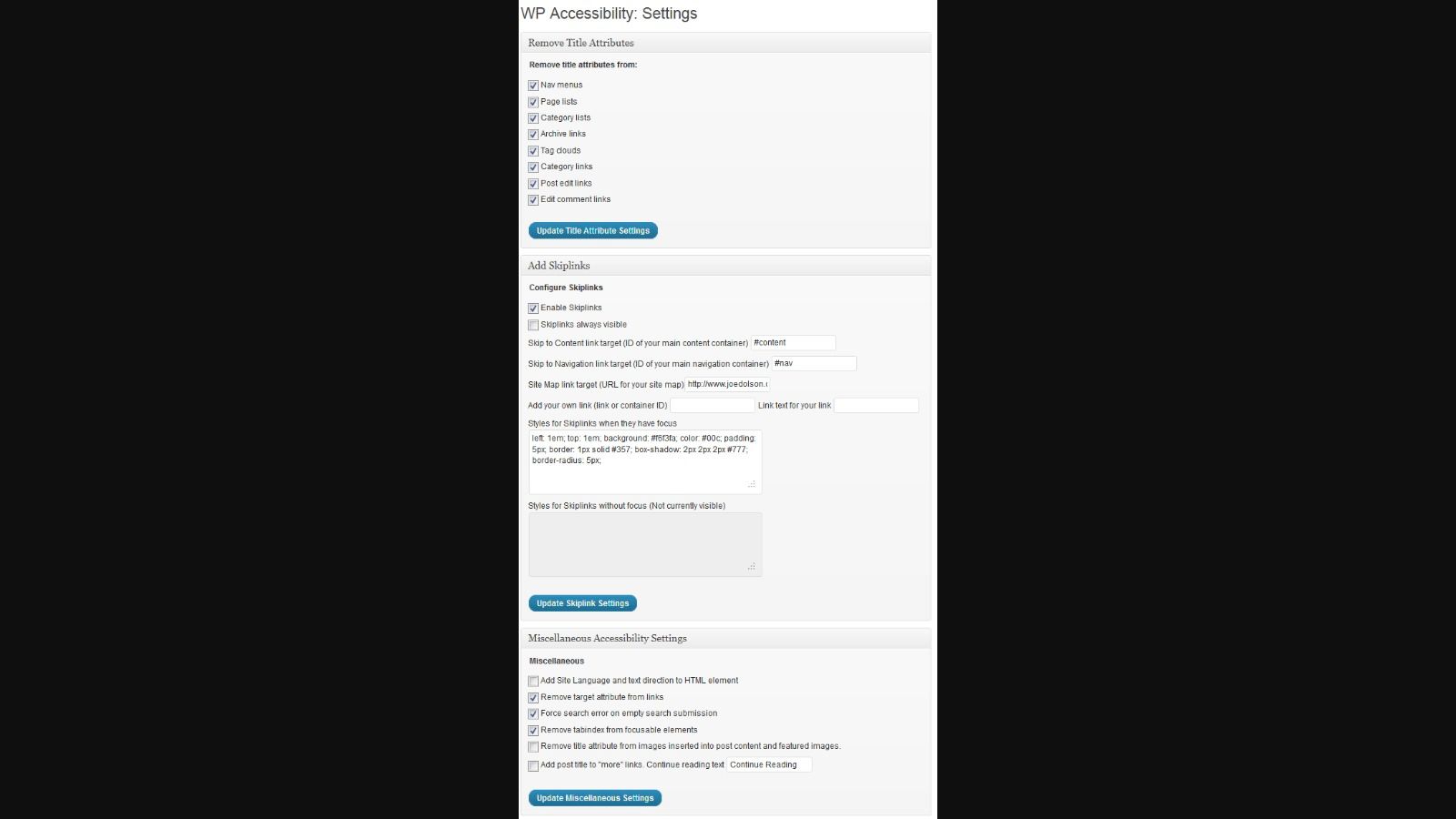
The screenshot below shows the kind of settings area that can support practical fixes.
A sensible WordPress workflow usually includes:
- An accessibility-ready theme or well-built custom theme
- A clear content editor guide
- Reusable blocks for buttons, alerts, FAQs, and calls to action
- Plugin reviews before installation, not after problems appear
If you're reviewing your stack, this roundup of top WordPress plugins is a useful starting point for thinking about what belongs in a maintainable build.
Use plugins carefully
A plugin such as WP Accessibility can help with practical improvements, but it shouldn't become a substitute for proper development. The value is in targeted support. Skip links, language attributes, contrast tools, or small admin prompts can all help. A plugin can't fix poor heading structure in your content or rebuild a broken checkout flow.
Treat plugins as assistants, not saviours.
A good rule is to ask two questions before installing anything:
| Question | Why it matters |
|---|---|
| Does it improve a real issue? | Avoid plugin clutter that adds complexity without fixing barriers |
| Can the site work accessibly without it? | Core accessibility should live in the theme, markup, and content model |
Focus harder on eCommerce journeys
For online shops, accessibility work should concentrate on the moments closest to conversion.
Product filters, variation selectors, add-to-basket buttons, mini carts, coupon fields, delivery options, and payment steps all need clear labels and keyboard access. If a customer can't choose a product size without a mouse, or an error in checkout isn't explained clearly, you have both an accessibility problem and a revenue problem.
These are the areas to audit first:
- Product pages: Variation selectors, image galleries, tabs, and reviews
- Category pages: Filters, sorting, pagination, and quick-view tools
- Basket and checkout: Error handling, focus order, and form labels
- Account areas: Password resets, saved addresses, and order history
"The prettiest checkout in the world still fails if a customer can't complete it."
For WordPress shops, WooCommerce often works well when implemented carefully. Problems usually come from theme overrides and third-party extensions, especially for bookings, subscriptions, and advanced filtering. That's why platform choice matters less than execution.
How to Test Your Website and Fix Accessibility Issues
Testing is where accessibility stops being theoretical. You don't need a perfect scorecard to get started, but you do need a repeatable process.
The most practical route is a blended audit. Use automated tools for speed, then use manual checks for the issues software can't judge properly.
Start with key user flows
Don't scan random pages first. Review the journeys that matter most:
- Homepage to enquiry
- Homepage to contact form
- Category page to product page
- Product page to basket
- Basket to checkout
- Account login or password reset
According to Who Is Accessible, a strong WCAG 2.1 Level AA process starts with an audit of key user flows using tools like WAVE, followed by manual keyboard and screen reader tests. The same source says over-relying on automation misses over 50% of issues, and that prioritising critical blockers such as keyboard traps can boost usability for screen reader users by 40%.
That reflects what experienced teams see in practice. Automated tools are good at flagging missing alt text, contrast failures, and some structural problems. They are not good at deciding whether the experience makes sense.

Run automated checks first
Use tools such as WAVE and Lighthouse to get a quick first pass.
These tools help you find obvious patterns:
- Missing alternative text
- Low contrast text
- Empty links or buttons
- Skipped headings
- Form input problems
Automated reports are useful because they make broad issues visible quickly. If the same button style fails contrast across the site, or the same form pattern lacks labels on every page, you can often fix many pages at once.
Then do manual testing like a user
Manual testing is where many serious issues appear.
Use only your keyboard. Start at the top of the page and tab through everything. Check whether focus is visible, whether menus open logically, whether modals can be closed, and whether every action can be completed without a mouse.
Then test with a screen reader. You don't need to become an expert user overnight. You just need enough exposure to hear whether the site announces content in a sensible way.
Try this review pattern:
| Manual test | What you're checking |
|---|---|
| Tab through page | Focus order, visibility, keyboard access |
| Open menus and popups | Whether interaction gets trapped or lost |
| Submit forms badly on purpose | Clarity of error handling |
| Resize text and zoom | Layout resilience and readability |
| Listen with a screen reader | Structure, labels, link clarity, page logic |
If your internal team doesn't have the development capacity to fix what testing reveals, it helps to involve experienced full-stack developers who understand front-end templates, CMS constraints, and back-end form or checkout logic together. Accessibility problems often sit across all three.
Prioritise by risk, not by report length
A long issue list can make teams freeze. Don't try to clear everything in one sweep.
Fix in this order:
- Critical blockers: Keyboard traps, broken forms, inaccessible checkout steps
- High-impact friction: Poor focus states, unclear errors, missing labels
- Structural weaknesses: Heading order, landmark issues, repeated template faults
- Content refinements: Alt text quality, link wording, content clarity
Priority test: If this issue stopped someone from buying, booking, enquiring, or understanding the page, move it to the top of the list.
That approach keeps the work commercial and user-centred. It also prevents teams from spending days debating minor warnings while serious barriers remain live.
Building an Accessible Future for Your Brand
Accessibility work lasts when it becomes part of day-to-day website management, not a one-off tidy-up before launch.
For UK SMEs, that matters for two reasons. First, your site changes constantly. New pages, product updates, staff uploads, plugin changes, and seasonal campaigns can all introduce fresh barriers. Second, under the Equality Act 2010, risk does not disappear because the original build was fine six months ago. If a customer cannot use a booking form, complete a purchase, or read key information, the problem sits with the business.
The practical answer is to set a few rules that your team and suppliers follow every time the site changes. Content editors should use proper headings, plain English, and meaningful link text. Designers should check colour contrast, text resizing, and focus states before sign-off. Developers should test forms, menus, and checkout journeys with a keyboard before anything goes live. If you use external freelancers or agencies, put those requirements into the brief so accessibility is not treated as an optional extra.
An accessibility statement also helps. It shows that you have considered the issue seriously, explains what standard you are working towards, and gives customers a clear route to report problems. For smaller businesses, that is a sensible, low-cost step. It will not fix a broken site on its own, but it does show intent, creates internal accountability, and can help you respond faster if someone raises a concern.
Good accessibility usually improves the commercial basics as well. Clearer navigation helps people find services faster. Better form handling cuts abandoned enquiries. Cleaner page structure makes content easier to scan on mobile. Those are not separate wins from accessibility. They are often the same work.
I also advise clients to judge accessibility over time, not just at handover. A site should still work when text is enlarged, when a customer relies on a keyboard, or when someone is tired, distracted, or using an older screen. That standard is realistic, and for many Dorset and UK businesses it is a far more useful benchmark than chasing every minor warning in a report while bigger barriers remain live.
If you are planning a redesign or replacing an ageing CMS, include accessibility in the brief from the start. Retrofitting always costs more, and it usually leaves avoidable gaps in templates, forms, and content workflows. A properly scoped website design project gives you a better chance of staying compliant without turning it into a major expense later.
Done properly, accessibility reduces legal exposure, improves conversion paths, and makes your brand look better run. That is a strong position for any business.

Leave a Reply