10 Powerful Brand Identity Examples to Inspire Your Business in 2026
A strong brand identity is more than just a memorable logo; it's the complete experience that connects you with your audience. It is the visual language, the tone of voice, and the core message that sets a business apart. For small and medium-sized enterprises (SMEs) in Dorset and across the UK, building a cohesive brand is key to standing out in a crowded marketplace, whether online or on the high street. But where do you begin?
The most effective way to learn is by studying the masters. This article dives deep into powerful brand identity examples, breaking down precisely what makes them so effective. We will move beyond surface-level descriptions to analyse the strategic thinking behind their logos, colour palettes, typography, and messaging. Beyond visual and verbal elements, a truly unforgettable brand also cultivates customer loyalty through well-designed experiences, such as the widely successful Starbucks Rewards Program.
Most importantly, this guide provides a clear, actionable list of takeaways with each example. You will learn:
- How to build a consistent visual system.
- The role of messaging in shaping perception.
- Practical ways to apply big-brand strategies on a modest budget.
Get ready to transform your understanding of branding and learn how to build an identity that not only looks professional but also drives genuine results.
1. Apple's Minimalist Visual Identity & 'Think Different' Positioning
Apple represents the peak of brand identity built on intentional simplicity. Its approach combines a clean, minimalist visual system with an aspirational verbal identity centred on innovation and elegance. This fusion has cultivated a powerful premium perception, making Apple one of the most recognisable and valuable brands in the world. For any business, especially SMEs, Apple provides a clear blueprint for how reducing visual clutter and maintaining a consistent message builds immediate recognition and trust.
![]()
The power of this brand identity example lies in its coherence. From the iconic bitten apple logo, designed to be identifiable even in monochrome, to the generous use of whitespace in its retail stores and packaging, every element communicates a core message: simplicity is the ultimate form of sophistication. This is not just a design choice; it is a business strategy that informs product design, marketing, and the customer experience.
Key Takeaway for SMEs
You do not need a complex design to be memorable. A strong, simple concept, applied consistently, is far more effective.
How to Apply This to Your Business
Here are four actionable steps to apply Apple's strategy of minimalism:
- Develop a Singular Symbol: Create a versatile logo that works effectively in a single colour. Test it at various sizes, from a tiny website favicon to a large sign.
- Choose a Core Typeface: Select one primary, highly legible sans-serif font (like Helvetica or a modern equivalent) and use it consistently across all your materials.
- Create Strict Brand Guidelines: Document your logo usage, colour codes (even if just black and white), and typography rules to ensure everyone maintains consistency.
- Prioritise Simplicity in Production: For local businesses, focusing on one or two core brand colours can significantly reduce printing and production costs while strengthening brand recall.
2. Nike's Swoosh + 'Just Do It' Verbal Identity Integration
Nike masterfully shows how a simple visual mark gains enormous power when fused with a compelling verbal identity. The brand pairs its iconic Swoosh, a symbol of motion and speed, with the motivational mantra 'Just Do It'. This combination, introduced in 1988, shifted Nike from being a sports equipment supplier to an aspirational lifestyle brand. This brand identity example proves that what you say is just as important as what you show, amplifying visual recognition with an emotional message.
The strength of this identity is its seamless integration. The Swoosh appears on athlete apparel, instantly signalling performance and quality, while the 'Just Do It' slogan fuels marketing campaigns with a tone of empowerment. From the Nike+ app ecosystem to its social media presence, the visual and verbal elements work together, creating a unified message of ambition and action that resonates far beyond the world of professional sports.
Key Takeaway for SMEs
Your brand's voice can turn a simple logo into a powerful statement. A strong verbal identity gives your visual mark meaning and emotion.
How to Apply This to Your Business
Here are four actionable steps to integrate your visual and verbal identities:
- Define Your Brand Promise: Develop a short, memorable three-to-five-word slogan that encapsulates the core benefit or feeling you provide to customers.
- Design a Standalone Mark: Ensure your logo is recognisable and works effectively on its own, without any accompanying text.
- Create Messaging Guidelines: Document how your verbal identity and tone of voice should be applied across different channels, from social media posts to customer service emails.
- Integrate Verbal Identity: For eCommerce businesses, weave your slogan and brand voice into product descriptions, checkout messages, and confirmation emails to reinforce your brand promise.
3. Coca-Cola's Script Typography & Colour Consistency Across Touchpoints
Coca-Cola's brand identity is a masterclass in endurance, built upon two unwavering pillars: its distinctive Spencerian script and the proprietary “Coke Red.” For over 130 years, this combination has been meticulously maintained across more than 200 countries, creating one of the most instantly recognisable brands on the planet. The strategy demonstrates how rigorous consistency in typography and colour can build immense equity and immediate recognition, a powerful brand identity example for any business.
The strength of this identity is its absolute discipline. The iconic red, officially Pantone 185C, and the custom script typography are identical on a glass bottle in London, a point-of-sale display in Tokyo, and a digital advert in Dorset. This is not accidental; it is the result of detailed brand guidelines that ensure every application, from print to digital, reinforces the same visual message. This strict control allows sub-brands like Diet Coke to borrow equity while establishing their own identity.
Key Takeaway for SMEs
Rigorous consistency in a few core visual elements is more powerful than a complex identity that is loosely applied.
How to Apply This to Your Business
Here are four actionable steps to achieve rigorous brand consistency:
- Define Your Colours Precisely: Go beyond just picking a colour. Define your brand colours using specific codes for every medium: Pantone for print, HEX/RGB for digital, and CMYK for process printing.
- Invest in Unique Typography: While a custom typeface is a significant investment, even selecting a distinctive, commercially licensed font and using it consistently can set you apart.
- Create Detailed Brand Guidelines: Document your visual identity in a clear brand guidelines PDF. This ensures any staff or external partners apply your brand correctly.
- Enforce Consistency Everywhere: Specify your Pantone colour on all print briefs to prevent colour drift. For your website, use CSS to set exact brand colours for key elements like buttons and links.
4. Airbnb's Bélo Mark & Community-Centric Verbal Identity Refresh (2014)
Airbnb's 2014 rebrand is a prime case study in how a brand can mature its identity to reflect a deeper business mission. The shift from a transactional rental platform to a community-focused lifestyle brand was captured by replacing its original script logo with the 'Bélo'. This symbol, paired with the verbal identity of 'Belong Anywhere', moved the company's positioning from simple accommodation to human connection.
This evolution is a powerful brand identity example because it synchronised visual and verbal cues perfectly. The Bélo was designed to represent people, places, and love, all coming together. This abstract, emotional concept was grounded by the clear 'Belong Anywhere' tagline, which guides everything from the host onboarding process ('Belong to a community') to social media campaigns. This strategic alignment is central to crafting meaningful digital experiences and understanding web design, where every element should reinforce the core message.
Key Takeaway for SMEs
A rebrand is most effective when it signals a genuine shift in your business strategy or values, not just a cosmetic update.
How to Apply This to Your Business
Here are four actionable steps to guide a meaningful brand evolution:
- Connect Visuals to a Story: Don’t just design a logo; create a symbol that has a story behind it. The Bélo represents 'belonging'. What single word or idea does your brand represent?
- Align Verbal and Visual Identity: Ensure your tagline and marketing messages reinforce what your new logo symbolises. If your logo is about speed, your tagline should be too.
- Plan a Phased Rollout: You don't need to change everything overnight. Start with digital assets like your website and social media profiles, then move on to printed materials.
- Document Your 'Why': Create a simple one-page document explaining the reason for the brand evolution. Share this with your team and even your customers to bring them along on the journey.
5. Slack's Colourful, Friendly Visual Identity & Conversational Verbal Tone
Slack proved that B2B software doesn't need to feel formal or corporate. Its brand identity masterfully blends a playful, multi-coloured visual system with a friendly, conversational verbal tone. This approach has humanised a technical product, making it feel approachable and easy to use, and is a fantastic brand identity example for any service-based business wanting to build genuine user affinity.
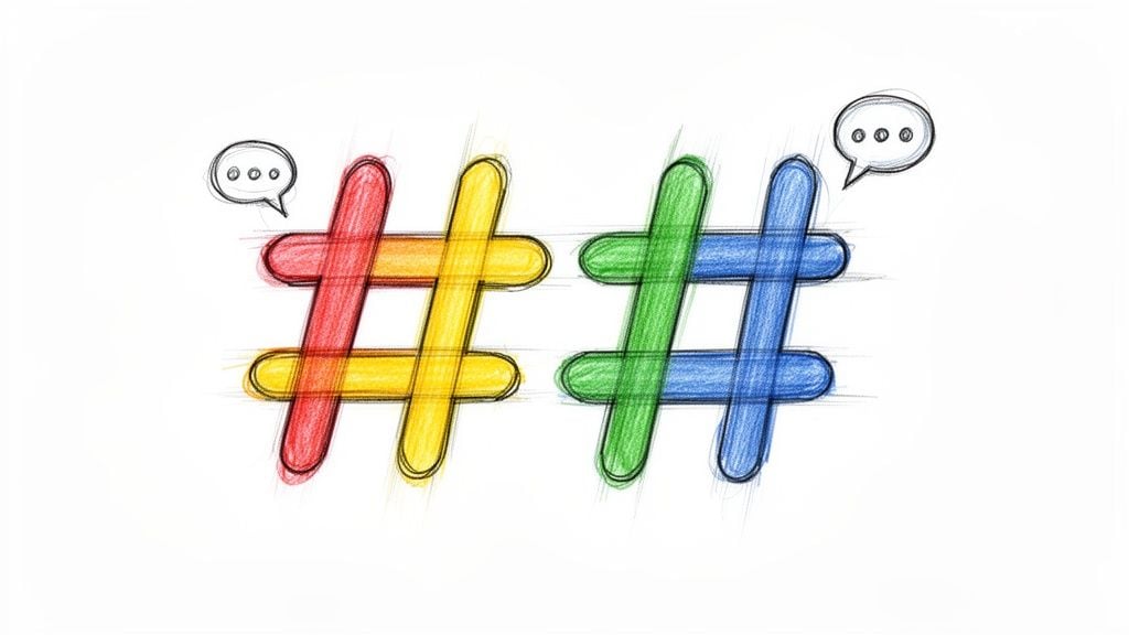
The strength of Slack's identity is its consistency in making work feel less like work. The colourful hashtag logo suggests collaboration and connection, a feeling reinforced by the conversational copy found everywhere, from marketing emails to in-app notifications. Instead of cold, technical jargon, users get helpful, human language. This isn't just a marketing gimmick; it's a core philosophy that reduces the perceived complexity of the software and fosters a strong sense of community.
Key Takeaway for SMEs
A friendly, human tone of voice can be your biggest differentiator, especially in a traditional or technical industry.
How to Apply This to Your Business
Here are four actionable steps for creating a human-centric brand voice:
- Create a Brand Voice Guide: Document your brand's personality. Is it witty, supportive, or straight-talking? Define its vocabulary and provide examples for social media, support messages, and emails.
- Use Colour with Purpose: Choose a colour palette that evokes the emotions you want customers to feel, combining trustworthy colours with vibrant, energetic accents.
- Write Conversational Microcopy: Review the text on your website's buttons, forms, and error messages. Instead of "Submit," try "Let's Go!" Instead of "Error 404," try "Oops, that page has gone for a walk."
- Be Human in Communications: Use a natural, personalised tone in your emails. Incorporate emojis where appropriate for your audience to add personality and warmth, making your brand more relatable.
6. Brandmark's Brand Consistency System: Visual + Verbal Guidelines Across Global Teams
A brand only truly exists if it is consistent. Systems like those popularised by Brandmark, Google, and Microsoft show how to maintain visual and verbal consistency across multiple teams and regions. This approach isn't about a single logo; it’s about creating the infrastructure for your identity: detailed asset libraries, colour specifications, typography rules, and messaging frameworks. For a growing business, this is one of the most vital brand identity examples to follow, as it provides a structured system to prevent brand dilution as the organisation scales.
The strength of a brand system is its ability to create a unified experience, no matter where a customer interacts with the brand. Google’s extensive brand guidelines and Microsoft’s Brand Central are prime examples of this principle in action. They document everything, ensuring that whether an asset is created in London or Tokyo, it feels part of the same cohesive whole. This systematic approach turns brand identity from a creative asset into a scalable operational tool.
Key Takeaway for SMEs
Brand consistency requires a documented system. A central source of truth for your logo, colours, and voice is essential for scaling without losing your identity.
How to Apply This to Your Business
Here are four actionable steps to build a scalable brand system:
- Create a Minimum Viable Brand Guide: Start with a 10-page document covering logo usage (clear space, minimum size), a primary and secondary colour palette (with hex codes), and your core typeface.
- Document Your Voice: Define your brand’s personality with 3-5 keywords (e.g., "friendly, professional, direct") and write a one-sentence brand promise.
- Centralise All Assets: Use a shared Google Drive or Dropbox folder as your brand hub. Store your final logo files (PNG, SVG), the brand guide, and approved imagery.
- Integrate with Your Tools: When managing your website, document the specific hex codes for buttons and links within your content management system's settings. For guidance on different systems, you can learn more about choosing a website content management platform.
7. Target's Bullseye Symbol & 'Expect More, Pay Less' Positioning
Target perfectly illustrates how a powerful symbol and a clear verbal promise can create a distinctive market position. Its brand identity centres on the geometric bullseye logo and the straightforward tagline, 'Expect More, Pay Less.' This combination allows Target to occupy the unique retail space of 'cheap chic,' balancing an accessible price point with a modern, quality-focused aesthetic. For retailers, this is a prime example of using brand identity to manage customer expectations, signalling both value and a superior shopping experience.
The strength of this brand identity example is how it unifies the customer journey. The bullseye is more than just a logo; it’s a beacon on storefronts, a mark of quality on private-label packaging like Good & Gather, and an icon for its Circle loyalty programme. This visual repetition, paired with the consistent 'Expect More, Pay Less' message in marketing, reinforces the brand promise at every touchpoint. It tells shoppers exactly what to expect: a curated, design-forward experience without a premium price tag.
Key Takeaway for SMEs
A strong brand connects a memorable visual with a clear, direct verbal promise.
How to Apply This to Your Business
Here are four actionable steps to connect your symbol and your promise:
- Design a Meaningful Symbol: Create a simple, bold symbol that visually suggests your brand's core benefit. Target’s bullseye implies precision and hitting the mark on value and quality.
- Craft a Clear Positioning Statement: Pair your visual identity with a short, understandable tagline that defines your value proposition, like 'Expect More, Pay Less.'
- Ensure Visual and Price Cohesion: Match your visual style to your price point. If you offer value, use bold, friendly visuals. If you are a premium service, lean towards more restrained aesthetics.
- Apply Your Symbol Everywhere: Use your brand symbol consistently across your website header, product packaging, in-store signage, and loyalty programmes to build instant recognition.
8. Mastercard's Overlapping Circles & Priceless Campaign (Verbal-Visual Integration)
Mastercard proves that even simple geometric shapes can form a world-class brand identity when infused with powerful emotional meaning. Its identity is built on the fusion of two simple overlapping circles (red and yellow-orange) and a resonant verbal campaign, 'Priceless'. This combination transforms an abstract visual mark into a symbol of life's most meaningful moments, showing that a visual identity's power often comes from the story you attach to it.
The genius of this brand identity example is how the verbal element gives purpose to the visual. The overlapping circles are not just a logo; they represent the intersection of commerce and emotion, the 'priceless moments' that financial transactions facilitate. Launched in 1997, the 'Priceless' campaign gave the brand a human-centric narrative that elevated it far beyond a payment processing service. This consistency between the visual and verbal identity creates a cohesive and deeply memorable brand experience.
Key Takeaway for SMEs
A simple logo can become incredibly powerful when you consistently pair it with a strong, emotionally resonant message. Your verbal identity gives your visual identity its meaning.
How to Apply This to Your Business
Here are four actionable steps to connect visuals with an emotional story:
- Define Your Core Message: Before finalising a logo, determine the core emotional value you provide. Is it security, joy, convenience, or something else? This will become your verbal anchor.
- Connect Visuals to Words: Create a tagline or messaging framework that explains the significance of your visual mark. For example, if your logo is a shield, your message could be about protection.
- Be Consistent Across Channels: Ensure your verbal tagline appears alongside your logo on your website, social media profiles, email signatures, and print materials. Repetition builds the connection.
- Focus on Storytelling: Use your marketing to tell stories that exemplify your core message. A local bakery could share 'priceless moments' of families enjoying its cakes.
9. Patagonia's Environmental Mission as Verbal Identity + Authentic Visual Storytelling
Patagonia is a prime example of a brand where corporate mission is not just a statement but the core of its entire identity. Its brand is built on environmental activism and radical transparency, supported by authentic visual storytelling. This approach moves beyond decorative branding, embedding the company’s values into its products, communications, and corporate actions, creating a powerful connection with its audience.
The strength of this brand identity example is its integrity. Patagonia’s famous tagline, "We're in business to save our home planet," is not just marketing copy; it dictates business decisions. This is visible in their use of real activists and adventurers in advertising, transparent supply chain information on product pages, and dedicating profits to environmental causes. Every element reinforces their mission, turning customers into advocates.
Key Takeaway for SMEs
Your brand’s core purpose can be your most powerful marketing tool. An identity built on genuine values and actions fosters deep customer loyalty.
How to Apply This to Your Business
Here are four actionable steps to build a mission-driven brand:
- Define Your Core Mission: Identify the problem your business solves beyond profit. What is your fundamental purpose? State this mission clearly on your website’s homepage and in your marketing materials.
- Use Authentic Imagery: Stop using stock photos. Showcase real customers, your actual team, and the genuine impact of your work. For service firms, feature real client stories.
- Practise Radical Transparency: Be open about your processes. Product-based businesses can detail their supply chain. Service-based companies can share case studies that reveal successes and challenges.
- Back Words with Action: Your mission must be supported by tangible proof. Document and share the work you are doing to live out your values, whether through community support or sustainable practices.
10. Duolingo's Mascot-Driven Brand Personality (Duo the Owl) + Playful Verbal Identity
Duolingo shows how a character-based brand identity can humanise a digital experience and build powerful user loyalty. Its mascot, Duo the owl, is the friendly, encouraging, and occasionally persistent face of the brand. This character-driven approach, paired with a playful verbal identity, makes the often-difficult process of learning a new language feel more like a game than a chore.
![]()
The strength of this brand identity example is Duo's integration into every touchpoint. From app notifications and social media memes to website onboarding and merchandise, Duo creates a consistent and recognisable presence. The mascot’s animations and emotional expressions make interactions feel personal. Duo’s animated reminders are particularly effective for user retention; if you want to understand this better, check out these insights on How to Animate Your Logo and Instantly Upgrade Your Brand. For any service-based SME, especially in the SaaS or app space, Duolingo proves that a well-developed mascot can become your most valuable brand asset.
Key Takeaway for SMEs
A mascot can give your brand a memorable personality that customers connect with on an emotional level, driving engagement and loyalty.
How to Apply This to Your Business
Here are four actionable steps for creating a brand mascot:
- Design a Versatile Mascot: Create a character that can express a range of simple emotions. Ensure the design is simple enough to work as a small icon, an animated GIF, or a printed sticker.
- Define Its Personality: Document your mascot's voice and tone. Is it witty, supportive, or professional? Create a short guide with sample phrases and interaction rules.
- Integrate Across Channels: Use your mascot consistently. Feature it on your website's homepage, in email newsletters, on social media profiles, and in your app's user interface.
- Avoid Overuse in Formal Contexts: Keep your mascot out of serious communications like invoices or legal notices to maintain professionalism where it matters most.
Comparison of 10 Iconic Brand Identities
| Brand | 🔄 Implementation Complexity | 💡 Resource Requirements | 📊⭐ Expected Outcomes | Ideal Use Cases | ⭐ Key Advantages |
|---|---|---|---|---|---|
| Apple's Minimalist Visual Identity & "Think Different" | High — strict governance, cross‑touchpoint discipline | Medium–High — design system, brand team, production controls | ⭐⭐⭐⭐ — premium perception, strong recognition over time | Professional services, luxury retail, startups seeking premium positioning | Extreme memorability; scalable across products and services |
| Nike's Swoosh + "Just Do It" | Medium — logo + verbal alignment, advertising reinforcement | Medium — creative/advertising spend and messaging assets | ⭐⭐⭐⭐ — motivational positioning, rapid recall with ads | eCommerce apparel, sports/lifestyle brands, performance marketing | Motivational verbal identity amplifies a simple mark |
| Coca‑Cola's Script & Colour Consistency | High — proprietary type, global colour control, legal protection | High — custom typeface, pantone management, global production costs | ⭐⭐⭐⭐⭐ — unparalleled shelf recognition and heritage equity | Multi‑channel retail, packaged goods, brands needing shelf presence | Typographic uniqueness and strict colour consistency |
| Airbnb's Bélo & "Belong Anywhere" | High — phased rebrand, global rollout, stakeholder alignment | High — rebrand budget, custom type, extensive rollout | ⭐⭐⭐⭐ — repositioning supports scaling and community growth | Marketplaces, startups scaling from product to platform | Visual evolution that extends into new services and community positioning |
| Slack's Colourful Visuals & Conversational Tone | Medium — voice guidelines + multi‑colour system | Medium — brand voice docs, UI assets, content creation | ⭐⭐⭐ — increased approachability and user affinity quickly | SaaS, B2B tools, modern professional services | Humanises B2B software; stands out vs. corporate palettes |
| Brandmark's Brand Consistency System | High — system design, governance, localisation rules | High — tooling, maintenance, training, subscription tools | ⭐⭐⭐⭐ — prevents dilution; speeds consistent deployment once built | Multi‑location organisations, enterprises, fast‑growing SMEs | Centralised assets and messaging framework for scale |
| Target's Bullseye & "Expect More, Pay Less" | Medium — symbol + positioning coordination across retail ops | Medium — signage, packaging, retail production | ⭐⭐⭐ — clear value positioning and in‑store visibility | Multi‑category retailers, brick‑and‑mortar + eCommerce blends | Iconic retail symbol paired with clear pricing promise |
| Mastercard's Overlapping Circles & "Priceless" | Medium — visual simplicity + sustained campaign effort | Medium–High — long‑running advertising investment | ⭐⭐⭐⭐ — simple mark gains emotional meaning via campaign | Fintech, payment brands, services needing emotional storytelling | Minimal symbol becomes meaningful when paired with campaign messaging |
| Patagonia's Mission‑Led Identity & Authentic Storytelling | High — mission integration requires operational change | Medium–High — transparency systems, authentic content production | ⭐⭐⭐⭐ — deep loyalty and trust; slower ROI but durable | Purpose‑driven SMEs, nonprofits, sustainable retailers | Authenticity and mission credibility that informs decisions |
| Duolingo's Mascot‑Driven Personality (Duo) | Medium — mascot rules, animation assets, tone guidelines | Medium — character design, content, localisation | ⭐⭐⭐ — fast engagement and retention; can polarise adults | App‑first products, gamified SaaS, edtech | High engagement through a consistent character and playful tone |
Your Actionable Blueprint for a Standout Brand Identity
Across the diverse brand identity examples we've explored, from Apple's calculated minimalism to Patagonia's rugged authenticity, a clear pattern emerges. A truly memorable brand is not the result of a huge marketing budget or a single clever logo. It is the product of intentional strategy and disciplined consistency, executed over time. The most successful brands, whether global giants like Coca-Cola or community-focused players like Airbnb, build their identity on a bedrock of self-awareness. They know who they are, who they serve, and what they stand for.
This clarity becomes the filter for every decision they make. It informs the choice of a colour palette, the curve of a typeface, and the tone of a social media post. For your business, this is the most important lesson: a strong identity begins with a strong foundation, not with a design brief. Before you consider visuals, you must first define your purpose, pin down your values, and decide on the personality you want to project. This internal work is what separates brands that simply exist from brands that connect and endure.
From Inspiration to Implementation
Watching what others have done is inspiring, but taking action is what builds your brand. To help you move from analysis to application, here is a practical checklist. This is your starting point for creating a cohesive and recognisable brand identity that genuinely reflects your business.
Define Your Brand Core: Before any design work begins, dedicate time to documenting your strategic foundation. Write down your company's mission (what you do and why), your core values (the principles that guide your actions), and three to five keywords that capture your desired brand personality (e.g., "friendly, reliable, professional").
Establish Your Visual System: A consistent look is crucial for recognition. Select a primary colour and two secondary colours, and record their specific HEX codes. Choose a primary typeface for headings that expresses your brand's character and a highly readable secondary typeface for body copy.
Develop Your Verbal Identity: How your brand sounds is as important as how it looks. Create a memorable tagline or brand promise that summarises your value to customers. Then, draft a simple one-page 'voice guide' with examples of how your brand communicates in emails, on your website, and across social media.
Create a Basic Brand Guide: Consolidate these elements into a single, accessible document, such as a PDF. Include your final logo, your defined colour palette with codes, your chosen typography, and your voice guide. This document becomes the single source of truth for you and your team.
Audit and Apply Consistently: With your guide complete, review all your existing assets. Methodically update your website, social media profiles, email signatures, and any printed materials to align with your new, unified identity. This final step is critical, as it's the consistent application that builds trust and makes your brand memorable over the long term.
Feeling ready to translate these ideas into a powerful identity for your own business? At DesignStack, we specialise in helping Dorset businesses build brands that connect with customers and drive growth. From crafting a foundational brand strategy to developing a stunning WordPress website that performs, we are your local partner for creating a brand that truly stands out.


Leave a Reply