
How to Improve Website Conversion Rate with Proven CRO Tactics
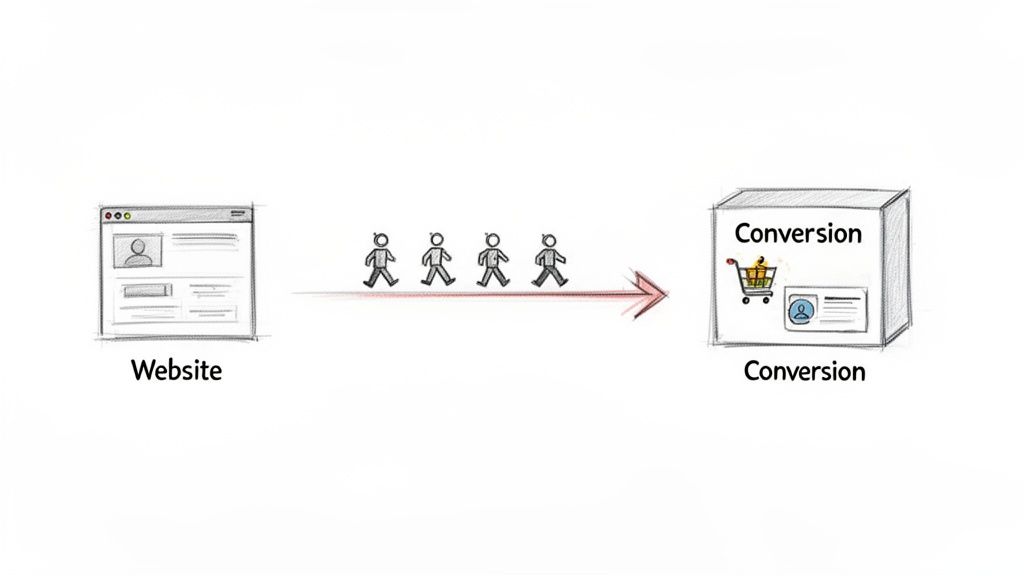
Getting more from your website really boils down to one thing: understanding why visitors aren't converting, then fixing it. It's all about smoothing out the path from their first click to the final action you want them to take, turning casual browsers into happy customers.
Your Starting Point for Higher Website Conversions
Let's cut through the jargon. A "conversion" is just a fancy word for when a visitor does something you want them to do. This isn't always about making a sale. It could be as simple as them filling out your contact form, signing up for your newsletter, or downloading a free guide.
When we talk about improving your conversion rate, we're simply trying to get a higher percentage of your visitors to take that all-important action. This entire process is what's known as Conversion Rate Optimisation (CRO). Forget the acronym for a moment; just think of it as making your website work smarter, not harder.
What Is Conversion Rate Optimisation (CRO)?
At its heart, CRO is a structured approach to increasing the percentage of visitors who complete a key goal on your website. It's a world away from just throwing ideas at the wall to see what sticks. Instead, it’s about making deliberate, data-backed improvements.
This guide is designed to give you a practical framework you can actually use, starting with diagnosing the real problems and then moving on to changes that make a measurable difference.
The real aim of CRO isn't just to chase a higher number. It's about creating a genuinely better experience for your users, which naturally encourages them to convert. It's a win for them and a win for your business.
We’ll keep things grounded in real-world examples relevant to UK businesses. You’ll be surprised how small, thoughtful changes—like tweaking the words on a button or removing one field from a form—can have a huge impact on your revenue. If you want to dive even deeper, check out this proven CRO playbook.
Why CRO Matters for Your Business
Spending time and effort on improving your website's conversion rate is one of the most powerful ways to grow your revenue without constantly needing to find more budget for advertising. A well-optimised site gets more value from the traffic you already have.
Here are the main benefits you'll see:
- More Revenue: By turning more existing visitors into customers, you make more money from your current marketing budget. Even a 1% lift in your conversion rate can have a dramatic effect on your bottom line.
- Deeper Customer Insight: The process forces you to truly get inside your customers' heads. You'll learn what motivates them, what frustrates them, and what they really need from you.
- A Better User Experience (UX): A website that converts well is almost always one that’s a pleasure to use. This not only builds trust but also makes people want to come back.
Finding Out Why Your Visitors Aren't Converting
Before you start changing buttons and rewriting headlines, you need to put on your detective hat. Trying to improve your website's conversion rate without understanding why people are leaving in the first place is just guesswork. You might get lucky, but you'll probably just waste time and effort.
This diagnostic phase is the bedrock of any successful CRO project. It’s where you stop making assumptions and start gathering real evidence to uncover the friction points that are quietly killing your sales and leads. We’ll start by digging into the numbers, then get into the human behaviour behind them.
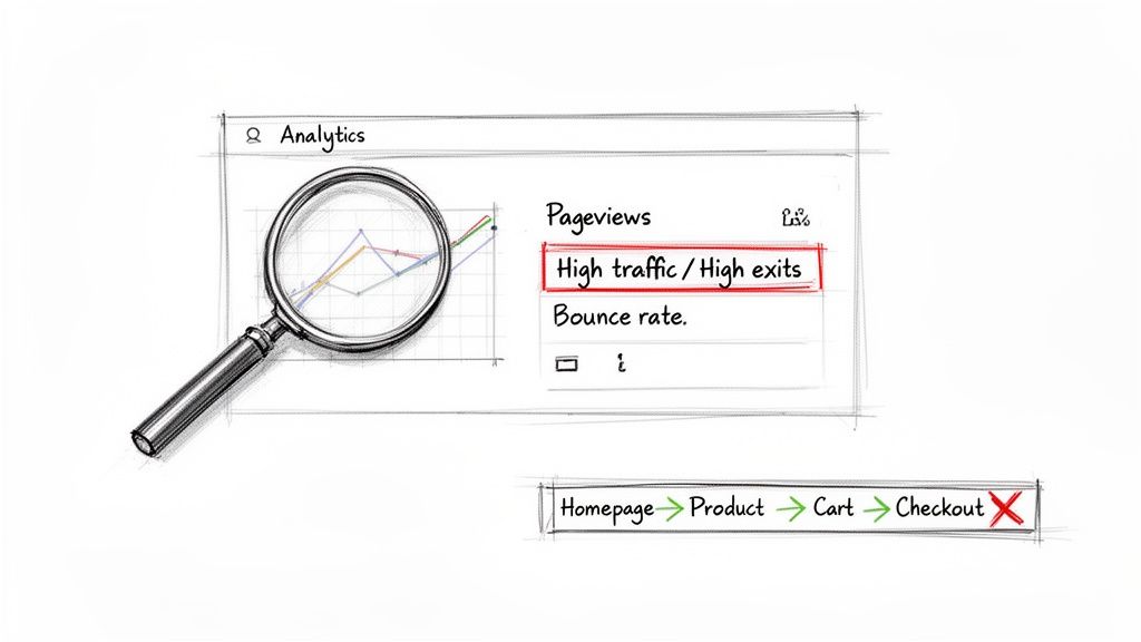
Start with the Data in Google Analytics
Google Analytics should always be your first port of call. It's an absolute goldmine for understanding what people are doing on your site, but you need to know where to look. It's easy to get lost in a sea of reports, so the trick is to focus your investigation on a few key areas to spot trouble.
The aim here is to find your high-traffic pages that are underperforming. These are your biggest opportunities, because even small tweaks can have a massive impact. If you're new to the platform, our guide for Google Analytics 4 mastery can get you up to speed.
Here are the reports I always check first:
-
Pages and Screens Report: Hunt for pages with plenty of visitors but an unusually high exit rate. Think of these as the digital equivalent of a customer walking into a specific aisle, looking around for a second, and immediately walking out of the shop. Something on that page is putting them off.
-
Landing Pages Report: This shows you the main front doors to your website. If you see a high bounce rate on a key landing page, it’s a huge red flag that your first impression isn't strong enough to convince people to stick around.
-
Funnel Exploration: This is brilliant. You can map out your ideal customer journey (e.g., Homepage > Product Page > Cart > Checkout) and see exactly where people are giving up. A massive drop-off between the cart and checkout pages, for example, screams "problem with the payment process!"
Look Beyond the Numbers with Qualitative Tools
While Google Analytics tells you what is happening, it can't tell you why. That’s where qualitative tools come in. They let you see your website through your users' eyes, adding the crucial human context that numbers alone can't provide.
I like to think of it this way: analytics shows you a puddle on the floor, but session recordings show you exactly where the leak is coming from.
Data tells you where the problems are, but watching users interact with your site tells you what the problems are. You need both for the full picture.
Tools like Hotjar or Microsoft Clarity are incredibly insightful for this. They let you see where users click, how far down a page they scroll, and what they completely ignore. I guarantee that watching just a handful of user session recordings will reveal frustrating bugs or confusing design choices you never would have spotted on your own.
Actionable Diagnostic Checklist
To really get to the bottom of why your visitors aren't converting, it helps to be systematic. This is why I recommend conducting a conversion rate optimization audit to gather both sets of data and build a proper action plan.
Ready to start your own investigation? Use this checklist:
- Identify Your Top 5 Exit Pages: Dive into Google Analytics and find the five non-essential pages where you lose the most visitors. What do they have in common? Is the content weak? Is the call-to-action missing?
- Analyse Your Conversion Funnel: Map out your main conversion path and calculate the drop-off rate at each stage. Is there one specific step where a huge number of people just vanish?
- Watch 10 User Recordings: Seriously, do this. Use a tool like Hotjar to watch 10 recordings of users who left your site without converting. Look for 'rage clicks' (frantic clicking), erratic mouse movements, or people clicking on things that aren't actually links.
- Review Heatmaps: Check the heatmaps for your key landing pages. Are people clicking where you want them to, or are they getting distracted by something else? Is your main call-to-action button being ignored?
It also helps to know what you're aiming for. In the UK eCommerce world, a good conversion rate is generally between 2.5% and 3.5%. The real top-performers, the sites that have this stuff nailed down, can push beyond 5%. This just shows the massive potential for UK businesses to grow by getting these optimisations right.
By the end of this diagnostic work, you should have moved from vague feelings to a concrete list of problems to tackle. You'll know which pages are bleeding visitors, where your forms are failing, and which parts of your user journey are causing all the headaches.
High-Impact Changes You Can Make Today
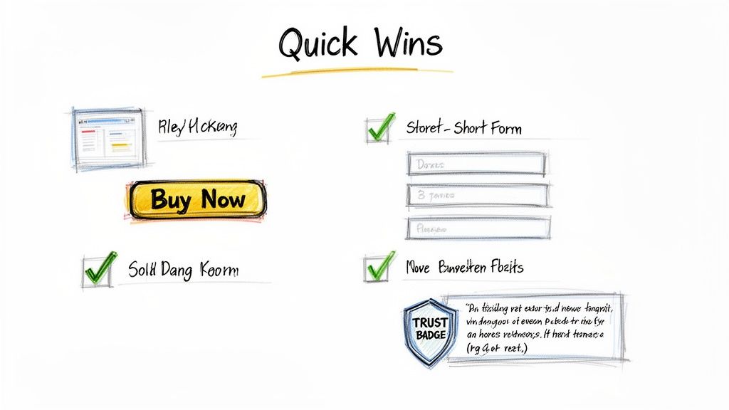
After digging through the data, you should have a decent list of potential conversion problems. But before you get tangled up in complex A/B testing, it’s time to bank some quick wins. These are the high-impact, low-effort changes that can often give you an immediate lift.
Think of it as picking the low-hanging fruit. These fixes target the most common conversion killers—slow pages, confusing buttons, and a general lack of trust—and you can often get them done in a single afternoon.
Boost Your Website Speed
Nothing kills a conversion faster than a slow-loading website. Seriously. A one-second delay in mobile page load times can slash your conversion rate by up to 20%. People are impatient, and your site needs to keep up. Tackling site speed is one of the most reliable ways to improve the user experience right away.
Here’s a quick and actionable list to get started:
- Compress Your Images: Use a free tool like TinyPNG to shrink image file sizes without losing quality. This is often the single biggest factor in slow page loads.
- Enable Browser Caching: This tells a visitor's browser to "remember" parts of your site, so it doesn't have to reload everything on their next visit. Check your hosting provider or use a caching plugin on WordPress.
- Minify Your Code: This technical-sounding step simply removes unnecessary characters (like extra spaces) from your site's code. Many caching plugins can do this automatically for you.
Write Calls-to-Action That Actually Work
Your Call-to-Action (CTA) is the most important element on the page. It’s the button you need people to click. Yet so many websites fall back on vague, uninspired CTAs like "Submit" or "Click Here," which create uncertainty and don’t motivate anyone.
A great CTA is specific, action-oriented, and spells out the value of clicking. It answers the user’s question: "What's in it for me?"
Instead of "Submit," try something that reflects the user's goal:
- "Get Your Free Quote Now"
- "Download My eBook"
- "Book My Consultation"
Just focusing on a single, clear CTA can have a massive impact. I've seen clients simplify their choices and remove competing buttons, leading to gains of 50-138%. Willo, a video platform, redesigned its homepage to spotlight one primary CTA, "Book a Demo," and saw its conversions jump by over 50%. It’s a powerful reminder that clarity guides users to act.
Your CTA isn't just a button; it's the climax of the story you're telling on that page. Make sure the ending is compelling and makes the user want to take the next step.
Simplify Your Forms and Checkout Process
Every single field you add to a form is another hurdle for a potential customer. Honestly, do you really need their fax number in 2024? Friction is the enemy of conversion, and complicated forms are pure friction.
Your goal is to make the process as painless as possible. Only ask for the information you absolutely need.
- Remove Non-Essential Fields: Audit every single field. Do you really need their job title? Each field you cut can directly increase your form completion rate.
- Enable Guest Checkout: Forcing people to create an account before they can buy is a classic conversion killer. Always offer a guest checkout option. For more on this, check out these helpful tips for running a successful online store.
- Show Progress Indicators: If your checkout has multiple steps, use a progress bar (e.g., "Step 1 of 3"). It shows people where they are in the process and how close they are to finishing, which reduces anxiety and abandonment.
Build Instant Trust with Visual Signals
People are naturally wary of sharing personal or payment information online, especially with a business they haven’t used before. You can overcome this hesitation by using trust signals—visual cues that reassure visitors your business is legitimate, secure, and valued by others.
These signals work on a subconscious level, making your site feel more credible from the moment someone lands on it.
- Display Customer Testimonials: Showing positive feedback from real customers is powerful social proof.
- Show Security Badges: Displaying familiar logos from security providers (like Norton) and payment options (Visa, Mastercard) signals that transactions are safe.
- Add Contact Information: Make your phone number and physical address easy to find. It’s a simple thing, but it proves you’re not a faceless entity hiding behind a website.
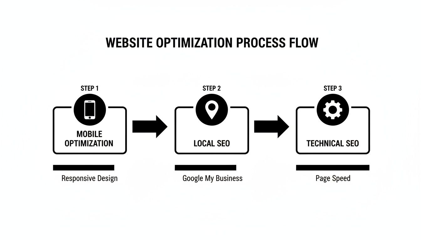
Optimising for Mobile and Local Customers
Let's be honest, you already know your customers are on their phones. A quick glance at your analytics probably confirms it: a flood of mobile traffic. But here's the frustrating part – a disappointingly low number of those mobile visitors actually convert. This isn't a coincidence. It's a huge flashing sign that your mobile experience isn't just responsive, it's actively letting you down.
Simply having a site that shrinks to fit a small screen is the bare minimum, not a strategy. Real mobile optimisation is about empathy. You have to get inside the head of a mobile user. They’re likely distracted, in a hurry, and navigating with their thumbs. Every single tap, scroll, and form field needs to be designed with that reality front and centre.
Thinking Beyond Responsive Design
A genuinely mobile-friendly experience is built for touch, not a mouse pointer. That means buttons and links need to be big enough for a thumb to tap without accidentally hitting something else. Navigation menus have to be crystal clear, avoiding those fiddly, complex drop-downs that are an absolute nightmare on a phone.
The checkout or contact form is where so many mobile conversions go to die. If a user has to pinch and zoom just to read text or fill in tiny form fields, they're gone. Your job is to create a seamless journey that feels completely natural on a mobile device, hunting down and eliminating every possible point of friction.
UK websites show a stark conversion gap: desktop sits at 2.6-2.9%, while mobile lags behind at around 2%. With over 50% of UK eCommerce traffic now coming from mobile, that gap represents a massive, untapped opportunity. A huge factor is speed; Google data shows 53% of mobile users will bounce if a page takes longer than 3 seconds to load. You can read more about the latest eCommerce conversion rate data on develodesign.co.uk.
Actionable Steps for a Better Mobile Experience
So, how do we bridge this chasm between mobile traffic and mobile sales? It starts with a practical to-do list that respects the user's time and their device.
Here are a few things you can implement right away:
- Prioritise "Thumb-Friendly" Design: Position your most important call-to-action buttons where a thumb can easily reach them. Think centre or bottom half of the screen.
- Simplify Navigation: A clean, simple "hamburger" menu is your best friend. Make sure your most important pages are accessible in just one or two taps.
- Streamline Forms: Use mobile-native inputs, like a numerical keyboard for phone numbers or a date picker for appointments. And be ruthless – cut out every non-essential field.
- Offer Mobile Wallets: This is a game-changer. Integrating options like Apple Pay and Google Pay lets users buy with a single tap, completely bypassing the soul-destroying task of typing in card details.
These aren't just minor tweaks. They're fundamental shifts in how you design the user journey for someone on the move.
Converting Your Local Customers
For any business serving a specific geographic area, local optimisation is every bit as crucial as mobile. When someone is searching nearby for your services, they’re often ready to act now. Your website has to make it ridiculously easy for them.
Don't bury your address and phone number on a contact page. They should be right there, instantly visible in the header or footer of every single page. And for mobile users, that phone number must be a "click-to-call" link. This one simple feature removes all the friction of copying and pasting, connecting you directly with a motivated local customer in a single tap.
Embedding a Google Map on your contact page is another non-negotiable. It gives visual context and lets people get directions straight to your door. This is gold for local shops, restaurants, and service providers. If you want to really dominate local search, have a look at our free guide on GBP optimisation. By making these details impossible to miss, you build trust and signal that you're an active, accessible part of the local community.
A Simple Framework for Testing Your Changes
So, you’ve pinpointed some potential conversion roadblocks and rolled out a few quick fixes. Great start. But here’s the million-dollar question: how do you know which of your changes are actually working?
This is where so many businesses trip up. They'll overhaul a page, changing the headline, the button colour, and the images all at once. If conversions go up, they celebrate without knowing why. If they go down, they have no idea which change did the damage. It's guesswork, plain and simple.
To get serious about CRO, you need to move from guesswork to a data-driven process. That means adopting a simple testing framework. Think of it less as a one-off project and more as an ongoing system for making your website better, one proven change at a time.
The heart of this framework is A/B testing (or split testing). The concept is beautifully straightforward. You take a webpage, create a second version with just one single element changed, and show each version to different groups of visitors. Then you see which one performs better. That’s it.
Building Your First Test
Good testing is methodical, not random. Throwing ideas at the wall to see what sticks is a waste of time and traffic. Every test you run should start with an educated guess—your hypothesis.
I find the best hypotheses follow a simple formula: "If I change [X], then [Y] will happen, because [Z]."
Let's imagine a local plumbing business. Their hypothesis might sound something like this:
"If we change our main call-to-action button from 'Contact Us' to 'Get Your Free Emergency Quote,' then we'll get more form submissions, because the new text is far more specific and taps directly into the user's urgent problem."
See how powerful that is? It clearly states the change, the expected result, and the reasoning behind it. It gives your test a real purpose.
With a solid hypothesis in hand, the process becomes clear:
- Create the Variation: You'll build the new version of your page (Version B) that includes the one specific change you're testing. Maybe it's a new headline, a different button colour, or a simplified form.
- Run the Test: Using a testing tool like Google Optimize (though now sunsetted, its principles are sound), VWO, or Optimizely, you'll split your website traffic between the original page (A) and your new variation (B). The software handles all the technical heavy lifting.
- Measure the Results: You need to let the test run long enough to gather a meaningful amount of data. This is called reaching "statistical significance," and your tool will tell you when you're there. It will then declare a winner based on which version drove more conversions.
This simple workflow isn't just for one test. It’s a repeatable cycle you can use to constantly improve your site, as the process flow below shows.
As you can see, optimisation is a journey. Insights from how users behave on mobile might inspire a test specifically targeting local customers. It's all connected.
Focusing on the Right Metrics
When you're running a test, you need to be crystal clear on what "success" looks like. Your primary metric should tie directly back to your hypothesis. If you're testing a new CTA on a product page, your north star is the conversion rate of that specific button.
But don't stop there. It's just as important to keep an eye on secondary metrics to make sure your change hasn't accidentally broken something else.
Here are the key metrics I always watch during a test:
- Conversion Rate: This is the big one—the percentage of visitors who completed the goal you set. It tells you if you won or lost.
- Click-Through Rate (CTR): A great metric for testing the initial appeal of a new button or link. Did more people click it?
- Average Order Value (AOV): For an eCommerce site, this is crucial. Did your change tempt people to spend more, or less?
- Bounce Rate: Did your change cause more people to hit the back button without interacting at all? This can be a sign of a serious problem.
Tracking this full range of metrics gives you the complete story. I’ve seen tests where a new button design increased clicks but ultimately lowered the overall page conversion rate—a hugely valuable lesson! This methodical approach ensures every change is a genuine step forward, building a website that performs better because it’s based on real user data, not just our assumptions.
So, What's Next on Your Conversion Journey?
Let’s bring it all home. Boosting your website's conversion rate isn't a one-and-done task; it's a continuous loop of improvement. For any UK business, no matter the size, this is entirely within reach. It all boils down to a simple rhythm: listen to what your users are doing, make changes based on that data, and then measure the results.
We've walked through the framework. You now know how to dig into your data to find the real problems, how to snag some quick wins, and how to properly test your ideas. This is how you build a website that doesn't just get traffic—it gets results.
The path to a better conversion rate starts with a single, smart change. Forget about trying to build the 'perfect' website overnight. Instead, aim for progress. The momentum from that first small victory is what will really drive long-term success.
Ready to get started? Here’s a simple, actionable plan you can put into motion today.
Your First CRO Sprint
-
Pinpoint One Problem: Head back to your analytics or user feedback. Find just one page that gets decent traffic but has a poor conversion rate. Start there.
-
Deploy One Quick Win: Pick one of the high-impact tweaks we covered. Maybe that means rewriting a confusing call-to-action or cutting a few fields from a form.
-
Define Your Metric for Success: How will you know if it worked? Decide on a clear goal, whether it's a lower bounce rate, more clicks on a button, or an increase in form submissions.
-
Check Back in Two Weeks: Don’t just set it and forget it. After a couple of weeks, dive into your analytics and see what’s changed. This is the simple feedback loop that sits at the very heart of good CRO.
Start with just one small, focused improvement. The insights you'll get from that single change will give you the confidence and the data you need to tackle the next one, creating a powerful engine for real, sustainable growth.
Your CRO Questions Answered
Getting started with conversion rate optimisation often raises more questions than answers. That's a good thing! It means you’re thinking critically about what makes your visitors tick. Let's tackle some of the most common queries we hear from UK businesses.
What’s a "Good" Conversion Rate Anyway?
This is the million-dollar question, but there's no magic number. You'll often see UK e-commerce averages hovering between 2.5% and 3.5%, but honestly, that figure can be misleading.
A high-volume retailer might do brilliantly with a 2% rate, while a specialist B2B service targeting a handful of high-value leads could be aiming for something closer to 10%. It all depends on your industry, your audience, and your price point.
My advice? Forget the vague industry benchmarks. The only number that truly matters is your own. The goal of CRO is continuous improvement – beating your own performance from last month or last quarter.
How Quickly Can I Expect to See Results?
This really depends on what you change. Some tweaks can give you an almost immediate lift, while bigger ideas need time to prove their worth.
- Quick Wins (Days to Weeks): Simple fixes often get the fastest results. Things like making your call-to-action buttons more prominent, slashing unnecessary fields from your checkout form, or boosting your page speed can show a noticeable impact within days.
- A/B Testing (Weeks to Months): For more strategic changes, like a complete redesign of your product page, you need to run a proper A/B test. Gathering enough data to be confident in the results takes time – usually a few weeks, depending on your traffic.
Think of CRO as a long-term strategy that builds on itself, not a quick-fix gimmick.
Do I Need to Spend a Fortune on Tools?
Not at all. You can get incredibly far with free tools, especially when you're just starting out. Don't let a small budget hold you back.
Google Analytics is your best friend here. It’s completely free and powerful enough to show you exactly where users are dropping off and what pages are underperforming.
You don't need a massive budget to get started. Honestly, you can uncover 80% of your biggest conversion problems with free tools. Master those first, fix the obvious issues, and then you can think about investing in paid platforms.
On top of that, tools like Hotjar and Microsoft Clarity have excellent free plans. They let you watch real recordings of people using your site and see heatmaps of where they click. It’s like looking over their shoulder – an absolute goldmine for finding what's broken.
At DesignStack, we build websites that don't just look good – they convert. If you're ready to get serious about turning more visitors into customers, we should talk. Find out more about our professional web design services.


Leave a Reply