

Landing Page Design That Converts: A Practical Guide
A Dorset plumbing firm launches a boiler-replacement campaign, watches 1,200 people click the advert, and receives just eight enquiries. The owner blames Google Ads. In practice, the advert may be doing its job. The campaign page is probably asking visitors to go through a general website, decipher vague copy, complete an overlong form, or trust a business that hasn't answered their obvious questions.
That's the central problem with weak landing page design. Businesses spend money attracting the right people, then send them to a page built for browsing rather than action. A landing page should make one offer clear, remove unnecessary decisions, build confidence quickly, and provide an obvious next step.
UK benchmarks give Dorset businesses a useful reference point, but not a universal pass mark. One large purpose-built landing page dataset reports a 6.6% median conversion rate across 41,000 pages, 464 million visitors and 57 million conversions, while a separate UK-focused benchmark reports an average UK landing page conversion rate of 4.8% and mobile landing pages at 3.9% in 2026 (UK landing page conversion benchmarks). The right comparison depends on your sector, offer, device mix and traffic source.
Table of Contents
- What Landing Page Design Really Means in 2026
- The Anatomy of a High-Converting Page
- Writing Headlines, Sub-Headlines and CTAs That Earn the Click
- Visuals, Social Proof and Mobile-First Layout
- Accessibility, Speed and WordPress Implementation
- Testing, Analytics and Knowing When Your Page Is Winning
- DIY Build Versus Hiring a UK Design Agency
What Landing Page Design Really Means in 2026
A Dorset business can pay for relevant traffic and still lose enquiries before a visitor reaches the contact form. The usual cause is a page that asks people to browse, compare unrelated services, or work out what happens next. Landing page design removes those decisions and directs one audience towards one measurable action.
A landing page works as a single-purpose conversion environment for a specific campaign. It carries the promise made in an advert, email or social post into an action such as requesting a quote, booking a consultation, downloading a guide or buying a product.
Your homepage has a wider role. It introduces the business, supports discovery, explains services, answers broad questions and helps existing customers find information. A campaign page should stay focused. Someone arriving from “boiler replacement Dorset” should see a relevant offer, clear service-area information and a straightforward next step, rather than links to bathrooms, general plumbing repairs and unrelated testimonials.
The page must also work for Dorset buyers browsing on mobile and for users covered by WCAG 2.2 requirements. Clear headings, sufficient colour contrast, visible keyboard focus, usable form labels and touch-friendly controls are part of conversion design, not optional polish. A page that looks persuasive but blocks part of its audience is poorly designed.
Start with the commercial baseline
Judge the page by its result, not by whether it appears professional. Calculate performance using conversions ÷ visitors × 100, measured over the same period, following this UK-focused landing page conversion rate calculation method.
Use the benchmark as a reference, not a target that applies to every campaign. A solicitor's enquiry page, a roofer's emergency call page and a product promotion attract different levels of intent. Compare like with like, then segment results by device, traffic source, offer and audience.
A separate UK benchmark reports 4.8% average conversion, with 2.8% on mobile compared with 4.8% on desktop (UK landing page conversion statistics). That difference should shape the build. Check the mobile journey first when performance falls, including page speed, form effort, tap targets, consent controls and whether the primary CTA remains visible and understandable.
Treat the page as a complete system
Conversion depends on connected decisions:
- Structure: Does the page answer the visitor's first questions in a sensible order?
- Copy: Does the headline match the advert and promise a worthwhile outcome?
- Visuals: Do images clarify the offer or merely fill space?
- Trust: Can a cautious UK buyer verify who they are dealing with?
- Accessibility: Can people use the page with different abilities and input methods?
- Measurement: Can you identify which traffic and interactions produce enquiries?
For a practical explanation of the wider discipline behind these decisions, read this guide to what user experience design involves. Landing page design applies UX principles to a tightly defined commercial outcome. In 2026, that means matching UK campaign evidence with an accessible, focused experience that local customers can use quickly and confidently.
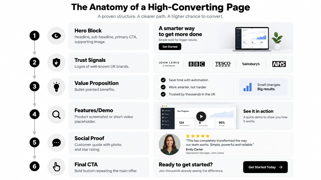
The Anatomy of a High-Converting Page
Visitors don't read a campaign page like a brochure. They scan the first screen, look for relevance, assess risk, then decide whether continuing feels worthwhile. Build the page in that order.
Give every section one job
1. The hero block hooks. Put the outcome-led headline, qualifying sub-headline, primary CTA and supporting visual above the fold. A Dorset roofing page should make the service area, offer and next action clear without requiring a scroll.
2. The problem section qualifies. Mirror the visitor's situation in language they recognise. “Worried your boiler won't last the winter?” is more useful than “We provide heating solutions.”
3. The benefit stack persuades. Use three to five benefits focused on outcomes, not a feature inventory. “Know the replacement cost before work starts” is stronger than “Fixed-price quotation system.”
4. Social proof reassures. Place reviews, relevant customer comments, accreditations or recognisable client logos immediately after the main claims. Visitors should encounter evidence before doubt has time to grow.
5. Objection handling removes friction. Use a concise FAQ to answer questions about timescales, service areas, payment, guarantees, preparation and what happens after submitting the form. Don't hide critical buying information behind a vague “learn more” link.
6. The final CTA converts and confirms. Repeat the primary offer before the footer, then use a trust footer with company details, registration information, contact options and privacy links.
Keep the journey disciplined
A page can be long if each section earns its place. It shouldn't contain a full navigation menu, unrelated blog posts, competing services or a dozen different buttons. The visitor should always know what the page offers and what clicking the main CTA will do.
For a deeper look at turning evidence into structured optimisation work, boost sales with data-driven CRO is a useful supplementary resource. The important principle is simple: don't rearrange sections because a design trend says so. Change the page to solve a measured obstacle.
A wireframe lets you make those decisions before branding and development consume time. This explanation of what a wireframe is in web design covers why page structure should be settled before visual polish.
Practical rule: If a section doesn't hook, qualify, persuade, reassure, convert or confirm, remove it or move it to the main website.
Writing Headlines, Sub-Headlines and CTAs That Earn the Click
Your advert earns the click. Your headline has to confirm that the visitor made the right decision.
“Welcome to Our Services” wastes the most valuable copy position on the page. It says nothing about the audience, result, location or reason to act. A sharper alternative for a Dorset plumbing firm would be: “Same-Day Boiler Quotes in Dorset, Fixed Price, No Callout Fee.” It identifies the service, geography, speed and risk reversal in one sentence.
Build the headline around the buyer
A reliable headline formula is:
Outcome + specificity + proof + risk reversal
You won't always include all four elements in the headline itself. The point is to make the promise concrete. Compare:
- “Professional Web Design”
- “A Faster, Clearer WordPress Website for Dorset Service Businesses”
- “Get a Fixed-Cost WordPress Website That Makes Enquiries Easier”
The strongest version depends on what the visitor already knows. Someone searching for a named service needs confirmation. Someone arriving from a broad social advert may need more context before a CTA feels reasonable.
The sub-headline filters and qualifies. It should explain who the offer suits, what happens next and any important limitation. For example: “Tell us about your current boiler and we'll arrange a straightforward survey for homes across Weymouth, Dorchester and nearby areas.” That copy can reduce irrelevant submissions while helping suitable prospects feel understood.
Your page copy should sound like the customer, not your internal service catalogue. Use real questions from sales calls, emails and quote requests. This practical guide to writing effective website copy is useful when your current wording describes the business more than it describes the buyer's problem.
Make the CTA specific and low-risk
Use one primary CTA per page, then repeat it at sensible points through the journey. “Submit” and “Learn More” are weak because they hide the outcome. Try “Request My Fixed Quote”, “Book a Boiler Survey” or “See Available Dates”, depending on what happens after the click.
Button colour needs enough contrast with its background, but colour won't rescue unclear copy. Put the button beside the promise, repeat it after the benefit section and offer a secondary action for visitors who aren't ready. A secondary action might be “See Our Accreditations” or “Call the Team”, but it must remain visually subordinate.
Micro-copy beneath the CTA can remove a specific concern:
- No commitment: Explain whether the enquiry is obligation-free.
- Response expectation: Say what happens next without making an unsupported time promise.
- Privacy reassurance: Link to the privacy notice and explain how the information is used.
Be wary of fake urgency, passive verbs and form-first layouts. A visitor who only wants an indicative price may not be ready to provide a full address, budget, project history and preferred appointment time. Ask for the minimum information needed to begin, then collect further details when the prospect has shown intent.
The video below provides another perspective on landing page optimisation. Watch it after reviewing your own headline and CTA, not as a substitute for checking your page data.
Visuals, Social Proof and Mobile-First Layout
A hero image should help the visitor understand the offer. It shouldn't exist because the template has an empty image box.
For a local mortgage broker, a photograph of a family discussing a home purchase supports the message better than a generic city skyline. For a Dorset trades business, a real team member, recognisable local setting or completed project can make the service feel tangible. Polished stock photography often creates distance. Candid, relevant images usually give visitors more to believe.
Use proof where doubt appears
One testimonial floating above the headline rarely answers every concern. Place a concise proof point near the first claim, then use a fuller cluster after the value proposition. This could include customer comments, review-platform references, relevant accreditations, project images and client logos, provided each item is genuine and appropriate to the audience.
Don't decorate the page with logos that have no relationship to the offer. A local business should prioritise relevant evidence, such as trade memberships, qualifications, verified reviews or named customer experiences, rather than displaying impressive but unexplained brand marks.
A testimonial works harder when it identifies the context. Include the customer's name or business where permission allows, explain what they bought, and use a photograph only when it belongs to the customer. Anonymous praise without detail gives cautious visitors little to assess.
Design for the thumb first
Start the responsive layout at the narrowest practical viewport, then expand it. On mobile:
- Stack the content: Keep the headline, supporting text, image, proof and CTA in a logical vertical sequence.
- Protect the thumb zone: Place the main button where it can be reached without awkward stretching or accidental taps.
- Reduce competing controls: Remove secondary navigation and non-essential decorative elements.
- Shorten visual distance: Keep labels, fields and error messages close to the control they explain.
- Review every breakpoint: Check headings, buttons, forms, testimonials and images rather than trusting the desktop preview.
WordPress can support this workflow without a bloated custom theme. Use a restrained page builder, an image optimisation tool, system or subset fonts, and lightweight SVG icons where they improve clarity. Don't install several overlapping plugins that each add scripts, animations or tracking libraries.
Use image optimisation techniques for websites before uploading hero photography. Large images create avoidable delays, especially when a campaign attracts mobile visitors who are ready to leave before the offer becomes visible.
Accessibility, Speed and WordPress Implementation
Accessibility belongs in the first design brief, not in the final QA queue. The GOV.UK Design System guidance identifies WCAG 2.2 AA as the new minimum accessibility standard for UK public-sector websites and mobile apps, and the Home Office design manual closely aligns with WCAG 2.2 Level AA.
Dorset businesses serving councils, regulated sectors or high-trust audiences should treat that standard as a practical baseline. It also makes commercial sense. A visitor who can't identify a form field, see keyboard focus or read low-contrast text can't complete the journey reliably.
Build the accessible path
Check the basics during design:
- Contrast: Choose text and control colours that remain readable against their backgrounds.
- Keyboard access: Make every link, button, field, menu and modal usable without a mouse.
- Focus states: Show clearly where the keyboard user is on the page.
- Form labels: Associate every input with a meaningful label. Placeholder text isn't a substitute.
- Error handling: State what went wrong, identify the affected field and explain how to correct it.
- Alternative text: Describe informative images. Mark purely decorative imagery appropriately.
- Semantic structure: Use real headings, lists, buttons and landmarks rather than styling generic containers.
- Motion control: Avoid animation that distracts or causes discomfort, and provide suitable controls where needed.
Remove avoidable performance weight
The supplied implementation brief mentions Core Web Vitals targets of LCP under 2.5 seconds, CLS below 0.1 and INP under 200 milliseconds. Those figures should be treated as build targets only when they can be verified with an appropriate test. Don't claim success from a desktop Lighthouse run if real mobile users experience something different.
In WordPress, practical choices include lazy-loading below-the-fold images, serving responsive image sizes, subsetting fonts, deferring non-essential scripts, reducing third-party tags and avoiding heavy page-builder themes. Cache and minification tools can help, but configuring several optimisation plugins blindly can create layout failures and broken forms.
Before launch, run a Lighthouse review, inspect the page at mobile widths, complete the whole form with a keyboard, test visible focus, zoom the text, review error messages and ask someone unfamiliar with the business to explain what happens after the CTA. Public-facing organisations should also document known limitations and planned fixes. WCAG compliance isn't a badge you add after launch. It's a continuing quality responsibility.
Testing, Analytics and Knowing When Your Page Is Winning
A Dorset trades firm can receive plenty of clicks from a paid campaign and still generate no usable enquiries. Traffic is only the starting point. Judge the page by qualified actions, not by visits or attractive engagement charts.
Track the full journey in GA4: conversion rate, cost per conversion, form abandonment, scroll behaviour and assisted attribution. Each metric answers a separate business question. Conversion rate shows whether the page persuades people to act. Cost per conversion connects performance to commercial reality. Abandonment exposes form friction. Scroll behaviour shows whether visitors reach proof and key information. Assisted attribution prevents the final click receiving credit for every sale.
Use this analytics for websites guide to configure events around decisions you can act on, rather than filling a dashboard with numbers nobody reviews.
Set the benchmark correctly
A UK ecommerce benchmark reports an average conversion rate of 1.51% in January 2026, down from 1.75% a year earlier, with a market median of 1.45% and a sector range from 0.53% in electrical and commercial equipment to 4.82% in arts and crafts (UK ecommerce conversion benchmarks). Those figures describe online retail, not every campaign page. A Dorset plumber, accountant or building firm should compare like with like, taking offer, traffic intent and enquiry quality into account.
Use the sector ranges referenced earlier as a starting point, not a pass or fail line. A page can beat a broad average and still attract poor-fit leads. Another page can sit below it while producing profitable enquiries from a smaller, more relevant audience. Track qualified outcomes back to the original campaign and device, because a form completion has less value if the business cannot serve the enquiry.
Test one meaningful change
Run an A/B test around one material variable, such as the headline, hero image, form length, CTA wording or proof placement. Keep the offer, audience and traffic source consistent. Changing the headline, button, form and layout together creates movement without explaining the cause.
Write the hypothesis before launch. Do not stop a test because one version leads early. Gather enough comparable data for a sensible decision. If traffic is too low for a reliable comparison, use session recordings, form feedback and conversations with customers instead of presenting a weak result as proof.
Review results through four actions:
- Iterate: The page is close to its relevant UK benchmark, but one identifiable friction point remains.
- Redesign: Visitors engage with the content yet fail to enquire, pointing to a structural or trust problem.
- Change the traffic: Qualified visitors convert, while a low-intent audience does not.
- Hold and scale carefully: Qualified conversions are profitable and event tracking has been checked across mobile and desktop.
For Dorset SMBs, a winning page is one that produces trackable, commercially useful enquiries while meeting WCAG 2.2 expectations. Recheck tracking after WordPress updates, consent changes and form edits. A result you cannot reproduce or explain is not a reliable win.
DIY Build Versus Hiring a UK Design Agency
DIY landing page design can work for a simple offer and a confident WordPress user. It becomes expensive when the owner has to learn copywriting, layout, responsive behaviour, accessibility, tracking, form integration, image preparation and testing at the same time.
The comparison isn't “free builder versus agency fee”. It's control versus specialist time, with quality risk sitting in the gaps between tasks.
What the options involve
A DIY build still requires decisions about the theme, page builder, copy, imagery, CTA, form fields, analytics events, cookie handling, mobile layout, accessibility checks and post-launch maintenance. If the owner keeps changing the page while learning the tools, the campaign can lose consistency before performance data becomes useful.
A fixed-fee UK agency engagement should define the deliverables clearly. That may include discovery, conversion-focused copywriting, custom design, WordPress development, form and analytics setup, WCAG 2.2 checks, responsive QA, launch support and a defined optimisation period. Ask what isn't included as carefully as you ask what is.
| Factor | DIY build | UK design agency |
|---|---|---|
| Strategy | Owner-led | Guided discovery and offer planning |
| Copy | Written internally or outsourced separately | Can be planned alongside the design |
| Development | Theme and builder configuration | Custom implementation within agreed scope |
| Accessibility | Owner must test it | WCAG 2.2 review can be included |
| Measurement | Often added later | Events and conversion goals can be planned before launch |
| Revisions | Self-managed | Defined revision rounds |
| Post-launch support | Owner responsibility | May include an agreed support window |
Some Dorset agencies quote from £900 for a single campaign page up to £3,500 for a bespoke build with A/B testing infrastructure, but those figures should be treated as indicative pricing bands from the supplied brief, not a market guarantee. Request a written scope showing whether copy, development, testing, hosting, tracking and post-launch changes are included.
Questions worth asking before signing
- Who writes and owns the copy?
- What happens if conversion performance drops after launch?
- Is accessibility testing against WCAG 2.2 included?
- Who owns the design files, code, images and tracking accounts?
- What reporting cadence applies after the page goes live?
Choose DIY when you have the time, a narrow offer and someone who can test the result properly. Hire an agency when the page supports paid acquisition, the offer is commercially important, or failure would cost more than professional implementation.
DesignStack provides Dorset businesses with responsive WordPress websites, conversion-focused page builds, branding, SEO support and post-launch updates, with fixed-cost project options and defined design revisions. Visit DesignStack to discuss a landing page that matches your offer, audience and measurement plan.
Leave a Reply