

Website Accessibility Audit Guide That Actually Works
You've checked your shop on a laptop, the pages load, and your test order completes. Then a customer reports that the payment form can't be used with a screen reader. Another visitor gets trapped inside a booking pop-up. A third can reach the signup form but can't understand which field caused the error. None of these problems is obvious from a quick visual check, yet each can stop a real customer from completing a valuable journey.
A website accessibility audit turns those reports, risks and hidden barriers into an organised plan. It combines automated checks, manual testing and assistive-technology review, then ranks the findings by how seriously they affect users and important business tasks. For a UK small business, that means treating accessibility as both a legal responsibility and a practical way to protect checkout, bookings, enquiries and signups.
Table of Contents
- What a Website Accessibility Audit Really Does for Your Business
- Scoping the Audit Before You Touch a Single Page
- Automated Scanners Versus Manual WCAG Checks
- Running the Audit on WordPress and Other Sites
- Prioritising Findings by Real User Impact
- Reporting, Remediation and What to Do Next
What a Website Accessibility Audit Really Does for Your Business
A proper audit is a working session, not a badge or a generic compliance certificate. The tester reviews your website against the relevant Web Content Accessibility Guidelines, normally including WCAG 2.1 and WCAG 2.2 requirements, then checks whether people can use, understand and complete tasks using different interaction methods.
That distinction matters. The UK's Public Sector Bodies (Websites and Mobile Applications) Accessibility Regulations came into force on 23 September 2018, establishing a legal baseline for accessibility in public-sector websites and apps. Government monitoring later reviewed 1,203 websites and 21 mobile apps, identifying 29,787 accessibility issues, while only 55.3% were fixed during monitoring, as reported in the Government Digital Service monitoring report. The lesson for commercial sites is straightforward. Compliance problems are common, and an audit has value only when it leads to repairs and retesting.
The useful outputs
A small-business audit should leave you with practical documents:
- A findings register: Each issue should show its location, affected component, relevant WCAG criterion, evidence and recommended fix.
- A risk-rated roadmap: Findings should be grouped by user impact, journey importance and implementation effort, rather than listed in the order a scanner found them.
- An evidence pack: Screenshots, page references, test conditions and verification notes help answer legal, procurement or customer questions.
- A monitoring baseline: The initial results give your team something to compare against after template, plugin or content changes.
The audit should also trace real routes through the site. A missing alternative text description on a decorative banner may inconvenience someone, while an unlabeled payment field can prevent a screen-reader user from placing an order. Both are accessibility findings, but they don't carry the same commercial or human consequence.
Practical rule: Ask the auditor to demonstrate how a disabled or assistive-technology user would complete your highest-value task, not just how many automated errors were found.
The rest of the process is about making that work specific. You need a defensible scope, a realistic blend of tools and human checks, a priority system that protects conversions, and a report developers can act on.
Scoping the Audit Before You Touch a Single Page
A useful scope document can be handed to a colleague, developer or external tester without a long briefing. Start by listing page types and templates, not just URLs. Include the home page, category or service pages, product pages, blog layouts, contact and legal pages, plus landing pages used for paid campaigns.
Then identify the journeys that matter commercially. For an online retailer, that might be product discovery, basket, checkout, account creation and order confirmation. A professional service firm may need to protect service-page navigation, quote requests, document downloads, live chat and appointment booking. If you're unsure how pages and journeys relate, a clear understanding of information architecture will help you map the structure before testing begins.
Build a representative page set
Don't promise to inspect every page if many pages share the same template. Instead, select examples that expose different structures and states:
- Content variations: A short service page, a long article, a page with tables, and one containing downloadable documents.
- Interactive components: Navigation menus, accordions, carousels, modal windows, date pickers and embedded forms.
- Transaction states: Empty basket, validation error, successful submission, unavailable appointment and confirmation screen.
- Responsive layouts: The same component at desktop, tablet and mobile widths, especially where navigation changes.
Record what's out of scope as carefully as what's included. Third-party platforms, authenticated areas, PDFs, embedded booking systems and customer portals may need separate agreements or specialist testing. Leaving them undefined creates a false sense of coverage.
Define people, devices and technologies
Your test matrix should include keyboard-only navigation, screen-reader users, people with low vision who rely on zoom and contrast, and people with cognitive or motor impairments. At minimum, plan desktop keyboard testing, Chrome with NVDA, and mobile Safari with VoiceOver. Add the browsers your customers use and any operating system that changes the experience.
WordPress needs extra care because the visible page may combine a theme, page builder, Gutenberg blocks, WooCommerce templates and plugins. A form plugin can introduce different markup from the theme. A booking widget may load inside an iframe. Test those pieces separately, then test them together in the journey where customers use them.
A workable scope statement might read: “In scope are the home page, primary templates, product or service page, contact form, account creation and checkout on desktop Chrome and mobile Safari, with keyboard, NVDA and VoiceOver checks. Out of scope are the customer portal, third-party booking platform and historical PDF archive. Testing will take place on staging during the agreed release window.” That level of precision prevents both missed risk and unnecessary work.
Automated Scanners Versus Manual WCAG Checks
Automated tools are valuable because they examine repeated patterns quickly. axe DevTools, Lighthouse, WAVE and Siteimprove can flag common problems such as insufficient colour contrast, missing alternative text, empty links, missing form labels and some incorrect ARIA usage. They're particularly useful across shared templates, where one repair can remove the same defect from many pages.
They can't judge whether an image's alternative text conveys the right meaning, whether a heading order makes sense, or whether a checkout error explains what the customer should do next. A scan may confirm that a button has an accessible name while missing the fact that focus never reaches it after a dynamic update. It may identify a modal but not recognise that keyboard users become trapped inside it.
The Growth 4 Trades 2026 guide to website accessibility standards is useful background for teams translating accessibility requirements into practical website work. Use guidance like that to set expectations, but don't mistake a checklist or scan for a complete audit. Technical site structure also intersects with technical SEO, yet search crawlers and accessibility tools evaluate different aspects of the experience.
Match the method to the question
| WCAG area | Automated catch rate | Manual review needed |
|---|---|---|
| Missing labels, empty links and some contrast failures | Often reliable for detectable patterns | Confirm the label is meaningful and the contrast works in context |
| Heading structure, alternative text and ARIA relationships | Partial, because tools can detect markup patterns | Sample content and review semantic meaning and announcement order |
| Keyboard operation and visible focus | Limited | Test every interactive element, including menus, dialogs and checkout controls |
| Error recovery, timeouts and dynamic updates | Limited | Full manual review of validation, focus movement and instructions |
| Complex widgets and screen-reader journeys | Limited | Full manual review with keyboard and assistive technology |
Manual testing should cover keyboard navigation, screen-reader announcement order and the practical recovery path after an error. It should also address criteria where judgement is central, including 1.3.1 Info and Relationships, 2.4.7 Focus Visible, 2.2.1 Timing Adjustable and 2.4.11 Focus Appearance. A tool can report that an element exists. It can't reliably tell you whether a person can understand and operate the journey.
Run the automated pass first. Fix straightforward repeated defects, then spend human testing time on the pages and states where a customer is trying to buy, book, register or request help. That combination gives you scale without pretending automation can replace expertise.
Running the Audit on WordPress and Other Sites
Begin on a staging copy, or use a carefully controlled test environment that won't create real orders or send live customer messages. Crawl representative pages with axe DevTools, WAVE or Lighthouse. Export the results, remove duplicate reports that point to the same template defect, and note which findings require human confirmation.
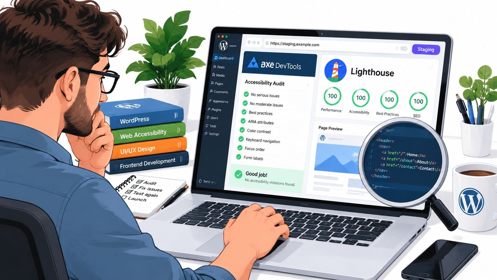
The first pass should identify low-hanging problems such as missing alternative text, poor colour contrast and empty links. Don't fix everything immediately. Capture the page, selector or component, tool result and whether the issue repeats elsewhere. An exported axe issues report can serve as a baseline CSV, provided someone validates the findings before developers treat it as a final backlog.
Work through the interface manually
Use the keyboard from the browser address bar. Press Tab through menus, filters, product options, forms, modals and checkout controls. Check that focus is visible, follows a sensible order, doesn't disappear behind sticky elements and returns to a logical location when a dialog closes.
A headings inspection tool such as HeadingsMap can expose an illogical outline, but read the page as a user would. A page can have technically valid heading levels and still present a confusing structure if headings describe styling rather than content. Inspect form labels, instructions, required states and error messages in both the initial and failed-submission states.
On WordPress, repeat this process for the active theme, page-builder blocks and plugins that generate interactive content. WooCommerce product, basket and checkout templates deserve separate attention. So do booking plugins, membership tools, pop-ups, cookie controls and embedded forms. A site may be accessible on its service pages while the plugin responsible for its main conversion journey is not.
Add assistive-technology passes
Use NVDA with Chrome and VoiceOver with Safari to test the home page, a representative product or service page, a form and a checkout or signup journey. Listen for useful names, roles, values, state changes and instructions. Check whether a screen-reader user can identify the current step, understand validation errors and reach the payment or submission control.
Capture screenshots, console logs and short screen-reader transcripts as evidence. Record browser, device, page state and test method for each issue. That context saves time during remediation because a developer can reproduce the barrier instead of guessing from a short label such as “form problem”.
This sequence applies beyond WordPress. Other CMS platforms and custom builds still need template coverage, component testing, responsive checks and assistive-technology review. The implementation differs, but the audit logic remains the same.
A short demonstration can help non-specialists understand why a scan is only one part of the process.
For ongoing WordPress work, accessibility checks belong in release testing alongside content, SEO and performance checks. Teams that need help maintaining updates can also consider a structured WordPress maintenance and support service so theme and plugin changes don't bypass the agreed checks.
Prioritising Findings by Real User Impact
A scanner's order isn't a business priority list. Fixing the first axe result, then the second, may leave a customer unable to submit a booking form while the team spends time correcting a minor issue on a low-traffic content block.
Rank findings across two dimensions. First, assess user harm: does the problem block a transaction, block a step in a journey, create serious frustration or cause a minor inconvenience? Second, assess fix effort: can a developer resolve it in under an hour, will it take part of a day, does it require several days, or does the component need a redesign?
Use the journey as the multiplier
A missing alternative text description on a decorative hero image may deserve attention, but an inaccessible checkout button should normally rise above it. A form label on a booking widget matters more than the same defect on an abandoned campaign page because the booking widget sits directly on a task a customer is trying to complete.
customer journey mapping supports accessibility work. Mark the points where a visitor searches, chooses, enters information, confirms details and receives a result. Findings at those points deserve additional scrutiny, especially when they repeat across a shared template.
| Finding | WCAG criterion | User impact | Fix effort | Priority |
|---|---|---|---|---|
| Payment button cannot be reached by keyboard | 2.1.1 Keyboard | Transaction-blocking | Half a day | Immediate |
| Booking field has no usable label | 1.3.1 Info and Relationships | Journey-blocking | Under an hour | Immediate |
| Modal traps keyboard focus | 2.4.3 Focus Order | Journey-blocking | Multi-day | Immediate |
| Informative hero image has weak alternative text | 1.1.1 Non-text Content | Frustrating or minor, depending on purpose | Under an hour | Planned |
The table shows why identical scan output can produce different priorities. The unlabeled booking field is a quick repair with direct task impact. The focus trap may require more work, but it blocks an entire interaction. The hero image still needs correction where its information matters, yet it shouldn't displace a failure that prevents payment or registration.
Don't count errors. Count blocked tasks, repeated components and people affected by the barrier.
This approach also makes budget discussions more honest. You can clear quick wins, protect key journeys and schedule structural work without claiming that every remaining issue has equal urgency.
Reporting, Remediation and What to Do Next
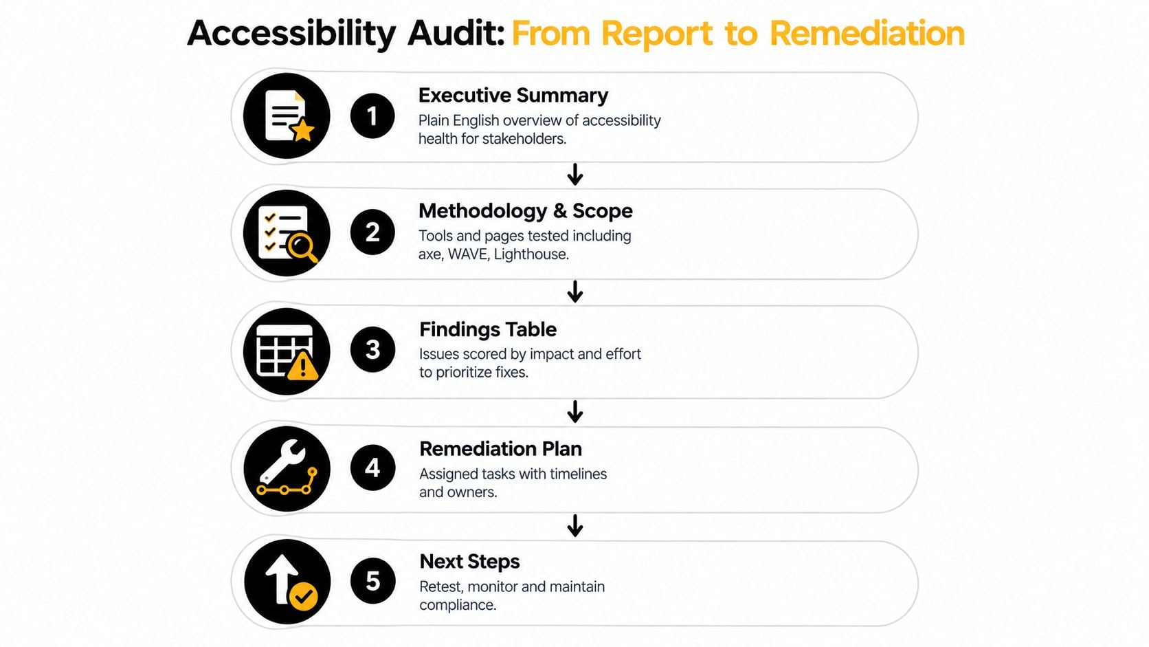
A report should help three audiences make decisions. The owner needs a plain-English view of risk and business impact. The developer needs reproducible evidence and a clear fix direction. The project manager needs owners, priorities, dependencies and a retest point.
Use a structure that keeps those needs connected:
- Executive summary: State what was tested, where the main barriers sit and which journeys need immediate attention.
- Methodology and scope: List pages, templates, devices, browsers, assistive technologies, tools and test conditions.
- Findings table: Include the issue, location, WCAG reference, evidence, user impact, effort estimate and priority.
- Remediation plan: Group work into quick wins, short-term fixes and structural changes such as theme or component redesign.
- Retest plan: Name the criteria and user journeys that must pass verification after each repair.
Turn each recommendation into a project-board ticket. Give it an owner, WCAG reference, affected template, evidence link and verification method. “Fix checkout accessibility” is too vague. “Associate the payment field with its visible label, announce the validation error, then verify with keyboard and VoiceOver” gives a developer and tester a shared definition of done.
Choose a sustainable follow-up
A small site may manage ongoing monitoring with a paid scanner and quarterly manual spot checks. A WordPress team can add keyboard checks, form-state checks and representative screen-reader testing to its deployment checklist. Bring in a specialist when the backlog includes a redesign, complex JavaScript widgets, third-party integrations or a customer portal that internal staff can't test confidently.
Be cautious with fixed cost and time promises. Audit duration and price depend on the number of templates, journeys, states, technologies and reporting detail in scope. A small representative review is different from a multi-template ecommerce assessment, and a detailed remediation workshop requires different resources from an automated scan.
The UK public-sector model is a useful reminder that expert audits should combine automated and manual testing across assistive technologies, browsers and mobile devices, as described in GOV.UK's accessibility audit guidance. Treat the result as a snapshot, not a permanent certificate. Themes change, plugins update, content editors add new components and third parties alter embedded journeys, so retesting must continue after the first backlog is closed.
For practical implementation advice, use DesignStack's guide on how to make a website accessible alongside your audit findings. It can help translate WCAG requirements into development and content checks that your team can repeat.
DesignStack can review your WordPress or ecommerce site, test the journeys that matter most, and turn accessibility findings into a prioritised remediation plan. Visit DesignStack to discuss an audit, accessible website build or ongoing support for your UK business.


Leave a Reply