What Is a Style Guide: Boost Brand Consistency
A style guide is your business's official rulebook for how you present yourself to the world. In the UK, some of the clearest examples are formal guides that have shaped communication for eight years and content standards shown to improve clarity and searchability by 30%, which tells you why consistency matters in practice.
If you're running a small business, you've probably felt the problem already. One Instagram post looks polished, the next uses a different shade of blue. A freelancer writes in a warm, chatty tone, then your website sounds stiff and corporate. Your brochure says one thing, your homepage says another, and suddenly the brand you've worked hard to build feels a bit messy.
That's where a style guide helps. It serves as a recipe book for your brand. It doesn't just say “make it look nice”. It tells everyone exactly which ingredients to use, in what order, and what the final result should feel like. The outcome is simple. Your website, emails, social posts, proposals and print materials all look and sound like they come from the same business.
For UK small and medium businesses, that matters more than many owners realise. A style guide isn't just for huge companies with large marketing teams. It's often most useful when you're growing, working with freelancers, juggling channels and trying to look professional without wasting time.
Table of Contents
- The Problem of Brand Chaos and Why Consistency Matters
- The Core Components of a Powerful Style Guide
- Key Benefits of a Style Guide for Your Business
- Real-World Style Guide Examples in Action
- Your Simple Checklist to Create and Maintain a Style Guide
- Let DesignStack Build Your Brand's Professional Rulebook
The Problem of Brand Chaos and Why Consistency Matters
A Dorset business owner hires a designer for a leaflet, asks a VA to schedule social posts and gets a web developer to tweak the homepage. Each person does decent work. But when the pieces go live, the logo sits differently in every place, the colours don't quite match and the tone jumps from formal to friendly to awkwardly salesy.
That kind of brand chaos doesn't usually come from bad people or bad ideas. It happens because nobody has one shared reference point. Without a clear guide, every supplier fills in the gaps themselves.
A style guide fixes that by becoming your single source of truth. It tells your team, your freelancers and your future self how the brand should look, sound and behave in day-to-day work. If you want a deeper look at why that matters across every customer touchpoint, this guide on brand consistency is a useful companion.
A brand book often explains the bigger picture. A style guide handles the practical rules people need when they're actually making things.
That distinction trips people up. A brand book might talk about mission, values and positioning. A style guide is more hands-on. It answers questions like these:
- Which logo version should we use on a dark background?
- What hex code is our brand blue?
- Should captions sound friendly or formal?
- Do we write dates in a UK format?
- What should never happen to the logo, fonts or imagery?
For many small businesses, the problem gets worse as the business gets busier. You're posting more often, replying faster, outsourcing bits of marketing and trying new platforms. If you use scheduling workflows or automate repeat jobs, even operational tools matter because they affect how often content gets published and reviewed. Teams that need help managing those recurring tasks can browse Cron tools on Toolradar to keep publishing processes tidy.
The bigger point is this. Consistency isn't about being fussy. It's about helping customers recognise you quickly and trust what they're seeing.
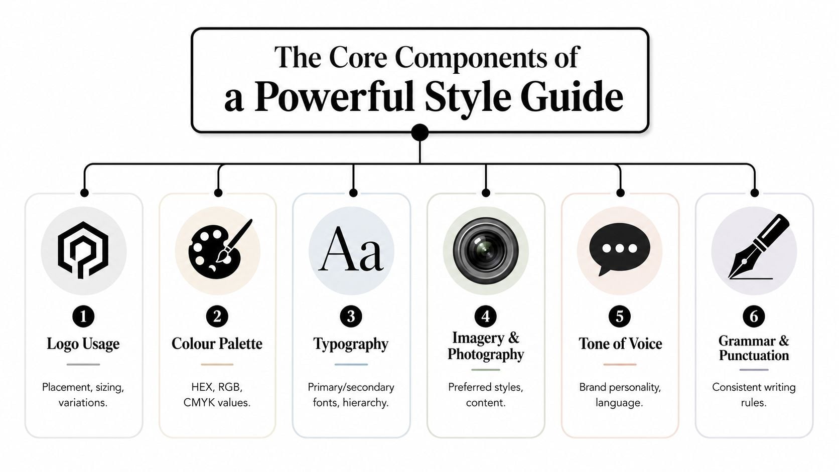
The Core Components of a Powerful Style Guide
A good style guide doesn't need to be huge. It needs to be clear. The best ones remove guesswork.
When people ask what is a style guide, they often expect a logo sheet. In reality, it's a mix of visual rules and writing rules. If you're also trying to separate style from the wider idea of branding, this explanation of brand identity design helps connect the pieces.
Logo Usage
Your logo section should do more than show the logo.
It should include the approved versions, such as full colour, black, white and icon-only versions. It should also explain minimum size, clear space around the logo and where each variation can be used.
A simple table often makes this easy to follow:
| Situation | Correct version | Common mistake |
|---|---|---|
| White background | Full colour logo | Stretching it to fit |
| Dark background | Reversed or white logo | Using the full colour version with poor contrast |
| Small social icon | Simplified mark | Squeezing full logo into tiny spaces |
If someone has to ask, “Can I put the logo over this photo?”, the guide should already answer that.
Colour Palette
A colour palette needs precision. “Use dark green and cream” isn't enough. People need exact values.
Include:
- Primary colours with HEX, RGB and CMYK values
- Secondary colours for accents and backgrounds
- Usage notes such as “use gold sparingly” or “never use red for CTA buttons”
This matters because colours shift quickly between print and digital. If your email template, signage and website all use slightly different shades, customers notice the inconsistency even if they can't name it.
Typography
Fonts shape personality. A serif typeface can feel established and editorial. A clean sans serif can feel modern and direct.
Your guide should name:
- Primary font for headings
- Secondary font for body copy
- Fallback fonts for systems that don't support your main choice
- Hierarchy rules for H1, H2, H3, body text and captions
This is also where practical content questions appear. Email subject lines, for instance, often drift into random title case, sentence case or all caps depending on who writes them. If your team wants a straightforward reference on email subject line capitalization, it can help you set a rule and stick to it.
Imagery and Photography
Most businesses are less consistent with images than with logos. Stock photos, phone snaps, product shots and team pictures often end up looking like four different brands.
A useful imagery section answers:
- Do we prefer bright or muted photos?
- Are people posed or candid?
- Do we show real customers, products, places or abstract visuals?
- Should images feel premium, local, playful or professional?
Practical rule: If two people picked images for your website separately, they should still choose pictures that feel related.
That's the ultimate test.
Tone of Voice
Tone of voice is where many style guides either become useful or vague. “Friendly but professional” sounds nice, but it doesn't tell a writer what to do.
Better rules sound like this:
- Use plain English instead of jargon
- Write as a helpful expert, not a hard seller
- Prefer short sentences on web pages
- Use contractions to sound natural
- Avoid bias or loaded terms
This area now overlaps with inclusive language. The verified data shows that 78% of UK brands prioritise inclusive language, but only 12% have formal inclusive style guides with pronoun and disability-language protocols, according to the reference provided in the verified data at the inclusive style guide source. That gap is one reason many businesses want practical wording rules, not just broad statements about being respectful.
Grammar and Punctuation
This is the least glamorous part of a style guide and one of the most useful.
The UK's Office for National Statistics has used its content style guide as a definitive standard for eight years, with rules such as spelling out numbers to ninety-nine, writing per cent in text and using British spelling such as labour in official communications, as shown in the ONS content style guide.
That example matters because it shows what strong style guidance looks like. It's specific. It removes doubt. It protects clarity.
For a small business, your grammar section might include:
- Date format such as 14 July 2026
- Number style for prices, sizes and measurements
- Spelling choices in UK English
- Punctuation rules such as whether you avoid the serial comma
A style guide becomes powerful when it turns fuzzy preferences into usable rules.
Key Benefits of a Style Guide for Your Business
A style guide pays off in ways that are easy to feel, even before you try to measure them.

Trust becomes easier to build
Customers don't read your business one asset at a time. They experience the whole thing. They might find you on Google, click to your website, open an email, then check your LinkedIn page.
When all of those touchpoints feel connected, the business feels established. When they clash, the business feels less certain. Consistency helps people think, “These people know who they are.”
Work gets faster
Without a style guide, every small decision becomes a discussion. Which logo file? Which font? Which headline style? Should this post sound playful or serious?
With a guide, people stop reinventing the wheel. That saves time with designers, copywriters, developers and in-house staff. It also reduces the endless round of “Can you just tweak this one thing?”
Your team gets clearer guidance
A good style guide doesn't restrict people. It gives them confidence.
New staff can write more quickly. Freelancers can match your brand faster. A virtual assistant can create social graphics without guessing. If you're a solo founder now, that matters even more later because today's rough decisions often become tomorrow's messy habits.
The easier your rules are to find and understand, the more likely people are to follow them.
There's also evidence that standardised guidance improves real-world usability. In the UK public sector, following the GOV.UK style guide improved content clarity and searchability by 30% for small businesses compared with unstandardised documentation, according to GOV.UK technical style guidance.
That figure comes from public-sector content, but the lesson is broader. Clear rules lead to clearer communication.
A short video can also help make the idea more concrete for teams who are new to branding systems.
Marketing feels more joined up
A style guide strengthens campaigns because every asset supports the same impression. Your ads, landing pages, lead magnets and brochures don't feel like separate experiments.
That doesn't mean every channel must look identical. It means they should feel recognisably related. That's a big difference.
Real-World Style Guide Examples in Action
You don't need to study a giant corporate manual to understand how style guides work. A few strong examples show the pattern clearly.
What strong examples have in common
Mailchimp is often discussed because its voice feels distinctive without becoming confusing. The useful lesson isn't that you should sound like Mailchimp. It's that the guide gives writers practical boundaries. It turns personality into choices people can apply.
UK institutions often excel in a different way. Their guidance tends to feel structured, formal and specific. That makes them helpful models if your business needs authority, clarity and repeatable standards rather than a quirky brand voice.
When you review examples, look for these features:
- Clear do and don't examples that remove ambiguity
- Real layouts and samples instead of abstract statements
- Rules for both visuals and words, not one or the other
- Simple navigation so busy people can use the guide
If you also produce business announcements, PR copy or media updates, these press release writing tips are useful because they show how format rules affect credibility in public-facing content.
Why UK examples feel especially useful
For UK SMEs, the most helpful examples usually share one trait. They reflect local expectations. That includes British spelling, UK date formats and a more grounded tone than many imported templates use.
A practical exercise is to review a few strong brands and ask: what rules are they making visible? You'll often notice repeated logo spacing, a narrow colour range, consistent headline styles and disciplined language choices. If you want inspiration from organisations that apply those ideas well, these brand identity examples can help you spot what polished consistency looks like in practice.
The lesson isn't to copy anyone. It's to notice that effective style guides make decisions easier.
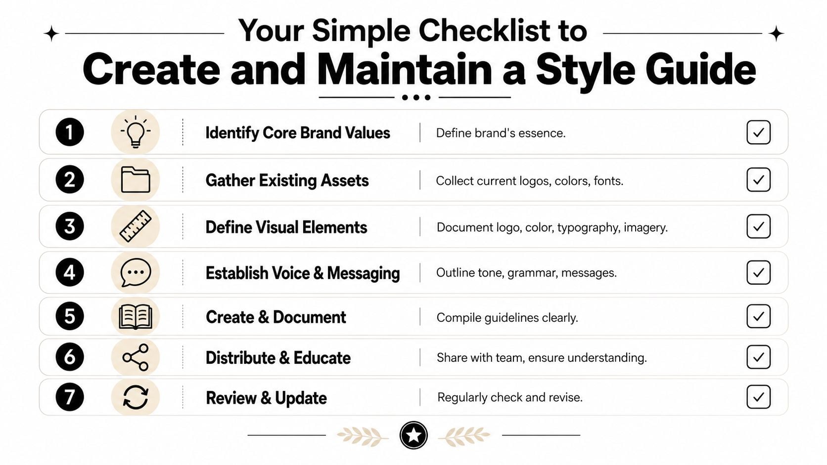
Your Simple Checklist to Create and Maintain a Style Guide
Most small businesses don't need a hundred-page document. They need something useful enough to guide daily work and simple enough to keep updated.
Start with what you already have
Begin by collecting the pieces that already exist. Logo files. Website colours. Fonts. Social post templates. Email signatures. Packaging. Business cards. Sales decks.
Then ask a blunt question. Which of these are correct?
You'll usually find duplicates, old versions and unofficial fixes. Cleaning that up is the first win.
A strong starting checklist looks like this:
Gather brand assets
Put all current files in one folder and label approved versions clearly.Choose your core rules
Start with logo use, colours, fonts, tone of voice and basic grammar choices.Write examples, not just statements
Show the right headline, the right button text and the right logo placement.
Write rules people can actually follow
A style guide fails when it sounds clever but leaves everyone guessing. Keep rules short and concrete.
Instead of writing “use accessible language”, write:
- Say what you mean in plain English
- Avoid abbreviations unless your audience already knows them
- Use descriptive link text rather than vague wording
- Write dates in UK format
A technical writing style guide defines style, voice and terminology for technical communication, which helps reduce documentation errors and improve reader understanding, according to Instrktiv's explanation of technical writing style guides. That same principle applies to websites, proposals and onboarding documents. Clarity comes from agreement.
You also don't need one giant file for everything. Verified data shows that 65% of local digital agencies in the 2025 Dorset Digital Growth Survey use dynamic, modular style guides, while 89% of SMEs still struggle with inconsistent branding due to static, unadapted guidelines, as noted in UX Magazine's style guide discussion. For a growing business, that supports a modular approach.
Build one master guide, then create shorter versions for specific jobs such as social media, web content or freelancer onboarding.
If you're planning a broader rebrand, this guide to brand identity development gives a useful framework for turning those rules into a more complete system.
Treat it like a living document
A style guide shouldn't be written once and forgotten.
Review it when:
- You launch a new website
- You add a service line
- You hire new content support
- You notice repeated mistakes
- You update your positioning
Many teams find it easiest to keep a master document and review it on a regular schedule, often once a year or whenever the brand changes materially. The key is to make updates visible. If people can't tell which version is current, they'll go back to guessing.
The aim isn't perfection. It's a usable rulebook that gets sharper over time.
Let DesignStack Build Your Brand's Professional Rulebook
A style guide isn't a restrictive document sitting in a folder nobody opens. It's the practical system that helps your brand look consistent, sound credible and work more smoothly as your business grows.
For businesses in Dorset and across the UK, that can mean the difference between a brand that feels stitched together and one that feels professional. When your logo, website, print materials and messaging all follow the same rules, customers notice the difference quickly.
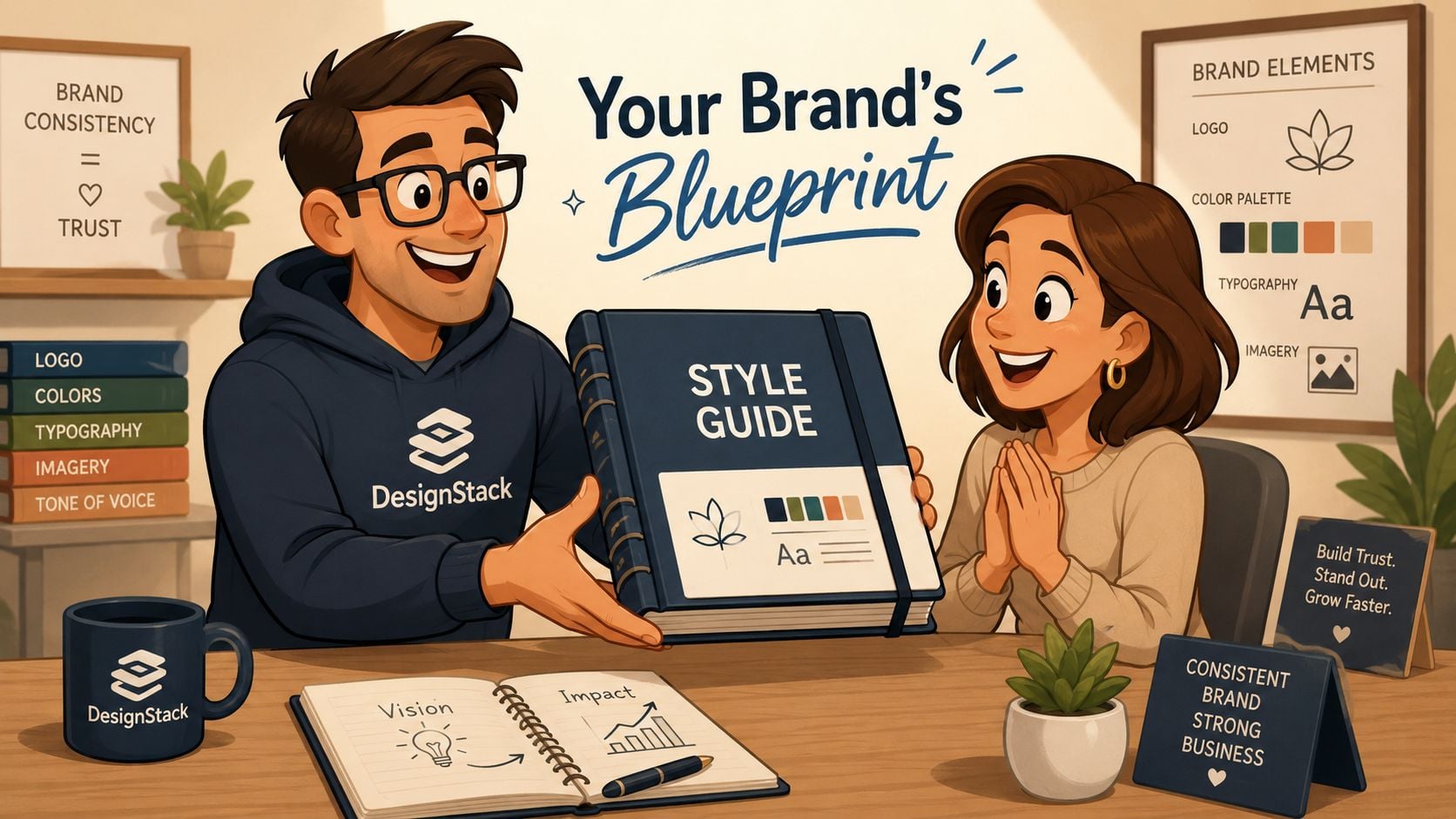
DesignStack is a Dorset-based digital agency with over 20 years of industry experience, helping businesses create stronger brands through web design, branding and graphic design. If you want a partner that can turn loose ideas into a polished, practical rulebook, their brand identity design services are a strong place to start.
Whether you're refreshing an existing identity or building one from scratch, the goal is the same. Give your business clear standards that make every touchpoint feel intentional.
If your brand feels inconsistent, outdated or hard to manage, DesignStack can help you turn it into a clear, professional system that works online and in print. Explore their portfolio, see how they approach branding and web design, and get in touch to discuss a style guide that fits your business.


Leave a Reply