Brand Identity Development: A UK Business Guide for 2026
A lot of business owners arrive at the same point for the same reason. The work has improved, the company has grown, the service is sharper than it was a few years ago, but the brand still looks and sounds like a placeholder. The website feels dated, the logo no longer fits, social posts look inconsistent, and sales materials vary depending on who made them.
That gap causes real friction. Prospects hesitate, existing customers get mixed signals, and the business starts to look less established than it is. Brand identity development fixes that, but only when it's treated as a business process rather than a cosmetic refresh.
What Strong Brand Identity Really Means for Your Business
Strong brand identity isn't just the logo in your header or the colours on your van. It's the full system customers experience when they move from your website to your proposal, from your packaging to your email footer, from your signage to your social content.
When that system is coherent, buyers feel more confident. They assume the business is organised, reliable, and established. When it's inconsistent, they notice the mismatch even if they can't explain it. In the UK, 68% of companies reported revenue increases of 10-20% directly attributable to maintaining brand consistency across their marketing efforts, according to UK branding statistics compiled by Marketing LTB.
What customers actually read from your brand
Most buyers don't study your brand in a formal way. They read it fast.
They notice whether your website looks current. They notice whether your printed materials match your digital presence. They notice whether your tone sounds confident on one page and awkward on another. Those signals shape trust before a sales conversation has even started.
For a Dorset retailer, that might show up as poor shelf impact, weak signage, and product photography that doesn't match the quality of the actual shop. For a Weymouth professional services firm, it might be a polished service offer wrapped in generic templates and inconsistent messaging. The service may be excellent. The identity still creates doubt.
Practical rule: If your business has changed but your branding hasn't, customers are buying through unnecessary uncertainty.
Strong identity is a commercial asset
A good brand identity does four things at once:
- Builds recognition: People remember what looks and sounds consistent.
- Signals quality: Professional presentation reduces perceived risk.
- Supports pricing: A coherent brand helps buyers understand why you charge what you charge.
- Improves decision-making: Your team has clearer standards for content, design, sales material, and rollout.
That last point matters more than most businesses expect. Brand identity development should make day-to-day decisions easier, not harder. It should help staff know how to write a page, choose an image, format a flyer, brief a photographer, or approve a social graphic without reinventing the brand each time.
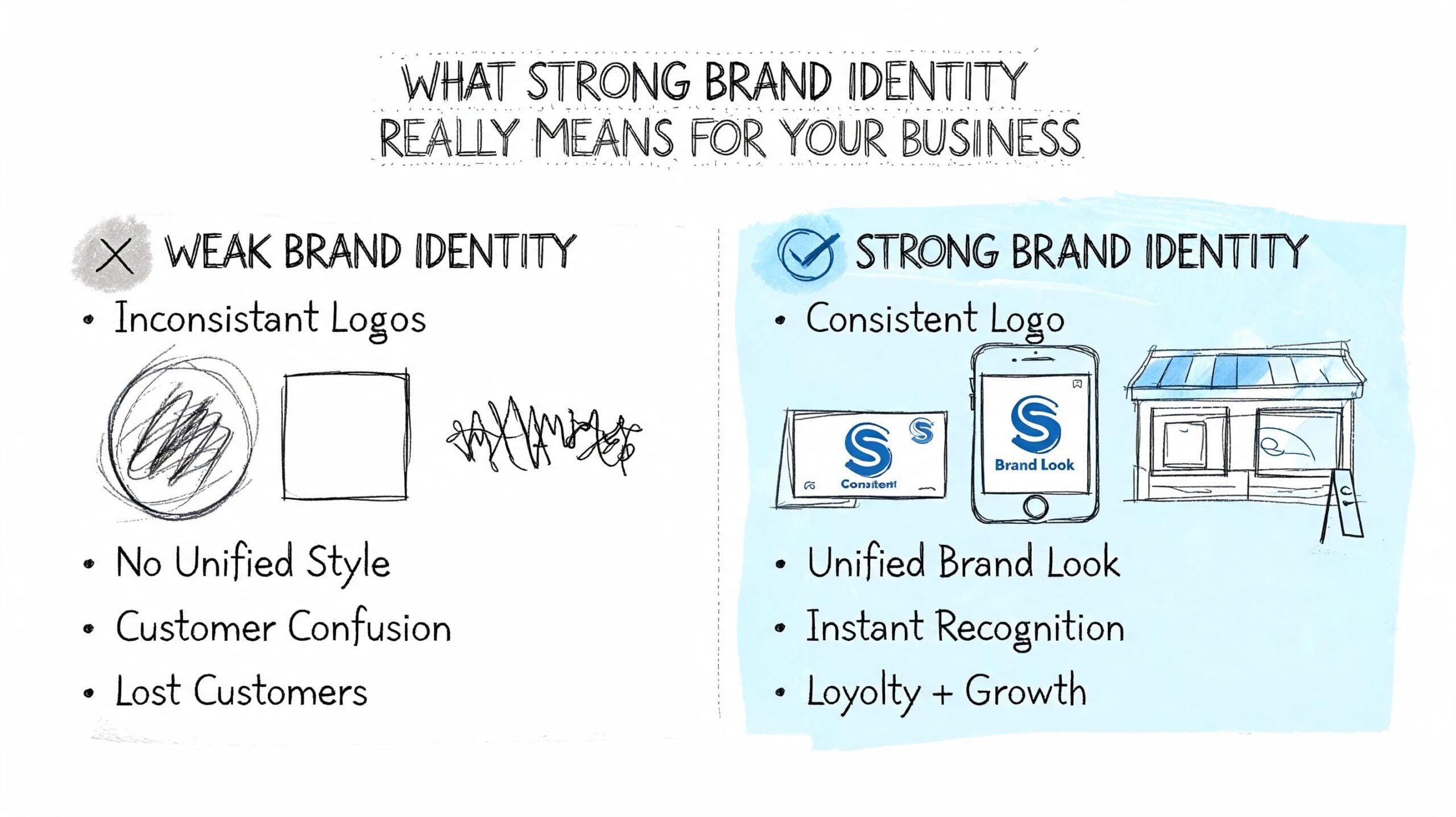
What weak identity usually looks like
Weak branding rarely means a business has no identity. It usually means the identity has formed by accident.
That often includes:
- A logo doing too much: The mark is expected to carry the whole brand.
- No visual system: Colours, fonts, and image styles change from channel to channel.
- No voice rules: Website copy sounds formal, Instagram sounds casual, and emails sound like neither.
- No clear positioning: The business describes what it does, but not why someone should choose it.
Brand identity development is the process of fixing that. It turns scattered assets and mixed signals into a system people can recognise, trust, and remember.
Uncovering Your Brand's Core Before a Single Design is Drawn
The most expensive mistake in branding is starting with visuals too early. Businesses often ask for a new logo when the underlying issue is that they haven't defined who they serve, what they stand for, or how they're different from the firm down the road.
The better route is to do the strategy work first. A practical way to handle that is the first half of the Double Diamond model. Discover, then define. Agencies using that iterative process achieve 28% higher client retention rates, while skipping the discovery phase leads to a 41% project misalignment rate, according to Dash branding statistics citing UK Design Economy data.
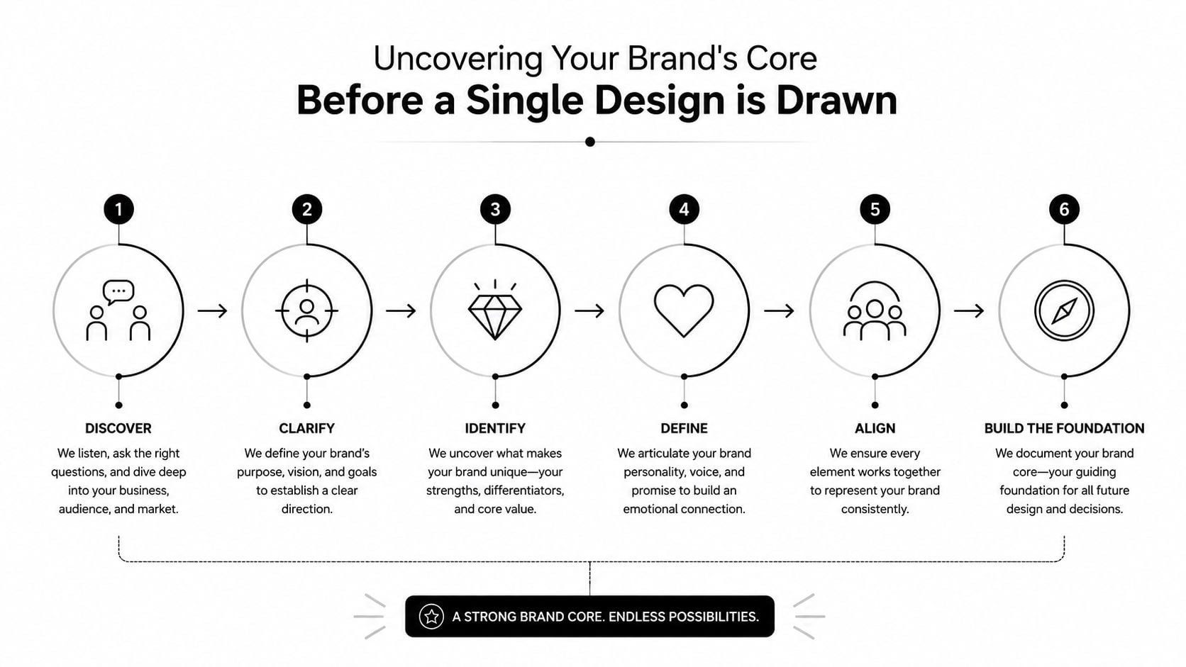
Discover what the business really stands for
Discovery isn't a branding workshop full of vague words on sticky notes. Done properly, it's an audit of reality.
Start with the business itself. Look at where revenue comes from, which services have the strongest margin, what customers praise, what they misunderstand, and where the sales process slows down. That gives you a clearer view of what the brand needs to support.
Then look outward.
A practical discovery checklist
- Interview customers: Ask why they chose you, what nearly stopped them buying, and how they'd describe you to someone else.
- Review competitors: Compare websites, visual style, offers, language, and market positioning. Don't copy. Find the pattern you need to avoid.
- Audit touchpoints: Check your website, proposals, signage, social profiles, email templates, packaging, and printed material.
- Talk to the team: Staff often know where the brand feels unclear long before leadership does.
- Identify decision drivers: Pin down whether customers buy on trust, speed, expertise, value, convenience, or a mix.
A Dorset trade business might discover that customers choose them because they communicate clearly and show up when they say they will. A local eCommerce brand might find that buyers care most about product confidence and a straightforward returns experience. Those are brand inputs, not just operational notes.
Good brand strategy doesn't invent a personality. It identifies the most credible version of what's already true and makes it easier to recognise.
Define the position before you define the visuals
Once discovery is done, the next step is definition. At this stage, many businesses drift into generic language. They say they're professional, friendly, trusted, quality-led. So does everyone else.
Useful brand definition is sharper than that. It should answer a few hard questions:
| Question | What a useful answer sounds like |
|---|---|
| Who are we for? | Specific customer groups, not “everyone” |
| What problem do we solve? | A practical issue the customer feels |
| Why choose us over alternatives? | A clear advantage, not a slogan |
| What do we want to be known for? | One or two memorable ideas |
| What shouldn't we sound or look like? | Boundaries that stop drift |
Here, your unique value proposition gets written in plain English. Not as an internal mantra, but as something that can shape copy, sales material, service pages, and design choices.
What works and what usually fails
What works is clarity. What fails is abstraction.
A useful brand core is specific enough that a designer can build from it and a copywriter can write from it. If your positioning can apply to ten competitors in the same postcode, it isn't finished.
For SMEs, that's often the difference between a rebrand that sharpens the whole business and one that produces a nice-looking logo with no commercial traction.
Building Your Brand's Look and Voice
Once the strategy is clear, the visible and verbal parts of the brand can be built properly. Many often jump to these elements first, but the work improves dramatically when the earlier thinking is done.
Customers read visual cues fast. According to UK branding data from Canny Creative, UK consumers are 81% more likely to recall a brand by its signature colour than its name, and a strong logo can boost brand recognition by up to 80%, with first impressions forming in 0.05 seconds. That doesn't mean colour or logo matter in isolation. It means the choices need to be deliberate.
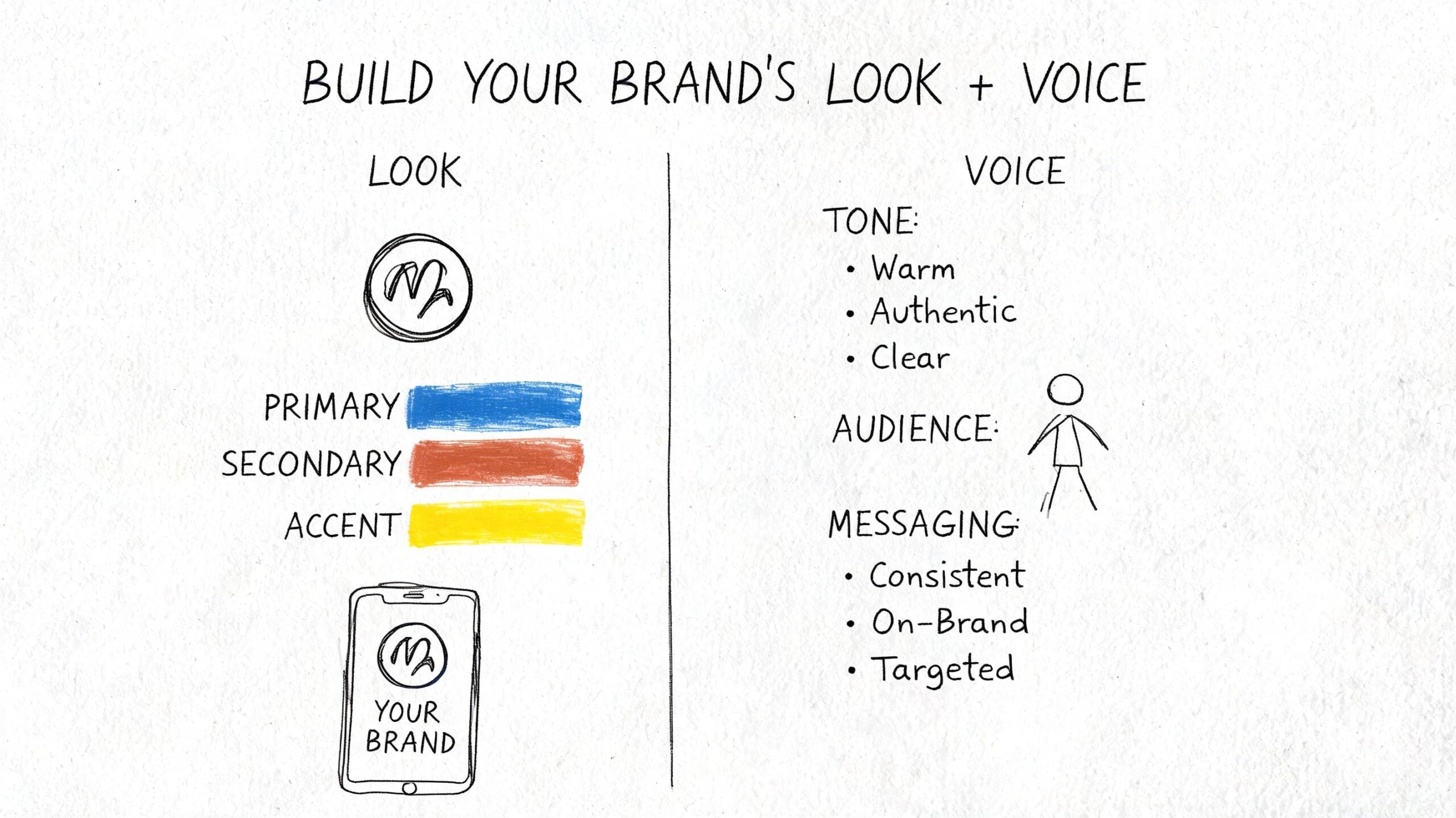
Build the visual system first
A visual identity should work as a system, not a collection of nice assets.
The logo is one component. It needs to function across a website header, social profile, packaging label, invoice, embroidered garment, and printed sign. That often means creating more than one version, such as a full logo, a simplified mark, and a stacked format for tighter spaces.
Colour choice needs discipline. One signature colour can do a lot of the memory work, but it needs support from secondary colours that work in digital and print. Choose a palette that holds up on screens, on paper, in signage, and in accessibility checks. If the colours only work in a polished presentation mock-up, they won't survive rollout.
Typography does just as much heavy lifting as colour. A pairing should create contrast without looking unrelated. One font might carry headings with confidence. Another might handle body copy with clarity. The point is consistency and usability, not novelty.
Practical visual decisions to make
- Logo structure: Decide whether you need a wordmark, symbol, or combination mark based on where the brand appears most.
- Primary colour role: Choose the colour that carries recognition, then define where it should and shouldn't dominate.
- Type hierarchy: Set fonts for headings, subheadings, body text, captions, and calls to action.
- Image direction: Define whether photography should feel polished, documentary, technical, warm, minimal, or product-led.
- Graphic devices: Add simple supporting elements like shapes, line treatments, icon styles, or patterns only if they solve a real consistency problem.
For businesses reviewing practical design outputs across print and digital, a service page like DesignStack's graphic design offering gives a useful benchmark for the kinds of assets that need to function together.
Then give the brand a voice people recognise
A lot of businesses spend time on visuals and leave the voice vague. That's a mistake. Buyers don't only see your brand. They read it.
Voice starts with personality, but it has to be translated into writing rules. “Professional but friendly” isn't enough. You need working guidance. Are you the expert who leads from authority, or the guide who simplifies? Are you direct and concise, or more conversational and reassuring? Can you use humour, or does that undermine trust?
Those decisions affect everything:
- Website headlines
- Product descriptions
- Social captions
- Quote emails
- Customer service replies
- Printed brochures
One test: Remove your logo from the page. If the words could belong to any competitor, the voice isn't developed enough.
A local accountant might need a voice that is calm, plain-English, and confidently authoritative. A lifestyle eCommerce brand may need more energy, more sensory language, and shorter punchier lines. Both can be strong. Problems start when tone shifts wildly between channels.
Keep content strategy tied to identity
Voice gets stronger when content has a clear role. If the brand is trying to build authority, trust, and repeat recognition, the content plan can't be random. It should reflect what the business wants to be known for and how customers make decisions.
For a useful example of how messaging themes can be organised around a commercial goal, the BEDHEAD guide to mattress content strategy is worth reading even if you're not in that sector. The value is in how it turns audience insight into a structured plan.
What works in practice
The strongest identities usually share a few traits:
- The logo is flexible, not overworked
- The colours are distinctive but usable
- The typography supports readability
- The image style matches the brand promise
- The voice sounds the same wherever the customer meets it
That combination is what turns branding from decoration into a recognisable commercial tool.
Your Brand Bible Ensuring Consistency Everywhere
Once the identity has been developed, it needs rules. Not vague advice. Actual usage guidance that a marketer, freelancer, printer, web designer, or new team member can follow without guessing.
Brand guidelines prove their worth. UK data shows that 47% of businesses publish off-brand content annually, and that this can erode revenue by as much as 10%, with lack of clear guidelines identified as the main cause in Crowdspring's branding statistics round-up.
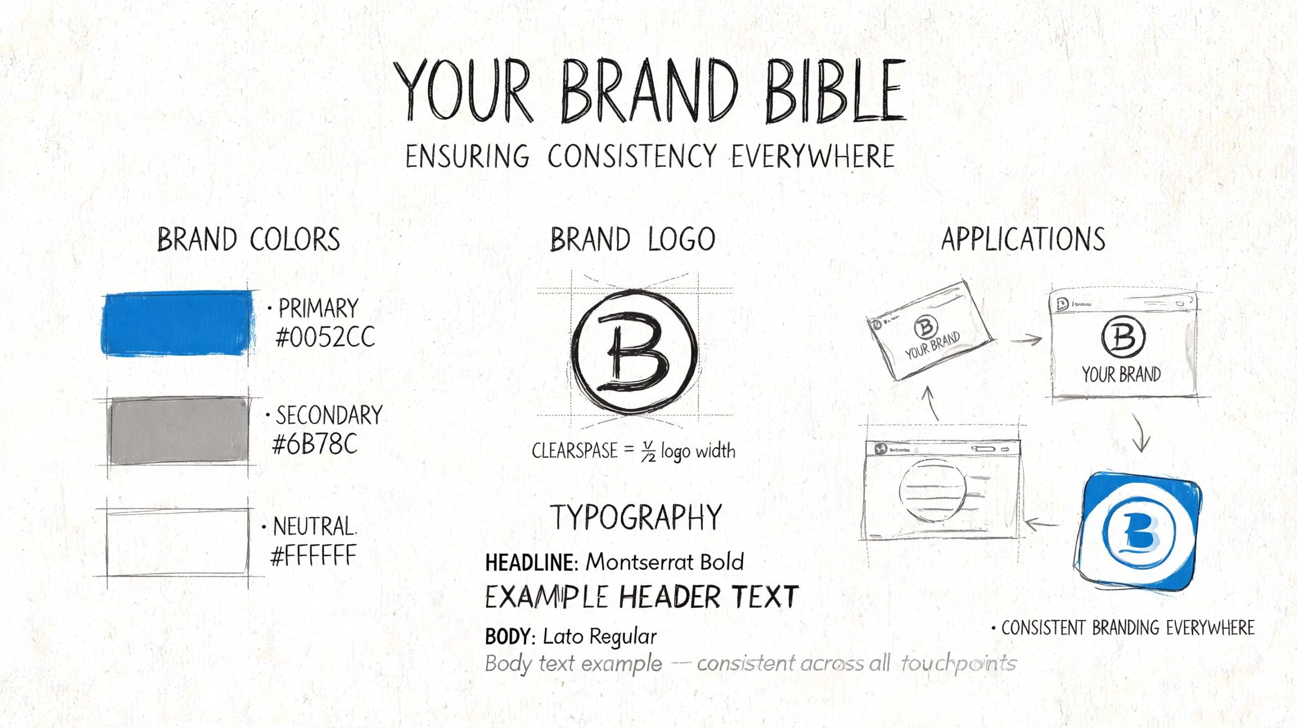
What a useful brand guide must include
A proper brand bible shouldn't be bloated. It should be practical enough that people use it.
Core sections to include
- Logo rules: Show approved versions, minimum sizes, clear space, background control, and examples of incorrect use.
- Colour specifications: List primary and secondary colours with HEX, RGB, and CMYK values so digital and print outputs stay aligned.
- Typography hierarchy: Define headline, subheading, body copy, button text, and caption styles.
- Tone of voice guidance: Include short examples of what on-brand writing sounds like, and what it doesn't.
- Imagery direction: Show the style of photography, illustration, icons, cropping, and composition the brand should use.
- Layout principles: Set basic rules for spacing, alignment, borders, and use of graphic elements.
- Application examples: Include mock-ups for web pages, social graphics, brochures, packaging, proposals, or signage.
Why guidelines protect the investment
Without a guide, every new piece of content becomes a new interpretation of the brand. That's how identity drifts. It rarely happens in one dramatic move. It happens through small inconsistencies repeated over months.
A team member downloads a substitute font. A supplier prints the logo in the wrong colour. A social template gets adjusted to “make it pop”. A sales PDF adopts a different tone because someone was rushing. None of that feels major in isolation. Together, it weakens recognition.
A brand guide should remove uncertainty. If people still have to guess, the document isn't finished.
Keep it usable
The best guidelines are clear enough for non-designers and detailed enough for production work. That means plain language, visual examples, downloadable assets, and a version everyone can access.
For SMEs, a shorter working guide is often more useful than an impressive but ignored presentation deck. The goal isn't to prove that the branding process happened. The goal is to keep the brand coherent after the project ends.
Rolling Out Your New Identity and What to Expect
A new identity only starts delivering value once it's live in the places customers see. That rollout phase is where good projects stay organised and weak ones start to fray.
Most businesses underestimate how many assets need changing. The obvious ones get covered first. The homepage, logo files, social profiles. Then the overlooked items start appearing. Quote templates, invoices, signage, packaging labels, email signatures, staff documents, presentation decks, and directory listings all need attention.
What to audit before launch
A rollout works better when there's a complete asset list before any switch happens.
- Website assets: Homepage, service pages, blog templates, contact pages, favicon, mobile menus, and forms.
- Sales material: Proposals, pitch decks, case study PDFs, rate cards, and brochures.
- Operational items: Invoices, email signatures, document templates, uniforms, vehicle graphics, and internal forms.
- Public profiles: Google Business Profile, LinkedIn, Instagram, Facebook, marketplace listings, and directory entries.
- Physical touchpoints: Signage, menus, packaging, labels, exhibition materials, and print collateral.
If the project includes a website refresh alongside the rebrand, this broader planning matters even more. A practical reference point is this guide to finding a website designer who understands your vision, because identity rollout and website delivery often rise or fall on the same things: clarity, process, and shared expectations.
Typical project stages and timelines
Exact timing depends on complexity, stakeholder availability, and how much existing material needs replacing. Still, most brand identity development projects follow a recognisable pattern.
| Phase | Typical Timeline | Key Deliverables |
|---|---|---|
| Discovery and audit | Several working sessions over the opening stage of the project | Stakeholder input, audience insight, competitor review, asset audit |
| Brand strategy definition | Short focused phase after discovery | Positioning, value proposition, brand attributes, messaging direction |
| Creative development | Iterative design phase | Logo routes, colour palette, typography, imagery direction, voice principles |
| Refinement and approval | Review cycle with feedback | Selected concept, amendments, approved master identity |
| Guidelines production | Finalisation stage | Brand guide, asset pack, usage rules, file organisation |
| Rollout and implementation | Planned handover and launch phase | Website updates, templates, social assets, print-ready files, launch checklist |
What affects cost and effort
Branding costs vary because project scope varies. A startup needing naming, identity, packaging, and website support is solving a different problem from a mature local firm that needs a cleaner identity system and updated guidelines.
The biggest cost drivers are usually:
- How much strategy is required
- How many stakeholders need sign-off
- How many applications need designing
- Whether copywriting is included
- Whether website work and print production sit inside the same project
- How much legacy material needs updating
What helps clients most is predictability. Fixed-cost models are useful because they reduce uncertainty, and structured review points keep projects moving. Three design revisions as standard is a practical way to keep feedback disciplined while still allowing the identity to develop properly.
A brand project goes off track when feedback is loose, decision-makers change the brief halfway through, or rollout is treated as an afterthought.
What a smooth rollout looks like
A smooth rollout is usually quiet. Nothing dramatic happens because the planning was done early.
Customers see a sharper website, cleaner documents, more consistent social content, and a brand that finally feels joined up. Staff stop improvising. Suppliers have the right files. The business looks more settled, which often makes selling easier.
Making Your Brand Identity a Living Asset
A finished brand identity isn't the end of the job. It's the point where the business has a working system it can start using properly.
That matters because brands don't stay static. Services evolve, teams change, customer expectations shift, and new channels appear. A good identity should be stable enough to stay recognisable and flexible enough to adapt without losing itself.
What long-term stewardship looks like
The businesses that get the most from brand identity development usually do a few things consistently.
- They review touchpoints regularly: Website pages, proposals, packaging, social templates, and sales material are checked rather than left to drift.
- They train people on the basics: New staff, freelancers, and suppliers know how the brand should look and sound.
- They update with intent: Changes happen because the business has evolved, not because someone got bored with the logo.
- They keep strategy connected to execution: Messaging, campaigns, design work, and customer experience still point back to the same core positioning.
A brand becomes more valuable when it's used consistently over time. Repetition builds recognition. Recognition supports trust. Trust makes future marketing work harder.
What this means for a growing SME
For a Dorset business, this often shows up in practical ways. A clearer identity helps a local company look more credible when pitching outside the area. It helps a retailer unify in-store and online presentation. It helps a service business sound more assured across its website, proposals, and follow-up emails.
If you want to see how a brand can extend cleanly into product presentation, this branded cans portfolio example is a useful reference for how identity decisions carry through into real-world application.
The key point is simple. Brand identity development should leave you with more than a logo pack. It should give you a clearer position, better tools, stronger consistency, and a system your business can effectively use.
If your current branding no longer matches the quality of the business behind it, that gap won't close on its own.
If you're ready to tighten your positioning, modernise your visual identity, and roll out a brand that works across web, print, and day-to-day sales material, DesignStack is a practical place to start. A no-obligation conversation can help you assess what needs changing, what should stay, and how to approach the project with clear scope and realistic expectations.
Leave a Reply