

How to Write an About Us Page That Connects
You’re probably staring at a blank About Us page right now, wondering how to write something that sounds credible without sounding like every other business in your sector. Most owners start with the same material: when the business began, a short founder bio, maybe a few values words like “quality” and “service”, then they stop because it all feels flat.
That’s the problem. An About Us page isn’t just a background page. It’s where a potential customer decides whether your business feels trustworthy, capable and easy to work with. For local and regional firms, that decision often happens before they ever enquire.
If you want to know how to write an about us page that helps win work, treat it like a sales page with a human voice. It should build trust, answer the quiet questions visitors have, and give them a clear next step. The strongest versions don’t try to impress everyone. They make the right people feel they’ve found the right business.
Why Your About Us Page Is Your Most Important Sales Tool
Most About Us pages fail because they read like a company record. They list dates, achievements and broad claims, but they don’t answer what the visitor is really asking.
Those questions are usually simple:
- Can I trust you
- Do you understand businesses like mine
- Are you established enough to deliver
- Will working with you be straightforward
- Why should I choose you over the next option in Google
Your homepage introduces you. Your services page explains what you offer. Your About Us page closes the trust gap between those two.
What visitors are actually looking for
When someone clicks About, they’re rarely looking for a full corporate history. They’re checking the people behind the business, the way you think, and whether your approach feels solid. That matters even more for service businesses, local retailers, consultants, trades, agencies and membership organisations, where the decision often comes down to confidence.
Practical rule: If your About Us page only tells your story, it’s unfinished. It also needs to tell the reader why your story makes you a safer choice.
A good About page does quiet sales work. It reassures the cautious buyer. It gives shape to your experience. It explains your standards without sounding defensive. It also makes your business feel real.
What works and what does not
Here’s the trade-off. If you make the page too personal, it can feel lightweight. If you make it too corporate, it becomes forgettable. The strongest page sits in the middle. It has personality, but it’s still commercially useful.
A weak page often includes:
| Common mistake | Why it underperforms |
|---|---|
| Generic opening line | It could belong to any company |
| Long timeline | It asks the reader to care too early |
| Empty value statements | Words like “integrity” mean little without proof |
| No team presence | Visitors can’t picture who they’ll deal with |
| No call to action | Trust builds, then the page goes nowhere |
A strong page gives the visitor enough detail to believe you, enough personality to remember you, and enough direction to act.
The Essential Elements of an Effective About Us Page
You don’t need a complicated formula, but you do need the right parts in the right order. If the page feels muddled, visitors work too hard to understand you.
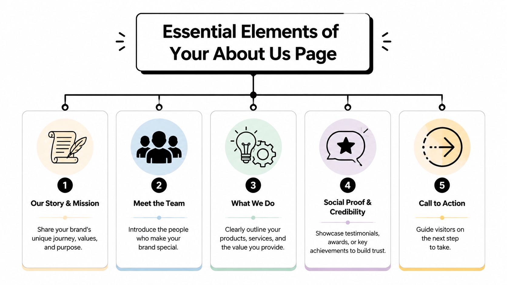
The five building blocks
A clear hero statement
This is the first thing people see. It should say who you help, what you do, and what kind of result or experience you’re known for. Skip slogans that sound clever but explain nothing.
Better:
“We design WordPress websites for Dorset businesses that want a clearer brand and more enquiries.”Worse:
“Passionate digital innovation for a changing world.”A brand story with a point
Your story needs direction. Don’t just describe how the business started. Explain why it exists, what problem you noticed, and what approach you take because of that experience.
Good story writing moves quickly from background to relevance. The reader shouldn’t have to dig for the part that matters to them.
A team section that makes you feel real
People hire people. Even if you’re a small business, show the faces behind the work. Add names, roles and short bios that explain what each person brings.
If you’re a solo founder, don’t pad this out. One strong profile beats three vague paragraphs.
A short, confident bio does more trust-building than a long paragraph full of buzzwords.
Trust signals that support your claims
If you say you’re experienced, show what that means. If you say clients value your service, back it up with testimonials, recognisable client names, certifications, awards, associations, years trading, or examples of sectors you serve.
Don’t dump everything into one carousel. Place trust signals beside the claims they support.
A clear call to action
Once someone feels reassured, tell them what to do next. That might be to contact you, request a quote, book a consultation, or view relevant work. Keep it direct.
How the pieces fit together
An effective page usually follows a simple reading flow:
- Open with clarity
- Build connection through story
- Reinforce credibility with people and proof
- End with a next step
That sequence matters. Visitors need context before detail, and proof before commitment.
For inspiration, look at the story behind Andy Barker Photography. It’s a useful example of an About page that feels personal without losing professionalism. You get a sense of the person, the perspective and the work style, which is exactly what a service-based About page should do.
A quick structure you can adapt
Use this as a starting point:
- Headline: what you do and who you help
- Short intro: what makes your approach different
- Story section: how the business started and why that matters
- Team section: who does the work
- Proof section: testimonials, recognisable clients, credentials or examples
- CTA: one clear action
If your page is missing one of those, it usually feels either vague or unfinished.
Finding Your Voice and Telling a Compelling Brand Story
The most persuasive About Us pages don’t sound polished in a generic way. They sound specific. You can tell there’s a real business behind them, with a clear standard, a point of view and a recognisable way of working.
That matters for local and regional companies more than most advice admits. UK SMEs represent 99.9% of all private sector businesses, yet much of the advice around About pages doesn’t deal with the core tension small firms face: how to sound rooted in a place without sounding limited by it, as noted in this discussion of standout About pages and local positioning.
Local doesn’t mean small-minded
A lot of Dorset, Weymouth, Portland and regional UK businesses make the same mistake. They remove local references because they’re worried they’ll appear too small. So they replace something credible and distinctive with bland national-sounding copy.
That usually weakens the page.
If your location shapes your understanding of customers, your service model, your response times, your community presence or your reputation, say so. Local detail becomes a strength when it signals closeness, accountability and experience in a defined market.
Compare these two versions:
| Version | Effect |
|---|---|
| “We work with businesses across the UK.” | Broad, but generic |
| “We help Dorset businesses build websites that reflect the quality of their work and make it easier for customers to enquire.” | Focused, more believable |
The second version doesn’t trap you in one geography. It shows where your expertise is grounded.
Write like a person with standards
Voice isn’t about being quirky. It’s about sounding like the kind of business you are. A solicitor’s firm, an artisan retailer, a membership group and a web agency shouldn’t all write the same way.
Use this filter when reviewing your copy:
- Would you say this to a client
- Does this sound like your business, not a template
- Is the claim specific enough to believe
- Does the sentence help someone decide whether to trust you
If the answer is no, rewrite it.
Your story earns attention when it explains your judgement, not just your history.
What to include in your brand story
A strong About story often answers four things:
Where you started
Keep this brief. One or two sentences usually does it.What you noticed
This is the turning point. Maybe clients kept getting templated service, poor communication or weak design.What you decided to do differently
This is the commercial heart of the story. It explains your method and priorities.Who you work best with now
This helps qualify enquiries without sounding exclusionary.
You can also borrow structure from other creative businesses that present identity through a specific lens. For example, a curated piece on South African wall art talent shows how place, perspective and creative identity can be framed as strengths rather than constraints. That same principle works for local business storytelling. Specificity gives your page texture.
A useful voice test
Read your About page out loud. The awkward bits reveal themselves fast. Sentences that look polished on screen often sound evasive or inflated when spoken.
If a line sounds like marketing copy rather than something a confident business owner would say, tighten it. Plain language nearly always wins.
Applying Technical Polish with SEO and Accessibility
A good About Us page should be easy to find, easy to scan and easy to use. Strong writing can still underperform if the page has poor structure, weak metadata or inaccessible images.
The on-page essentials
Use a simple checklist before you publish:
Choose one primary phrase
If this page targets “how to write an about us page”, use that naturally in the title, one heading, and the body copy. Don’t repeat it mechanically. Search engines can tell when copy is written for algorithms instead of people.Write a useful meta title and description
These shape how your page appears in search results. Keep the title clear and the description benefit-led. Think less “brand statement”, more “why click this result”.Use headings in the right order
Your page should have one main page title, then logical H2 and H3 headings beneath it. That helps readers scan and helps search engines understand the page structure.Name image files sensibly
Before uploading team photos or office shots, rename files to something descriptive. That’s better for organisation and can support visibility.
Accessibility is part of quality
Accessibility isn’t a separate task for later. It’s part of building a page that more people can use.
Check these points:
Add alt text to meaningful images
Team photos, office photos and brand visuals should have concise alt text that describes what’s in the image and why it matters.Make text easy to read
Use enough contrast between text and background. Light grey text on white might look elegant, but it often reads badly.Avoid image-only headings
If key messages are embedded in graphics, some users and search engines may miss them.Use descriptive link text
“Learn about our SEO process” is better than “click here”. If you need support with the search side of your site, DesignStack also outlines its search engine optimisation service in plain terms.
If a visitor has to pinch, squint, guess or hunt, the page is doing extra work for no gain.
Technical polish without overcomplicating it
You don’t need a giant SEO checklist for an About page. You need the basics done well. Clean headings, readable copy, meaningful image text, and a sensible keyword focus are usually enough to make the page stronger.
The goal isn’t to force this page to rank for everything. The goal is to make sure your credibility page is visible, understandable and usable when people land on it.
Building and Measuring Your Page in WordPress
WordPress makes About pages easy to build badly. The block editor gives you plenty of flexibility, but it also makes it easy to pile in text, random spacers and mismatched image blocks until the page feels cluttered.
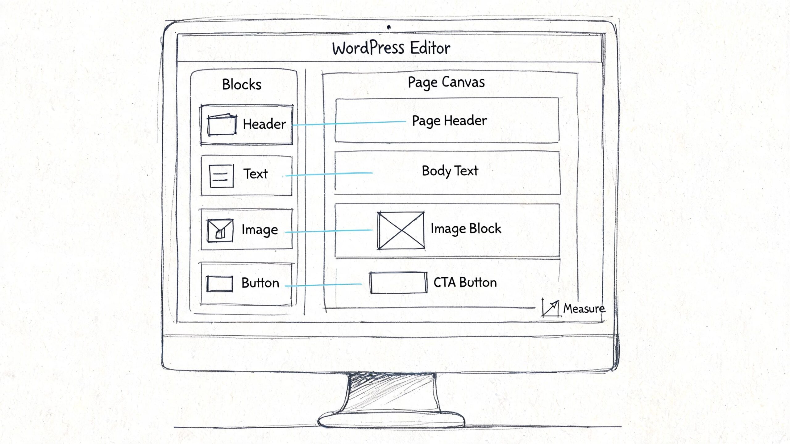
A better approach is to build the page in sections. Think in vertical slices: hero, story, team, proof, CTA. That gives the layout rhythm and makes the page easier to edit later.
A practical WordPress layout
Use the block editor with restraint. Most About pages only need a handful of block types:
- Group blocks to separate sections cleanly
- Heading and paragraph blocks for readable structure
- Image blocks for team photos or workspace imagery
- Columns for short bios or trust signals
- Buttons for the final call to action
- Quote blocks for selected testimonials
If you start adding sliders, animated counters and stacked accordions, the page often feels less trustworthy, not more.
For plugin support and layout enhancements, a practical roundup like these WordPress plugin recommendations can help you decide what’s useful and what’s unnecessary.
What to measure after publishing
This is the part most About page guides miss. Much of the existing advice focuses on what to write, but not how to test whether it works. Businesses often lack a framework for measuring engagement, comparing narrative styles, or seeing which trust signals lead to better enquiries, as noted in Squarespace’s overview of About page guidance.
Start by tracking behaviour that tells you whether the page is doing its job:
| What to watch | What it can tell you |
|---|---|
| Time on page | Whether visitors are engaging with the story |
| Scroll depth | Whether they reach your team, proof and CTA sections |
| Exit behaviour | Whether the page is a dead end |
| Contact form submissions from About page traffic | Whether trust is turning into action |
| Clicks on CTA buttons | Whether your next step is clear enough |
What to test
You don’t need a complex experimentation programme. Test one narrative angle at a time.
For example:
- Founder-led version with a personal story near the top
- Team-led version that foregrounds people and roles
- Values-led version that focuses on approach and standards
- Local expertise version that leans into place and sector knowledge
You can also test different trust signals. One version may lead with years of experience. Another may lead with client examples or testimonials. The key is to change one important variable at a time so you can learn something useful.
Your Pre-Launch Checklist and Common Mistakes to Avoid
Before you publish, give the page one final review. Most weak About pages aren’t ruined by one major flaw. They’re weakened by a series of small misses.
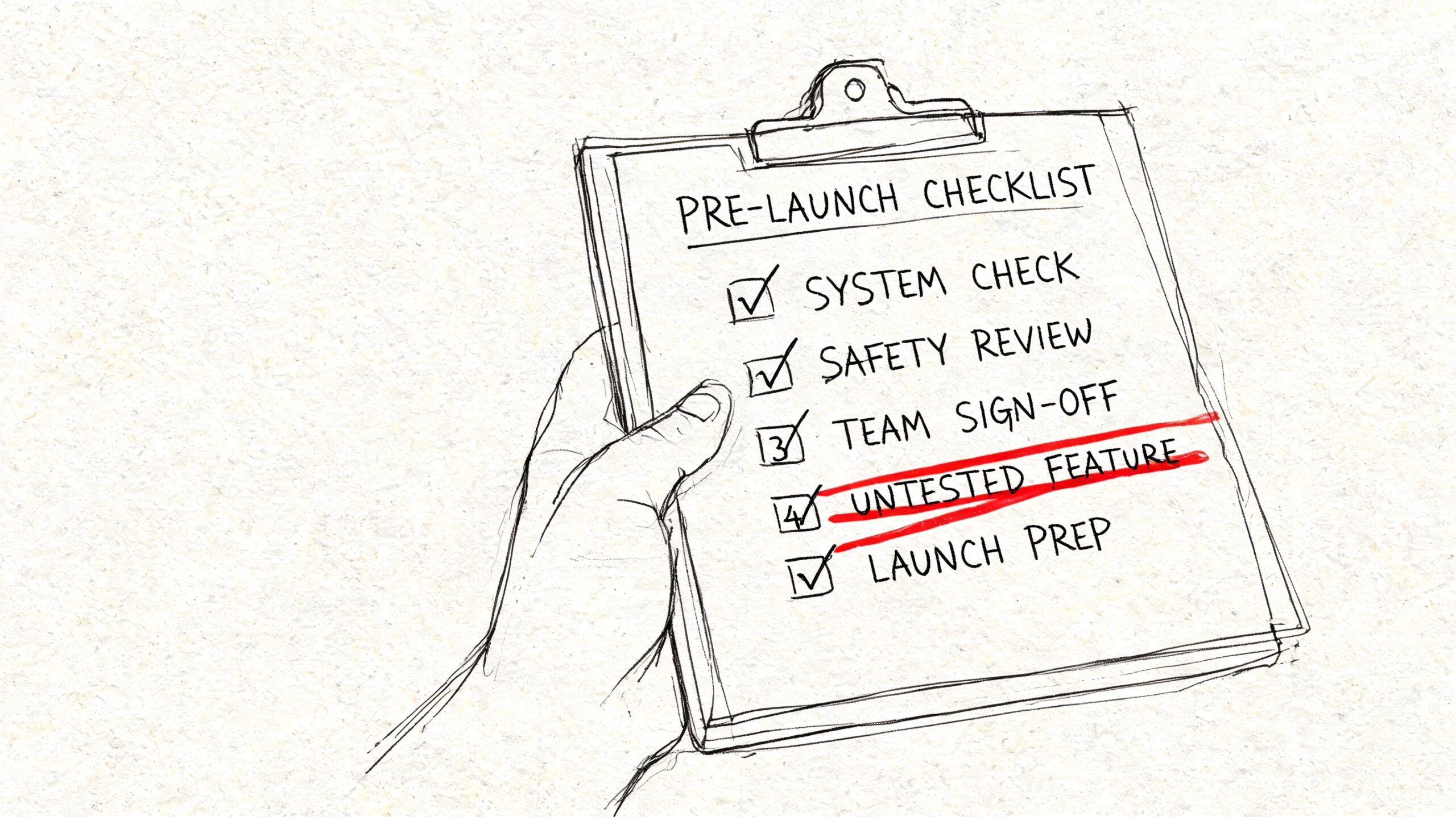
Pre-launch checklist
Run through this list:
Headline is clear
A visitor should understand who you help and what you do within seconds.Story has relevance
Your background should connect to your approach, not sit there as trivia.People are visible
Add real names, roles and photos where appropriate.Proof is placed near claims
Don’t make people search for reasons to believe you.CTA is obvious
The next step should be easy to spot and easy to take.Mobile layout is clean
Check spacing, image crops, button size and text flow on a phone.Tracking is set up
If you want to assess performance properly, review your measurement setup in this Google Analytics 4 guide.
Mistakes worth catching early
Some issues show up again and again:
Making it all about you
Visitors care about your story because they want to know what it means for them.Trying to sound bigger than you are
Forced corporate language usually lowers trust.Hiding the page
If About is buried in a footer, fewer people will use it to build confidence.Writing without proof
Claims without evidence feel thin.Ending without direction
A page that builds trust but asks for nothing wastes momentum.
The best About Us page doesn’t try to impress everyone. It helps the right visitor decide, “Yes, these are my people.”
If your current About page feels generic, underwritten or disconnected from the rest of your site, DesignStack can help shape the copy, structure and WordPress build so the page does its real job: building trust and turning interest into enquiries.
Leave a Reply