

What Is Call to Action: A Complete Guide for 2026
You've probably had this experience. A person finds your Dorset business website, scans the homepage, reads a few nice testimonials, and then leaves without phoning, booking, buying, or filling in the form. The site looked tidy, but it never clearly asked for the next step.
That missing nudge is the heart of what is call to action. A call to action is the specific word, button, link, or prompt that tells a visitor what to do next in a digital journey, whether that's book, request a quote, start checkout, or continue. In UK web design, it sits right where copywriting, layout, and conversion meet, which is why it matters on WordPress sites just as much as on big national platforms.
For public-facing digital services, the logic is simple. GOV.UK's service design approach treats CTAs as task-focused prompts that help people complete actions, not decorative extras, and the platform's long-standing task-first model helped turn clear action wording into an expectation across UK content. That same mindset is useful for small businesses, especially when the website has to work on phones, meet accessibility expectations, and make sense to people who are busy, distracted, or unsure what to do next.
Table of Contents
- The Moment a Visitor Becomes a Customer
- The Four Building Blocks of Every Effective CTA
- Common CTA Types and Where They Belong
- Design and Copy Rules That Actually Move the Needle
- Real CTA Examples for Service Businesses and Online Shops
- Measuring CTA Performance and Running Simple A B Tests
- Your WordPress CTA Implementation Checklist
The Moment a Visitor Becomes a Customer
A visitor doesn't become a customer because they admired your branding for a few seconds. They become a customer when the page gives them a clear next move, and they take it. If that move is missing, they can like your work and still disappear without a trace.
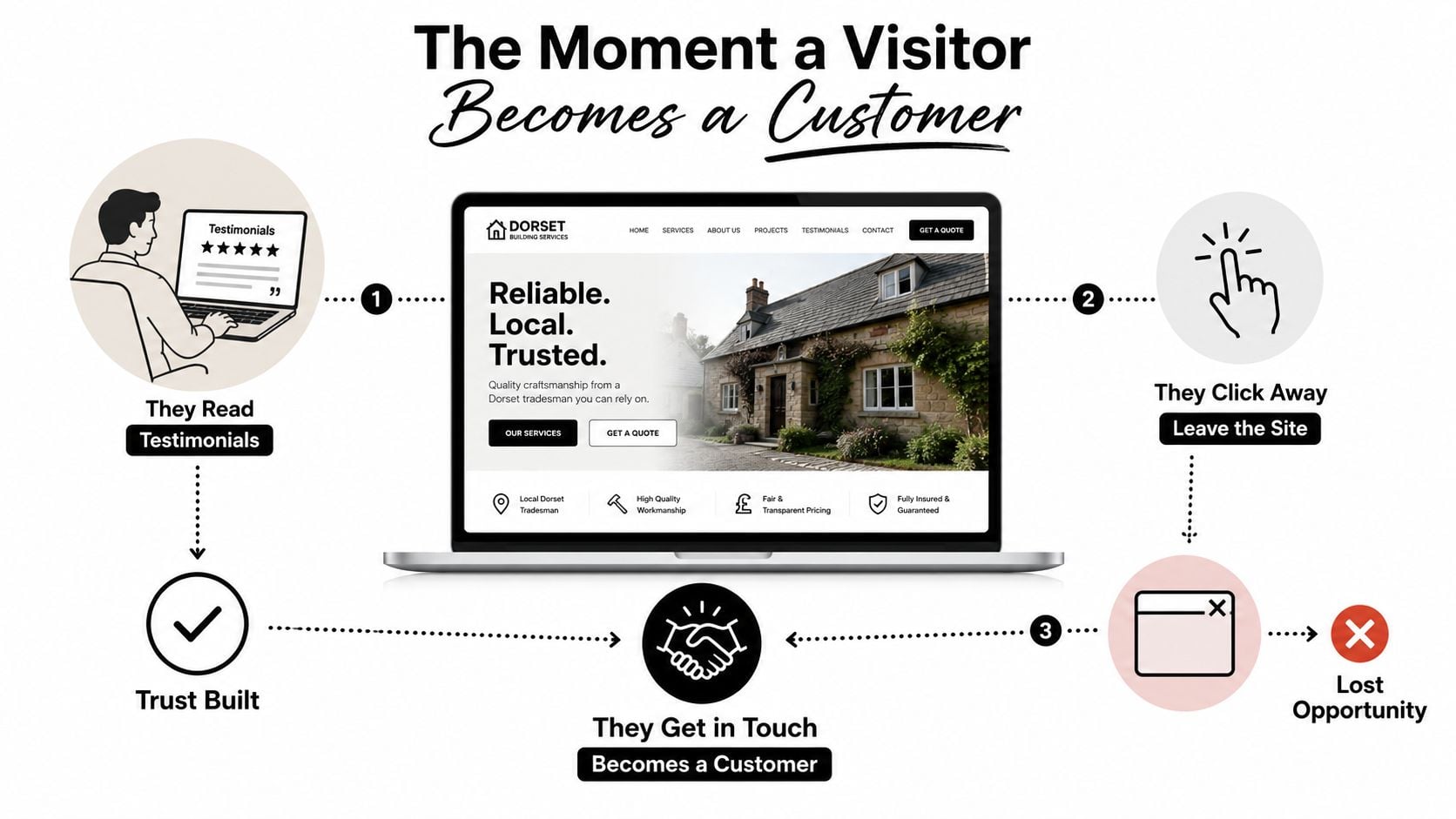
A call to action, or CTA, is the moment the website stops behaving like a brochure and starts behaving like a guide. It might be a button that says Book a call, a link that says Read the pricing, or a form prompt that says Request a quote. The important part is not the colour of the button, it's the clarity of the next step.
Why the phrase matters in practice
On a Dorset tradesman's site, the homepage may do a good job of building trust. It can show services, photos, reviews, and years of experience. But if the page never asks the visitor to act, the effort ends in a dead end.
That is why CTA design sits at the intersection of design, copywriting, and conversion control. The button isn't decoration, it's the part that helps someone move from interest to action. For a service site, the best CTA usually matches one page and one intention, which is the same principle used in task-led content design on the public web.
A simple way to think about it is this. The visitor arrives with a question in mind. Your CTA answers that question with a next step, not with more noise.
For a useful customer-path view, a lot of businesses also map the journey visually before changing the button text. If that's new to you, a customer journey map can help you see where people drop off and where a CTA should appear, as outlined in customer journey mapping guidance.
What a CTA is not
A CTA isn't just a button shape. It isn't every link on the page. It isn't a random “click here” label tucked into the footer.
Practical rule: if the visitor could read the page and still not know what to do next, the CTA is too weak or too hidden.
That's the reason this topic matters so much for small businesses. On a WordPress site, one clear prompt can do more useful work than a homepage full of vague invitations. It also sets up the rest of the design decisions, because once the next action is clear, placement, visual treatment, and friction become much easier to judge.
The Four Building Blocks of Every Effective CTA
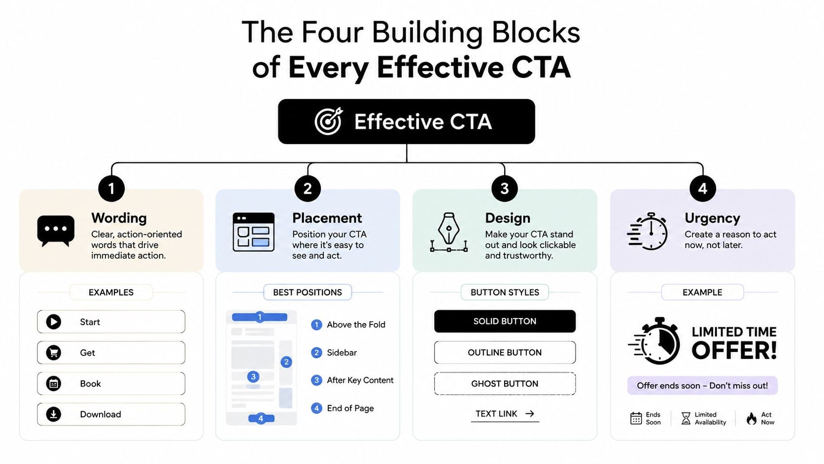
A CTA works when four things line up. The wording has to make sense, the placement has to fit the page, the design has to stand out without shouting, and the amount of effort required has to feel reasonable. Miss one of those and the whole thing gets weaker.
Wording that tells people exactly what happens next
Good CTA copy uses a verb that feels immediate. Book, start, download, get, and request all make the next action obvious. By contrast, vague labels such as “submit” or “click here” force people to guess.
That guesswork matters more on a small business website than many owners realise. If the page is about plumbing, accounting, or eCommerce products, the CTA should sound like the page itself. The wording should match the user's intent, which is why a service page often needs a different CTA from a blog post or product page.
If you're refining the benefit statement around the button, it helps to tighten the wider page message first. A clear value proposition makes the CTA easier to understand, which is why this pairs naturally with writing a strong unique value proposition.
Placement that appears at the right moment
A CTA placed too early feels pushy. A CTA placed too late feels absent. The best spot usually comes after the visitor has seen enough evidence to feel ready.
Imagine a shop assistant. If they jump in at the door, it's annoying. If they appear once you've looked around and shown interest, they're helpful. That same timing logic works on a homepage, a service page, and a landing page.
Design that supports the decision
Button size, contrast, whitespace, and spacing all matter. A CTA should look like the thing to press, not one more link in a crowded paragraph. On mobile, it also has to be easy to tap without zooming or mis-hitting nearby text.
If you want a deeper look at form-heavy CTAs and button optimisation, improve form CTA with Orbit AI is a useful resource because it focuses on the mechanics around the action, not just the words on the button.
Friction that respects the user's effort
Every extra field, click, or decision adds friction. A quote form with ten fields asks for more commitment than a booking form with three. That doesn't mean short is always better, it means the effort should match the value of the next step.
Shorter pathways work best when the page has already earned trust.
That's the core trade-off. The CTA should make the next action feel easy enough to attempt, but specific enough to matter. If it asks for too much too soon, people back away. If it asks for too little, it may not move the visitor forward at all.
Common CTA Types and Where They Belong
Different pages need different jobs from their CTAs. A homepage is not trying to do the same thing as a product page, and a blog post is not trying to do the same thing as a checkout page. Once you sort CTAs by purpose, the choices become much easier.
Lead capture and sales CTAs
A lead capture CTA asks for contact details or a conversation. Typical examples are Request a quote, Book a call, and Get in touch. These fit service pages, contact pages, and high-intent landing pages, where the visitor has already shown enough interest to start a conversation.
A transaction CTA asks for a purchase. Add to basket, Start checkout, and Buy now belong on product pages, basket pages, and checkout flows. For online shops, this CTA usually needs to be the most visually obvious element on the page because it carries the direct commercial action.
Engagement and retention CTAs
An engagement CTA keeps people exploring. That might be Read more, Watch the demo, or See the case study. These belong in blog posts, homepage sections, and comparison pages, where the visitor may not be ready to buy yet but still wants useful information.
A retention CTA helps you stay in touch. Subscribe, Follow, and Download the guide all fit here. They often sit in the footer, a sidebar, a mid-page content block, or a light-touch pop-up when the user has already engaged with the site.
One primary CTA, one secondary CTA
Most pages work better with one main action and one smaller backup action. If a service page tries to push Call now, Email us, Download the brochure, and See our pricing all at once, the visitor has to choose from too many exits. A primary CTA should answer the page's main intent. A secondary CTA can support people who are not ready for that step yet.
Here's the simple test. If the page disappeared tomorrow, what is the one action you'd still want people to take? That's usually the primary CTA.
A quick page-to-CTA fit check
- Service page: Request a quote, Book a consultation
- Product page: Add to basket, Start checkout
- Homepage: Explore services, View work
- Blog post: Read more, Download a guide
- Footer: Subscribe, Contact us
When the CTA type fits the page, visitors don't have to decode your intent. They can take the next step that matches where they are in the journey.
Design and Copy Rules That Actually Move the Needle
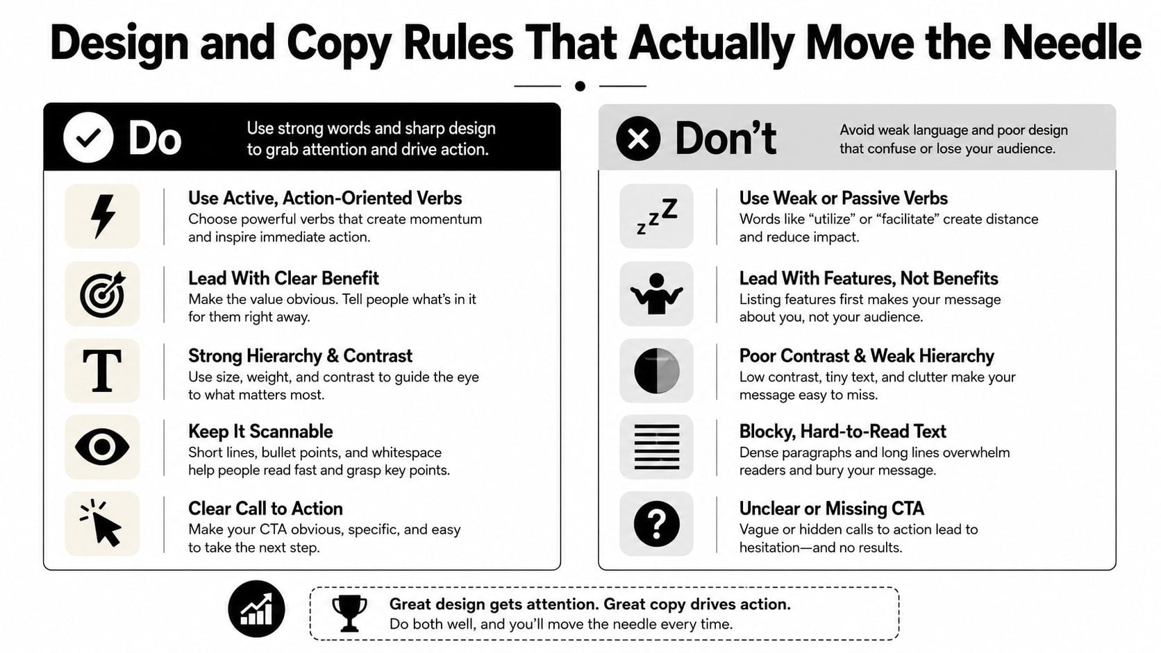
Good CTA design is plain, not flashy. It has to work for someone using a phone with one hand, someone scanning quickly between errands, and someone relying on a screen reader or keyboard navigation. That's why accessibility and mobile use aren't side issues, they're part of the job.
Copy rules that help visitors act
Use active verbs that match the page. Book your consultation is clearer than Submit. Download the price list is more useful than Learn more when the page is already close to a decision.
Avoid copy that sounds generic or hollow. A phrase like Learn more can still work, but only when the user is early in the journey. If the page is already persuasive, the CTA should ask for a more specific step.
Design rules that suit real users
A CTA needs contrast, whitespace, and a sensible size. It shouldn't disappear into the background, and it shouldn't sit so close to other links that people hit the wrong thing. On mobile, the tap target has to be easy to reach with a thumb, not just readable on a desktop mock-up.
Accessibility matters here: the label, contrast, and focus state are practical usability issues, not optional styling choices.
UK public-sector accessibility guidance expects websites and apps to support users with disabilities, which makes CTA clarity and focus states more than a nice-to-have. For a small business, that same thinking helps everyone, because a clear button helps people who are in a rush as much as people using assistive tech.
Keep one clear next step
If two CTAs compete at the same size and strength, neither gets the confidence it needs. A visitor should know which action is primary without thinking hard about it. That does not mean every page must be stripped bare, it means the hierarchy has to be obvious.
A good rule is to ask whether the page has earned the right to ask for the action. If the answer is no, soften the CTA or move it lower. If the answer is yes, make the button clear and the path short.
For people wanting more examples of page copy that supports action, website copywriting guidance is useful because CTA text works better when the surrounding words do their job too.
The video above can help you spot common layout mistakes, especially when a button is technically present but visually lost. That kind of problem is common on older WordPress sites, where page builders and theme defaults sometimes bury the action under too many competing elements.
A simple do and don't pattern
- Do: use one strong verb, enough contrast, and room around the button.
- Do: match the CTA to the user's readiness.
- Don't: rely on “submit” when a more specific label would feel clearer.
- Don't: make people hunt for the next step on mobile.
For a gallery of practical layouts, browse top landing page examples is worth a look because it shows how structure, hierarchy, and CTA placement work together on live pages.
Real CTA Examples for Service Businesses and Online Shops
The same CTA formula does not suit every business. A local accountant, a restaurant, and a product brand all need different language because their visitors arrive with different intent. The strongest CTA is the one that fits the decision the user is trying to make.
Service businesses need lower-friction promises
A Dorset accountant who uses Contact us is asking for a vague effort. Book a free 20-minute call is better because it tells the visitor what happens next and reduces uncertainty. The phrase also feels more concrete, which matters when the service is personal and trust-based.
A local restaurant has a different job. A generic enquiry form makes people work harder than they need to. A reservation widget that says Reserve a table or Check availability matches the task better, especially on mobile where people want speed.
Online shops need hierarchy, not clutter
A small eCommerce brand often makes the mistake of putting Add to basket beside too many secondary prompts. The main product-page CTA should sit above the fold or close to the price, while a supporting prompt like Subscribe for offers should stay quieter and out of the way. The shopper came to buy, not to solve a puzzle.
If you're building those buttons in WordPress, it helps to see how different blocks, widgets, and theme patterns handle hierarchy. Best CTA buttons for WordPress is useful here because it gives a visual reference for how button styling can support the main action without overpowering the page.
CTA examples by business type
| Page Type | Weak CTA | Stronger CTA |
|---|---|---|
| Accountant service page | Contact us | Book a free 20-minute call |
| Restaurant booking page | Enquire now | Reserve a table |
| Product page | Shop now | Add to basket |
| Product email signup | Sign up | Subscribe for updates |
| Service homepage | Learn more | View services |
The best version usually does three things at once. It says what will happen, it lowers the sense of risk, and it matches the visitor's current level of interest. That's why the strongest CTA often sounds less clever and more specific.
Measuring CTA Performance and Running Simple A B Tests
If you can't measure a CTA, you're guessing. Small businesses don't need enterprise dashboards to get useful signals, though. They need a few simple indicators that show whether people are moving forward.
What to track without overcomplicating it
Start with click-throughs on the main button, form-starts, calls, and task completion. A click-through tells you whether people noticed the CTA and felt enough interest to act. A form-start rate shows whether they began the process, even if they didn't finish it.
That matters in the UK because consent settings and privacy choices can reduce the amount of behavioural data available for optimisation. You may not get a perfect picture, so simpler proxies become more valuable. If the CTA gets more clicks and more starts, you've probably improved the path even before full attribution tells the story.
For a deeper view of small-business measurement, analytics for websites is a useful reference because it focuses on practical signals rather than enterprise complexity.
A simple A B test you can run in a week
Pick one page and change only one thing. Test the wording, the placement, or the colour, but not all three at once. If you change too much, you won't know what caused the difference.
Use two versions of the same page in a page builder or WordPress setup, then track the button event in Google Analytics. Leave the test live long enough to collect a sensible pattern of clicks, starts, or calls, then compare the two versions. The winner is the one that drives the action you care about most, not the one that merely looks nicer in the editor.
A good test is narrow enough to read and simple enough to repeat.
If one version gets more button clicks but fewer completed forms, that matters. The goal is not vanity interaction, it's movement toward a lead, booking, or sale. For a service site, a call booked can matter more than a button click. For an online shop, basket additions may matter more than homepage engagement.
Your WordPress CTA Implementation Checklist
A WordPress site owner can fix a weak CTA without rebuilding the whole website. Start with the main pages and ask one simple question on each one, what is the single action I want here? If the answer changes from page to page, the CTAs should change too.
A practical checklist for this week
- Audit the main pages: check the homepage, service pages, product pages, and contact page for one clear primary CTA.
- Rewrite the button text: swap vague labels for action-led wording that matches the page intent.
- Check the placement: make sure the CTA appears where the visitor has seen enough context to act.
- Review the tap target: on mobile, the button should be easy to press without zooming or accuracy problems.
- Set up measurement first: track clicks, form starts, and calls before changing anything else.
- Ask for help when needed: if your theme fights the layout, a designer or developer can usually fix the button structure faster than you can guess your way through it.
WordPress builders, button blocks, and form plugins can handle a lot of this without code. The trick is using them with restraint, so the CTA stays tied to the page's real purpose instead of turning into a decorative extra.
For site owners who want a real-world reference, WordPress eCommerce website examples can help you compare how product pages, collection pages, and calls to action are usually arranged in practice.
If you only change one thing this week, change the weakest button on the page that brings you the most business. That's usually the fastest way to turn a passive visit into a useful enquiry, a booked call, or a sale.
If you want a clearer website that turns more visits into enquiries, DesignStack builds WordPress sites, eCommerce stores, and content-led pages with CTA structure worked into the layout from the start. Visit DesignStack to see how the team can help shape a site that gives visitors a clear next step without adding clutter.
Leave a Reply