What Is User Journey Mapping: A 2026 SMB Guide
User journey mapping works best when you keep it simple. In practice, that often means tracking 4–5 core categories, using a small workshop of 6–8 participants, and spending 20–30 minutes per journey stage so the map stays useful instead of turning into a messy brainstorm.
If your website gets visits but not enough enquiries, bookings, or sales, the problem usually isn't just one page. It's the gap between how you think people buy and how they move from a Google search to trust, action, and repeat business. User journey mapping is a visual way to understand a customer's full experience with your business, from first discovery to post-purchase, while a user flow is much narrower and only shows the steps inside a specific task or interface. That difference matters because many UK businesses don't have a “website problem” in isolation. They have a journey problem.
Table of Contents
- Introduction Beyond the First Click
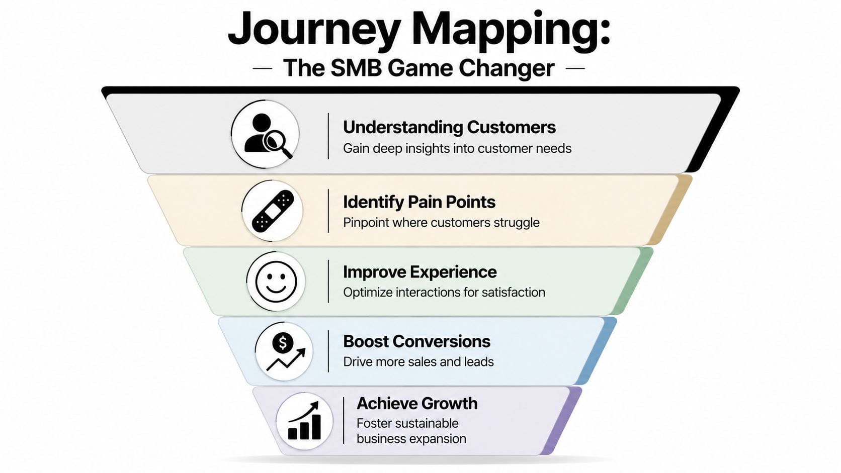
- Why Journey Mapping Is a Game Changer for SMBs
- The Core Components of a User Journey Map
- A Practical Journey Mapping Example for a Local Business
- Common Pitfalls and Essential Tools for SMBs
- How DesignStack Puts Journey Mapping Into Action
Introduction Beyond the First Click
A common small business scenario goes like this. You pay for SEO, post on social media, maybe run a few ads, and the site gets traffic. But the phone doesn't ring as often as it should, the basket gets abandoned, or people read the page and disappear.
That usually means customers are hitting friction somewhere between interest and action. They may find your business on Google, jump to your website on their phone, check your reviews, open your menu or service page, hesitate at pricing, then leave because booking feels awkward or the next step isn't clear. You don't see that full chain by staring at one page in isolation.
User journey mapping helps you see that chain as a connected experience. It looks at the user's path across touchpoints and over time, including what they're trying to do, what they're thinking, and where they feel confused or reassured. By contrast, user flows are narrower diagrams that show step-by-step interactions inside a task. Optimizely's glossary explanation of journey maps versus user flows is useful here because it makes the practical distinction clear for businesses deciding whether they need to map a full buying journey or just a single website action.
A user flow might show how someone completes a checkout. A journey map shows why they almost never reach checkout in the first place.
For an SMB, that's its core value. Journey mapping is less about creating a pretty workshop document and more about solving a business mystery. Why do people ask basic questions that are already on the site? Why do shoppers browse but not buy? Why do leads arrive poorly qualified? The map helps you stop blaming “traffic quality” for every problem and start finding the exact moments where trust breaks down.
Why Journey Mapping Is a Game Changer for SMBs
A lot of website problems look expensive when they're still vague. Once you map the journey, they often become surprisingly specific.
It shows where customers leak out
Think of your sales process as a leaky bucket. You can pour in more traffic from SEO, ads, email, or social, but if people keep dropping out at the same weak points, growth stays frustratingly uneven.
A journey map helps you locate those weak points in plain English. Maybe customers discover you on Instagram, land on a category page, can't tell what makes your offer different, and leave. Maybe they reach the contact form but don't trust that anyone will reply. Maybe they add products to basket, then hit uncertainty around delivery, returns, or checkout effort.
This is why the method matters for smaller businesses with tighter budgets. You rarely need a total rebuild. You need to fix the right part of the experience.
It replaces guesswork with evidence
Good journey mapping isn't just opinion. It's a research-led process that brings together qualitative input such as interviews or usability feedback with behavioural evidence such as analytics and support queries. That combination helps teams identify where friction happens and trace cause-and-effect across touchpoints instead of guessing which page is “underperforming” in isolation, as explained in Smaply's guide to user journey mapping.
In practical terms, that means you stop saying things like:
- “People just aren't ready to buy” when the core issue is that your product pages don't answer basic questions.
- “Our traffic is poor” when users are getting lost between mobile navigation and checkout.
- “We need a redesign” when the stronger move is to simplify forms, rewrite service pages, or tighten the booking path.
If you're already looking at broader ways to improve website user experience, journey mapping gives you the missing context. It connects UX problems to business outcomes like fewer support calls, cleaner leads, and smoother conversion.
A short walkthrough can help if you want to see the concept from another angle.
Practical rule: If your team can't point to the stage where users get stuck, you're still diagnosing from the inside out.
For SMBs, that's the game changer. It makes improvement work focused. Instead of spending money across the whole site, you can concentrate on the moments that shape whether someone buys, books, calls, or leaves.
The Core Components of a User Journey Map
A useful journey map doesn't need enterprise software or a wall covered in sticky notes. It needs the right ingredients and enough structure to make decisions.
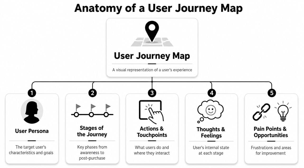
The five parts that matter most
Oxford University's UX guidance is refreshingly practical here. It recommends keeping the map manageable by selecting 4–5 core categories, and its workshop approach commonly uses 6–8 participants with 20–30 minutes per journey stage to gather evidence in a structured way, as outlined in Oxford's user journey mapping guidance.
That advice is useful because many first-time maps fail for one reason. They try to capture everything.
For most SMBs, a simple map should include the following:
| Component | What It Is | Example |
|---|---|---|
| Persona | The specific type of customer you're mapping for | A busy parent ordering gifts on a phone |
| Stages | The broad phases of the journey | Discover, compare, decide, buy, follow-up |
| Actions | What the customer does at each stage | Searches Google, reads reviews, checks FAQs |
| Thoughts and feelings | Their mindset, concerns, and emotional state | “Is this trustworthy?” “This is taking too long” |
| Opportunities | Practical improvements the business can make | Clearer delivery info, better mobile menu, shorter form |
A simple map is easier to use
The map only works if your team can read it and act on it. That's why I prefer a lean version over a giant diagram with dozens of rows. Once a map becomes too detailed, it stops being a decision tool and turns into documentation nobody revisits.
A smart starting point is:
- One persona at a time so you're not mixing very different needs into one messy picture.
- One clear goal such as buying a product, booking a service, or requesting a quote.
- One channel mix that reflects reality, not ideal behaviour. People may move from Google to mobile site to email to phone call.
If you're planning a redesign, this thinking also helps before layout work starts. A wireframe in web design is useful for page structure, but a journey map tells you which pages and interactions matter most in the first place.
Keep the map broad enough to show the real experience, but narrow enough that someone can still decide what to fix next.
That's the balance most businesses need. Not a museum piece. A worksheet that turns customer friction into a shortlist of actions.
A Practical Journey Mapping Example for a Local Business
Abstract explanations only go so far, so let's use a local example.
Sarah tries to book a table
Sarah is visiting Weymouth for the weekend. On her phone, she searches for “best restaurant in Weymouth”. She taps a few results, checks images, skims reviews, and lands on a restaurant website.
So far, everything is fine.
Then the friction starts. The menu opens as a hard-to-read file on mobile. The booking button is easy to miss. The opening times are buried. Sarah wants a quick answer, not a scavenger hunt. She gets mildly annoyed, leaves the site, then calls instead because speaking to someone feels faster than figuring out the page.
That journey might look something like this:
- Discovery. Sarah finds the restaurant through Google and review platforms.
- Research. She checks photos, menus, and whether the place feels right.
- Decision. She tries to confirm price range, opening hours, and booking method.
- Action. She calls instead of booking online because mobile usability gets in the way.
- Aftermath. If the phone is unanswered, the booking may never happen.
The map earns its keep. The problem isn't “our website needs a refresh”. The problem is more precise. Mobile visitors trying to make a quick booking hit friction at the menu and booking stage.
What the business should do next
The map becomes useful when you treat it as a validation framework, not a one-off document. For UK websites, journey mapping works best when the map acts as a measurable hypothesis about why users succeed or fail, so teams can verify it with methods such as A/B tests, heatmaps, scrollmaps, surveys, and interviews, as described in 4ALLPORTAL's user journey guide.
For this restaurant, the hypothesis might be simple:
If we make the menu easy to read on mobile and make booking obvious, fewer people will switch to calling or give up.
That can lead to practical tests such as:
- Replace awkward menu formats with a clean mobile page.
- Move booking higher on the page so it appears without hunting.
- Add reassurance details such as opening times, parking, dietary notes, and phone number in obvious places.
- Ask real customers what slowed them down.
For local firms doing this alongside broader digital marketing for local businesses, this matters because better marketing only pays off when the next step is easy. A journey map exposes where local intent turns into local frustration.
Common Pitfalls and Essential Tools for SMBs
Most journey maps fail for boring reasons, not technical ones. The team guesses. The document gets too complicated. Nobody turns the findings into changes.
What usually goes wrong
The first mistake is mapping your own opinion instead of the customer's experience. Owners and staff know the business too well. They know where the booking link is, what the service names mean, and how the checkout works. First-time visitors don't.
The second mistake is overbuilding the map. If you add every audience, every channel, and every internal process in one document, it becomes unreadable. A simpler current-state map is usually more useful than a giant all-in-one diagram.
The third mistake is treating the map as finished once it's designed. It isn't. The map should lead to action, then be revised as you learn more.
Common warning signs include:
- Assumption-led notes that say what users “must be thinking” without evidence from calls, surveys, analytics, or session behaviour.
- Too much detail in low-value areas and not enough focus on moments tied to revenue or lead quality.
- No owner for next steps so the same friction points stay on the site for months.
- No measurement plan after changes go live.
If you're not tying findings back to outcomes, the exercise turns into a workshop ritual. That's where many SMBs lose patience.
Low-cost tools that are enough to start
You don't need a specialist UX stack to begin. A practical toolkit is usually enough:
- Google Analytics for broad behavioural patterns. It helps you see where users enter, where they leave, and which paths deserve a closer look.
- Hotjar or a similar tool for heatmaps, scroll behaviour, and session replays. These are useful when a page looks fine in a design review but fails in real use.
- Google Forms or a short email survey for direct feedback after a purchase, booking, or enquiry.
- A spreadsheet, whiteboard, or Miro board for the actual map. Fancy software doesn't make weak research stronger.
- Support inbox and call notes for repeated questions. If customers keep asking the same thing, your journey already has a visible crack.
A good discipline is to pair behaviour with voice. Analytics can tell you where people drop off. Feedback can tell you why.
If you want a practical baseline for judging whether changes are helping, this guide on how to measure website success is a useful companion. It keeps the conversation grounded in outcomes rather than opinions.
The best SMB journey map is often the one built in a simple document, reviewed regularly, and used to make real changes.
That's what works. Not the most polished template. The clearest path from customer friction to action.
How DesignStack Puts Journey Mapping Into Action
A good website project shouldn't start with colours or layout ideas. It should start with how customers move, hesitate, compare, and decide.

From research to better decisions
At DesignStack, journey mapping feeds the decisions that shape web design, eCommerce builds, and brand touchpoints. Instead of assuming what users want, the team looks at the moments that influence trust and action. That might be how a service page answers key questions, how a mobile navigation behaves, or how cleanly a checkout removes doubt.
Many website projects drift into personal preference. A stakeholder wants more animation. Someone else wants more text. Another person wants the home page reorganised. Journey thinking pulls the conversation back to the customer and the task.
That approach fits especially well with website design services for growing businesses because the goal isn't just to launch something attractive. It's to create a site that helps the right visitor move forward with less friction.
Why this matters for growing businesses
For a local service firm, that can mean making it easier to request a quote, understand the offer, and trust the company enough to enquire. For an online shop, it can mean reducing hesitation around product details, navigation, and checkout steps. For a membership organisation or community group, it may be about making information easier to find so fewer people have to email or call.
The point isn't that every customer follows one perfect path. They don't. The point is that patterns appear when you look properly, and those patterns tell you where design and content need to work harder.
Journey mapping is useful because it translates scattered observations into decisions. Which page needs rewriting first. Which form needs simplifying. Which mobile interaction is costing conversions. Which channel hands off badly to the next one.
For a busy business owner, that's the win. Clearer priorities. Better digital decisions. Less guesswork.
If your website is getting attention but not enough action, DesignStack can help you uncover where customers are getting stuck and turn that insight into a better site, smoother user journeys, and stronger results for your business.


Leave a Reply