
Ecommerce Website Homepage Design: 2026 Best Practices
Your website may look polished, your products may be good, and your ads may be bringing people in. Yet the sales still feel underwhelming. That usually isn't a traffic problem. It's a homepage problem.
Small business owners often treat the homepage like a digital brochure. In practice, it behaves more like a shop assistant, receptionist, sales display, and customer service desk all at once. If it doesn't answer basic questions quickly, people leave. If it only speaks to first-time visitors, existing customers feel ignored. And if it's cluttered, slow, or vague, trust drops before anyone reaches a product page.
Good ecommerce website homepage design isn't about making the site look modern for the sake of it. It's about helping different visitors do different jobs fast. A new shopper wants proof they're in the right place. A returning customer may want to reorder, check delivery information, or jump straight to a category. Someone comparing suppliers wants signs that your business is legitimate, clear, and easy to buy from.
That's why the strongest homepages don't just attract attention. They reduce hesitation. They point people toward action. They support repeat business. For UK SMEs, that matters because every wasted click costs attention you've already paid to earn.
Your Homepage Is More Than a Welcome Mat
A pattern turns up often in ecommerce projects. A business owner invests in a redesign, chooses strong photography, signs off a stylish layout, launches with optimism, and then asks a month later why revenue hasn't moved.
The issue is rarely that the homepage looks bad. It's that it isn't doing enough work.
A homepage has to serve at least three audiences at once. First-time visitors need orientation. Returning customers need shortcuts. Browsers need nudges toward the next sensible step. If your homepage only says “welcome”, it's wasting prime space.
A homepage should answer three questions quickly. What do you sell, why should I trust you, and where do I go next?
That changes how you judge design choices. A large banner might look impressive, but if it pushes useful categories, delivery information, and proof points too far down, it slows buying. A neat minimalist layout might feel premium, but if it hides search, stock cues, or support links, it creates friction for people ready to act.
Think like an operator, not just a designer
The most effective homepages act like a business hub. They help new shoppers discover products, but they also help existing customers return with confidence. That might mean giving more prominence to account access, delivery messaging, popular categories, or product collections people buy repeatedly.
For a small retailer, that's often where profit hides. The homepage shouldn't only chase the first sale. It should also support the second and third.
What a stronger homepage usually does
- Guides first-time visitors: It explains the offer fast and makes categories obvious.
- Supports returning buyers: It gives clear routes to account areas, reordering, or current collections.
- Builds trust early: It surfaces delivery details, reviews, contact options, and payment confidence cues.
- Reduces wasted browsing: It points people to best sellers, seasonal items, or relevant collections instead of making them hunt.
When ecommerce website homepage design is done well, the site stops feeling like a static front page and starts behaving like part of the sales process.
The Discovery Phase Before You Design
Most homepage problems start before any design software opens. The team jumps to colours, banners, and layouts without deciding what the homepage is meant to do.
That's risky, because most guidance on homepage optimisation still doesn't give UK small retailers much local benchmarking on direct ROI from redesign work, which is exactly the gap highlighted in this discussion of ecommerce homepage design limitations. In other words, you can't rely on generic examples alone. You need a working brief tied to your own business.
Start with one main goal
A homepage can support many actions, but it needs one dominant job. If you try to push everything equally, the page becomes indecisive.
Ask yourself which of these matters most right now:
- Drive direct sales
- Push visitors into key categories
- Generate enquiries for higher-ticket products
- Support repeat customers with faster navigation
- Promote a seasonal campaign or launch
If you sell a narrow product range, direct product promotion may be right. If you have a large catalogue, category-led navigation usually performs better. If your average order value is high and people need reassurance, your homepage may need to focus more on trust and education than immediate conversion.
Define who the homepage is for
A simple persona exercise is enough. Don't build a fiction-heavy marketing document. Build a practical list of visitor types.
For many UK SMEs, three groups are enough:
- New visitors from search: They need clarity, product range, and trust.
- Returning customers: They want speed, account access, and familiar products.
- Social or ad traffic: They often need a stronger bridge between the promise in the ad and what they land on.
If you're doing content planning around categories, search intent, and landing pages, this comprehensive guide for SEO professionals is useful because it helps connect homepage messaging with the phrases customers use.
Review competitors with a sharper eye
Don't ask whether a competitor's homepage looks better than yours. Ask whether it removes more friction.
Use a short comparison table while reviewing five competitor sites:
| What to check | What good looks like | Red flag |
|---|---|---|
| Navigation | Categories are obvious and easy to scan | Clever labels nobody uses |
| Hero area | Clear value proposition and next step | Generic lifestyle image with no direction |
| Trust signals | Delivery, reviews, payment confidence, contact info | No reassurance until checkout |
| Returning customer support | Account, basket, reorder paths are visible | Homepage only speaks to new users |
| Promotional blocks | Focused and relevant | Too many competing messages |
A good pre-design brief should fit on one page. It should say who the homepage serves, what action matters most, and which friction points from your competitors you want to avoid.
If you're improving the whole shop rather than the homepage alone, these tips for running a successful online store are a useful companion because homepage choices only work when the rest of the journey supports them.
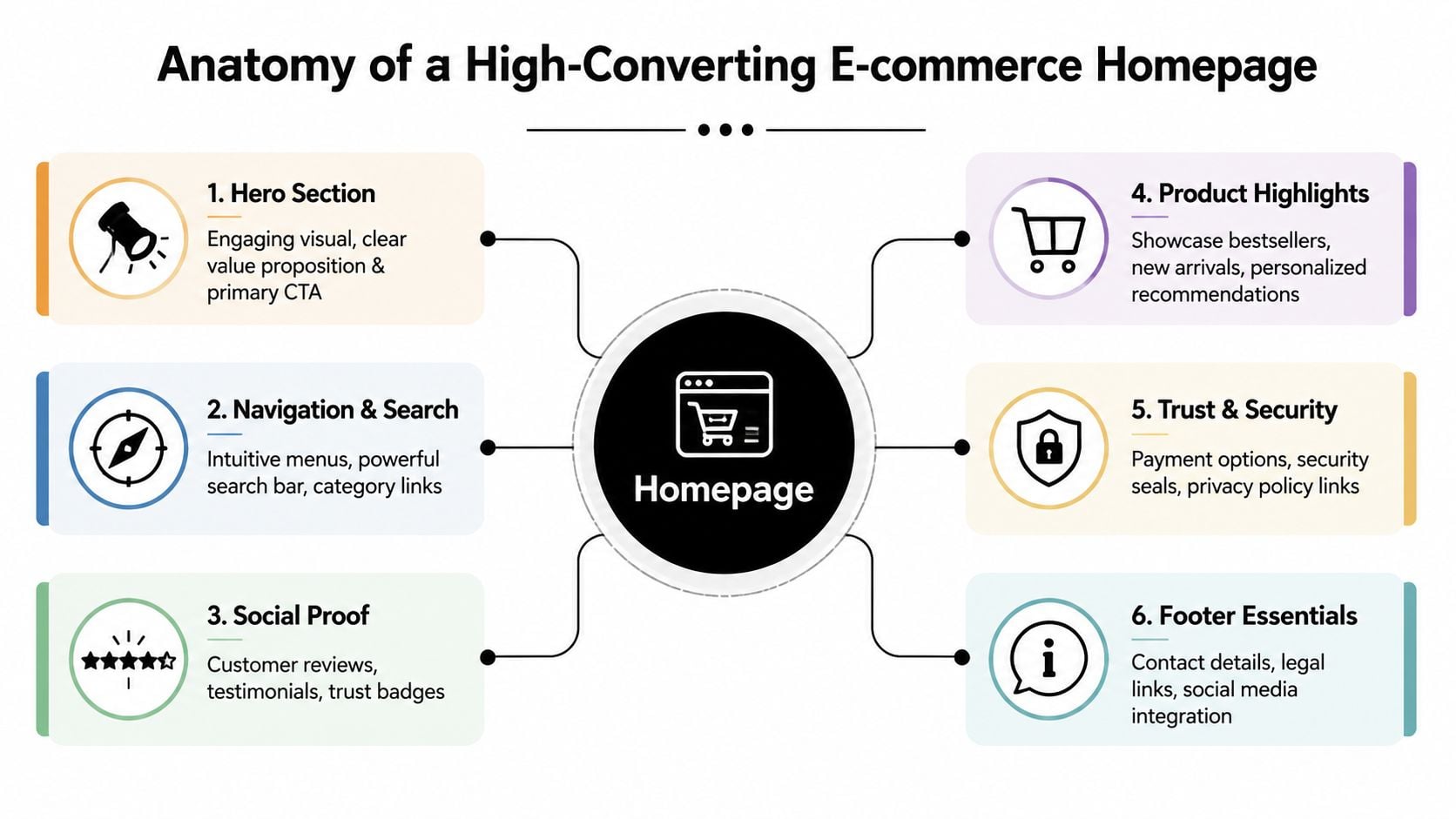
Anatomy of a High-Converting Homepage
A strong homepage isn't one big idea. It's a sequence of blocks, each doing a specific job. Miss one, and the rest work harder than they should.
Research collected by IO Web Studio on ecommerce design trends says personalisation on UK e-commerce homepages can increase sales by up to 202%, 75% of users judge credibility by homepage design, minimalist, personalised layouts see 30% higher engagement, and high-quality homepage images and videos can gain 94% more views. The lesson isn't “add more features”. It's “make the homepage more relevant and easier to trust”.
The blocks worth getting right
Here are the homepage elements that usually matter most.
Hero section
This needs to communicate the offer fast. Use one clear headline, a short supporting line, and a primary action such as “Shop best sellers” or “Browse garden furniture”. Don't waste this area on vague brand language.Navigation and search
If people can't find products quickly, the homepage has already failed. Put search in a visible position, keep top-level labels plain, and avoid forcing users to decode internal terminology.Category shortcuts
These are often more useful than pushing individual products too early. Categories let shoppers self-select. For larger catalogues, that's usually a better first move than trying to guess exactly what they want.Product highlights
Best sellers, new arrivals, seasonal picks, and personalised recommendations all have a place. The key is curation. Feature products you can support with strong photography, solid stock confidence, and clear pricing.Social proof
Reviews, star ratings, press mentions, or recognisable customer logos can all reduce hesitation. Place them near decision points, not hidden in the footer.Trust and support signals
Delivery information, returns reassurance, secure payment cues, and visible contact routes matter more than many businesses realise. These don't just reassure first-time buyers. They also support repeat customers who want operational clarity.
Where many SMEs get it wrong
The common mistake is trying to use every homepage block as an advert. That creates noise.
A better approach is to assign each block a single purpose.
| Homepage area | Primary job | Common mistake |
|---|---|---|
| Hero | Clarify the offer and direct action | Showing style without substance |
| Categories | Help people self-navigate | Using too many equal options |
| Featured products | Create momentum | Featuring weak or random items |
| Trust area | Reduce purchase anxiety | Hiding reassurance below the fold |
| Support links | Help returning customers | Treating support as an afterthought |
Practical rule: If a block doesn't help someone choose, trust, or move forward, it probably doesn't belong on the homepage.
Personalisation that helps rather than irritates
Personalisation works best when it feels useful, not intrusive. Product recommendations based on browsing behaviour can help returning visitors. So can homepage banners that reflect current categories, seasonal ranges, or recently viewed areas.
But personalisation isn't an excuse for clutter. The best ecommerce website homepage design still keeps the layout clean. Relevance works because it reduces effort, not because it adds novelty.
Don't forget existing customers
Most homepage advice stops at first impressions. That's too narrow.
A homepage can also support existing buyers by surfacing:
- Order tracking and account access
- Replenishment-friendly categories
- Delivery and returns updates
- Low-stock or restock messaging
- Loyalty or subscriber benefits
That shift matters. Your homepage shouldn't reset to “hello stranger” every time a customer comes back.
Mastering Mobile-First Design and Performance
In UK ecommerce, the mobile version isn't a secondary layout. It's the main one.
According to the 2025 guide to ecommerce website design, 67% of UK consumers complete purchases on mobile phones, over 60% of online shopping traffic comes from mobile devices, 53% of UK mobile users abandon sites that take longer than 3 seconds to load, and a poor mobile experience can cost 50% of potential traffic. That should settle the argument. Mobile performance isn't a nice upgrade. It's the base requirement.
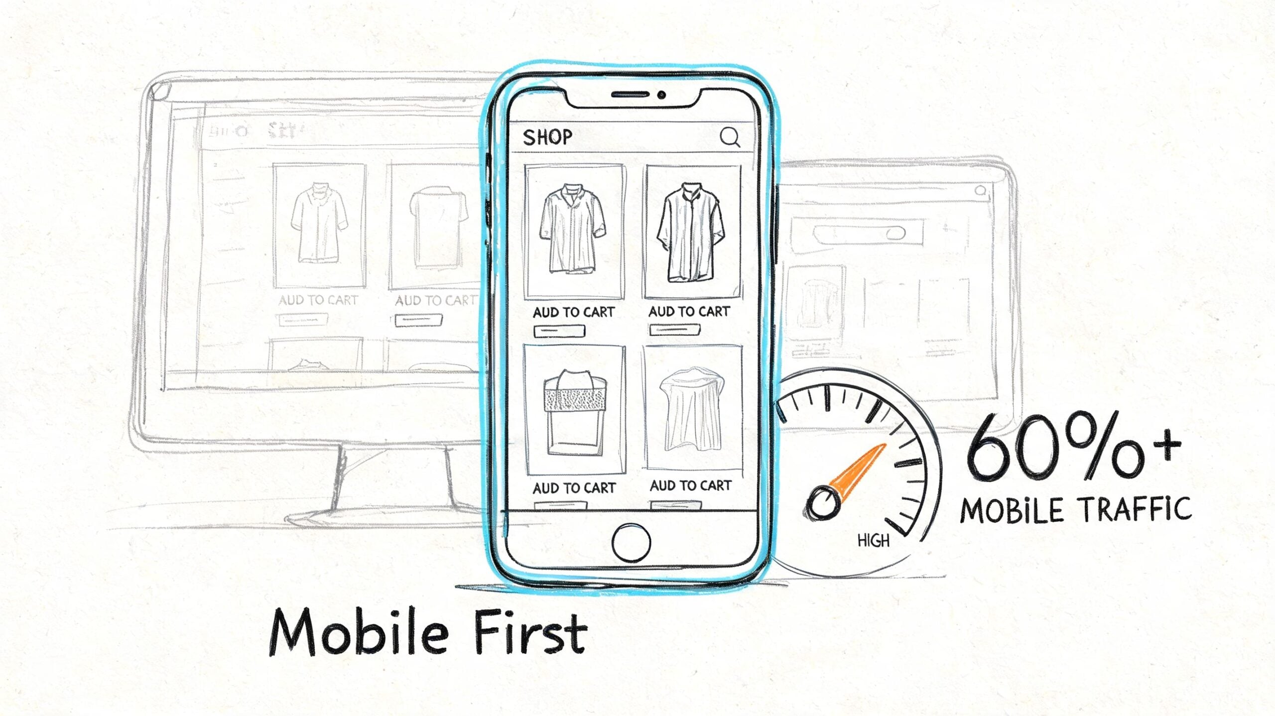
What mobile-first actually means
Many sites claim to be responsive when what they really mean is “the desktop design shrinks without breaking”.
That isn't enough.
Mobile-first ecommerce website homepage design means the smallest screen gets the clearest thinking. Navigation is shorter. buttons are easier to tap. Text is readable without zooming. Images earn their place. Important actions sit where thumbs can reach them without strain.
The page should feel lighter, not just narrower.
A practical performance checklist
The speed work that matters most is usually straightforward if it's handled early. Research summarised by Futur Media's ecommerce homepage guidance points to a layered approach focused on image compression, lazy loading, code minification, CDN use, and browser caching for returning visitors. In short, do not try to solve speed with one plugin and hope for the best.
Use this checklist:
- Compress images properly: Homepage banners and product tiles often carry most of the weight. Optimise before upload, not after the site has become bloated.
- Lazy load below-the-fold content: Let the first visible content load first. That keeps the page feeling responsive.
- Minify CSS and JavaScript: Extra files and bulky scripts often come from theme choices and add-ons, not from WooCommerce itself.
- Use a CDN if you serve broad UK audiences: This helps content arrive faster and more consistently.
- Keep typography practical: Mobile users shouldn't need to pinch and zoom to read product names, prices, or CTA buttons.
- Increase tap comfort: Buttons need clear spacing. Packed links cause mistakes and frustration.
- Trim homepage ambition: Don't turn the homepage into a dumping ground for every campaign, post, category, and popup.
Here's a quick visual primer on why mobile-first thinking changes how you build the page:
Performance is part of trust
People rarely say, “I left because the CSS wasn't minified.” They say the site felt awkward, slow, or harder than it should've been.
That's what speed affects. It changes the mood of the visit. A fast mobile homepage signals competence. A sluggish one suggests risk.
On mobile, every extra layer has to justify itself. If it doesn't help someone buy, find, or trust, strip it out.
Implementation Tips for WordPress and WooCommerce
A good homepage concept still needs a practical build. For many UK SMEs, WordPress with WooCommerce remains the sensible route because it's flexible, familiar, and adaptable to different catalogue sizes and content needs.
The platform has scale behind it too. WooCommerce powers between 20% and 33% of all global online stores and has over 4.5 million active installations, according to the same ecommerce design guidance referenced earlier in the research set. That matters because it means you're building on software with a mature ecosystem, not forcing ecommerce into a tool that wasn't meant for it.
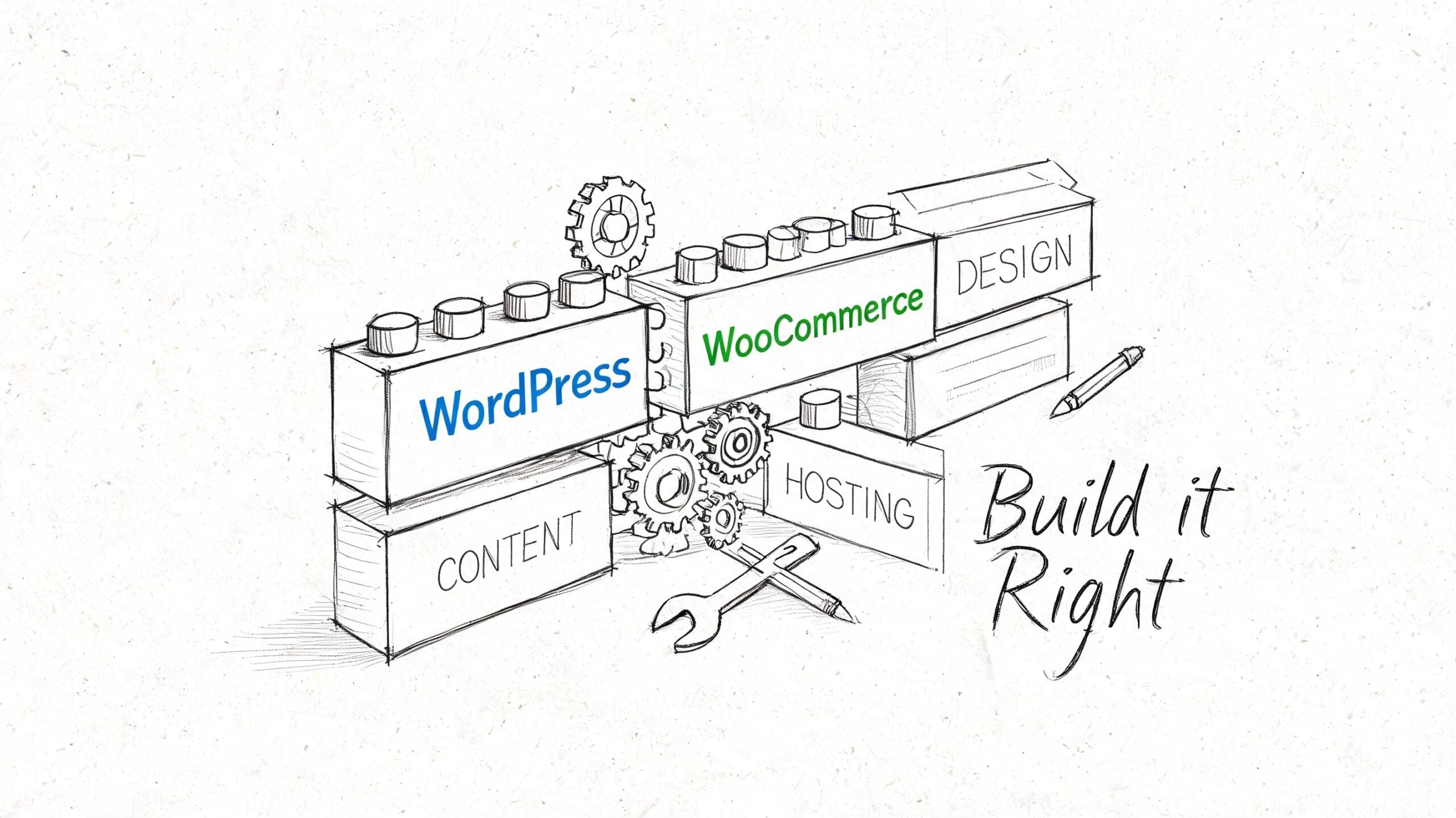
Choose your foundation carefully
The fastest way to damage a homepage build is to start with a bloated theme that promises everything.
Instead, look for:
- A lightweight theme
- Reliable WooCommerce compatibility
- Flexible header and archive controls
- Clean mobile behaviour
- Good support and regular updates
If your homepage depends on custom sections, Gutenberg can be enough for many businesses. Elementor can work well too, especially when the team needs more layout control without code. The key isn't which builder is fashionable. It's whether the build stays fast, maintainable, and easy to update after launch.
Build the homepage in reusable parts
Think in blocks, not one giant page template.
A sensible WooCommerce homepage often includes:
- Hero block with one CTA
- Category tiles
- Featured or best-selling products
- Trust strip for delivery, returns, or support
- Review or rating section
- Footer with customer service essentials
This makes testing and editing easier. If a featured products section underperforms, you can swap it without rebuilding the whole page.
Use plugins to support the design, not drown it
WooCommerce can handle product grids, stock status, pricing, and featured items well. The trouble usually starts when businesses install too many extras for sliders, badges, popups, filtering, and animation.
Keep the stack tight. Add tools because they solve a user problem, not because they looked good in a demo.
If you're reviewing options for extending WordPress cleanly, this round-up of top WordPress plugins is a helpful reference point.
A homepage build should be easy to edit by the business owner after launch. If every small change needs a developer, the design is too brittle.
How to Test and Optimise Your Homepage for Growth
Launching a homepage isn't the finish line. It's the point where actual evidence starts arriving.
Many SMEs lose momentum when they approve the redesign, go live, and treat the page as fixed. Meanwhile, customer behaviour keeps changing. Promotions change. Product priorities change. Traffic sources change. The homepage should change with them.
Start with tests that matter
Research from Ecomm.design on homepage best practices shows that hero image sliders only outperform static images about 50% of the time in A/B tests. That's a useful reminder that familiar homepage patterns aren't automatically good ones. The same research notes that retailers often test hybrid approaches or product widgets such as best sellers and new products on mobile first before wider rollout.
That gives you a sensible test queue.
Try testing:
- A static hero versus a slider
- Category-first homepage sections versus product-first sections
- “Shop now” against more specific CTA copy
- Best sellers versus new arrivals in the first product block
- Trust signals placed higher versus lower on the page
Use a launch-and-learn routine
You don't need a complicated optimisation programme to improve results. You need consistency.
A simple monthly process works well:
| Step | What to do | Why it helps |
|---|---|---|
| Review behaviour | Check homepage click paths, bounce points, and device split | Shows where users hesitate |
| Pick one hypothesis | Example: “The hero is too vague” | Keeps testing focused |
| Change one meaningful element | Headline, CTA, product block, layout | Makes results easier to interpret |
| Watch real behaviour | Use analytics, heatmaps, and session recordings | Reveals friction numbers alone miss |
| Keep or revert | Roll forward only if the change helps | Prevents opinion-led drift |
If your shop runs on Shopify rather than WooCommerce, tools like The SEO Agent Shopify can support broader visibility work around product and collection pages while you're refining homepage performance.
Measure more than first-click conversion
The unique angle many businesses miss is retention. A homepage can help existing customers too, but only if you watch the right signals.
Look at whether returning users reach account areas more easily, whether category shortcuts reduce unnecessary search, and whether support-related pages become easier to access. If repeat visitors still behave like lost first-timers, the homepage isn't serving them properly.
For cleaner reporting, it helps to build a regular measurement routine in Google Analytics 4, especially around homepage click paths, device behaviour, and returning user journeys.
Don't ask whether you like the homepage. Ask whether customers move through it with less effort than before.
Frequently Asked Homepage Design Questions
How often should an ecommerce homepage be redesigned
Not every homepage needs a full redesign. Many need a clearer structure, better messaging, and ongoing optimisation. Redesign when the homepage no longer reflects the catalogue, traffic sources, customer behaviour, or business priorities. If the layout is still serviceable, iterative improvement is often the better investment.
Should the homepage focus on products or categories
That depends on the size of your catalogue and how people shop. Stores with a narrow range can push products directly. Stores with broader ranges usually benefit from stronger category pathways because they help customers find their own route quickly.
Are homepage sliders worth it
Sometimes, but they shouldn't be accepted by default. If you use one, test it against a static hero or a hybrid layout. Many businesses discover that a simpler structure creates more clarity.
What trust signals belong on a homepage
The essentials are usually reviews, delivery information, returns reassurance, payment confidence cues, and easy-to-find contact details. If you're a lesser-known brand, these matter early. They shouldn't be buried deep in the journey.
Should returning customers see the same homepage as new visitors
Not necessarily. Returning customers often need faster routes to products, account areas, support, and current offers. Even simple personalisation or clearer shortcut links can make the homepage more useful for repeat business.
What about legal and privacy considerations
Be careful with personalisation, cookies, and tracking tools. If you're tailoring homepage content based on behaviour, your privacy and consent setup needs to be clear and properly implemented. The homepage can still be personalised without feeling invasive, but transparency matters.
How much content is too much
If the page feels like a stack of competing promotions, it's too much. A homepage should prioritise clarity over volume. Keep the strongest messages visible, support them with proof, and remove anything that doesn't help someone decide, trust, or move forward.
If your current homepage looks decent but isn't pulling its weight, DesignStack can help you turn it into a conversion-focused ecommerce hub. From Dorset-based WordPress and WooCommerce builds to sharper UX, branding, and ongoing support, the team creates websites that don't just look better. They work harder for your business.


Leave a Reply