

10 Brand Identity Deliverables for Your 2026 Project
You sign off the brand work, your agency sends the final folder, and then the actual test starts. The web developer asks for the right logo file, someone in sales drops a stretched JPEG into a pitch deck, and your printer wants colour values your team cannot find. That is the moment a brand identity stops being a design exercise and becomes an operational one.
A professional brand identity should leave you with more than attractive visuals. It should give your business a usable handover: files for web and print, rules for consistent application, and enough context that the next designer, freelancer, or internal hire does not have to guess. Good projects take time for that reason. Brand assets only hold up in day-to-day use when the thinking, testing, and handover detail have been done properly.
SMEs run into the same problem again and again. They approve the creative work, receive a folder full of exports, and realise nobody knows which logo works on dark backgrounds, what file type to send to a sign maker, or whether the licensed fonts can legally be shared with contractors.
There is a rights issue here too. If ownership, licensing, and usage terms are vague, a tidy handover can still create expensive problems later. This practical AI Image Detector guide on IP is a useful extra read.
This article treats brand identity deliverables as a handover plan, not a gallery of nice-to-haves. For each item, I'll cover why it exists, which file formats are worth requesting, and which questions separate a polished presentation from a brand system your team can use. If you want a useful reference point before sign-off, this guide on how to create a style guide helps frame what a practical standards document should include, and you can also discover brand guideline insights to see how other brands document their systems well.
Table of Contents
- 1. Brand Style Guide / Brand Guidelines Document
- 2. Logo Design & Logo Variations Suite
- 3. Colour Palette & Colour System
- 4. Typography System & Font Hierarchy
- 5. Photography & Imagery Style Guide
- 6. Voice & Tone Guidelines
- 7. Logo Lock-ups & Brand Configurations
- 8. Brand Personality & Brand Archetype Document
- 9. Brand Application Mockups & Usage Examples
- 10. Iconography System & Icon Library
- Top 10 Brand Identity Deliverables Comparison
- Your Handover Checklist Turning Deliverables into Assets
1. Brand Style Guide / Brand Guidelines Document
Six weeks after launch, the cracks usually show in the same places. A salesperson stretches the logo in PowerPoint. A web developer swaps in a fallback font. A franchisee prints a flyer in the wrong colours because the original files are buried in someone's inbox.
That is what the brand guidelines document is there to prevent.
If I had to protect one deliverable in a brand handover, I'd protect this one. It gives every designer, marketer, printer, developer, and copywriter the same reference point, so the brand stays recognisable once the agency steps back. For an SME, that matters more than a glossy presentation deck.
A useful guide does two jobs. It explains the rules, and it explains why those rules exist. Teams follow brand standards more reliably when they understand the reason behind them, not just the instruction. Apple's Human Interface Guidelines, IBM's Design Language, and the UK Government Digital Service design system are strong examples because they reduce guesswork and make decisions faster.
What should be inside
At minimum, the document should cover logo rules, colour codes, type hierarchy, spacing, imagery direction, tone cues, and misuse examples. The better version goes one step further and shows application in real situations. Website buttons, proposal documents, LinkedIn graphics, packaging labels, email signatures, signage, pitch decks. That is where SMEs get value, because those are the places brands usually drift.
File format matters too. For many smaller businesses, a well-structured PDF is the right starting point because it is easy to share and hard to accidentally break. If several departments, partners, or locations need access, ask whether the guide can also be supplied in Figma, Notion, or a simple web-based format. The trade-off is straightforward. PDFs are stable. Online systems are easier to update.
If you want a benchmark for structure, DesignStack's guide to creating a style guide is a useful reference. If you also want to see how different brands handle depth and presentation, you can discover brand guideline insights.
One practical test works every time. Hand the guide to a designer or freelancer who was not in the original branding process. If they still need a 45-minute call to understand how to apply the brand, the document needs more work.
What to ask for before handover
- Does it explain decisions, not just list rules? Ask why each standard exists, especially around spacing, colour pairings, and typography. Teams follow logic better than they follow arbitrary restrictions.
- Does it reflect real usage? Request examples based on your actual touchpoints, such as Shopify pages, trade show banners, menus, uniforms, investor decks, or social templates.
- Is there a version for day-to-day users? Senior stakeholders may like a polished brand book, but internal teams often need a shorter operational version they can scan quickly.
- Can it be updated without rebuilding the whole thing? Brands change. New sub-brands, channels, and campaigns appear. Ask what the update process looks like.
- Does it connect to production files? The guide should point to the working assets, not sit separately from them. A good handover links standards to the actual files people need to use.
For agencies, this document is often the least glamorous part of the job. For clients, it is usually the part that saves the most time and rework. It also makes later deliverables easier to use, especially once your team starts applying the identity across logo files, templates, and digital products. For a practical look at how identity decisions should be prepared for use, DesignStack's logo design process is worth reviewing before sign-off.
2. Logo Design & Logo Variations Suite
A founder signs off a logo on Friday. By Monday, the team needs it in a website header, an Instagram profile, a proposal PDF, a shop sign, and an email signature. One master file will not cover that job.
A usable logo suite gives your team versions built for those situations, before anyone starts improvising. That usually means a primary logo, a secondary version, a stacked option, a horizontal option, a one-colour file, a reverse file for dark backgrounds, and a symbol or icon-only mark where the brand has one.
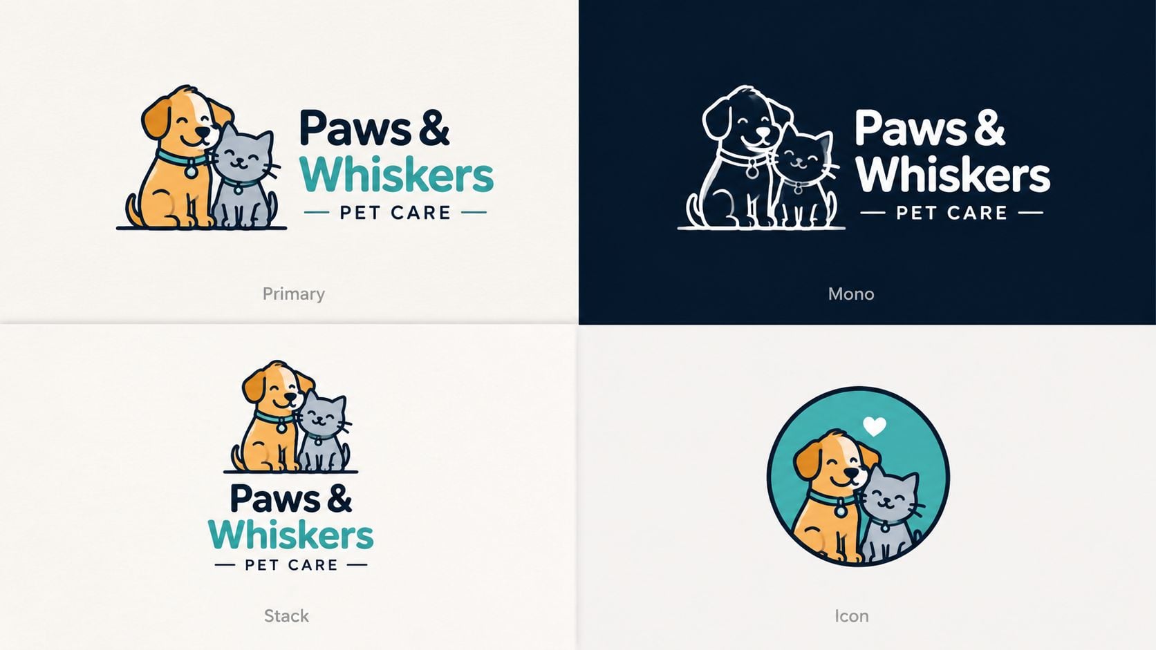
What a usable logo suite includes
The point is not variety for its own sake. Each version should solve a real production problem.
A wide wordmark may work perfectly on a homepage and fail in a social avatar. A detailed symbol may look sharp in a pitch deck and fall apart when embroidered on a cap. Good agencies test for those compromises early and hand over files that match actual use, not just presentation slides.
Ask for vector master files first. SVG is usually the most practical format for web and interface use. EPS and PDF are still useful for printers, fabricators, and anyone working in Adobe workflows. Then ask for transparent PNG exports at sensible sizes for everyday use by your marketing or operations team.
Folder structure matters more than clients expect. If handover files are labelled clearly, such as primary, reversed, mono, print, web, and social, your team will choose the right asset faster and make fewer mistakes. If every file is called "final_v3", the handover is not finished.
A sensible agency should also explain why the logo has been built this way. If the icon has been simplified for small sizes, that should be stated. If the spacing changes in a stacked version, there should be a reason. If colour has been reduced in one variation, that should tie back to legibility and reproduction. This is also where adjacent decisions start to connect. For example, colour contrast and recognition affect which logo version works best in different contexts, which is covered in this guide to colour psychology in branding.
DesignStack's logo design process is a useful reference here because it shows the practical side of sign-off. A logo needs checking in a browser tab, on mobile, in a footer, on merchandise, and on printed material. I would not sign off a suite that has only been shown in polished mockups.
Questions to ask your agency
- Which file format is for which use case? Your team should get a plain-English guide to SVG, EPS, PDF, PNG, and JPG, not just a folder of exports.
- What has been tested at small sizes? Ask whether the favicon, social avatar, and mobile header versions were reviewed separately.
- Are reverse and one-colour versions approved, not just supplied? Many brands receive these as afterthoughts, even though they are often the versions used most in print, signage, and sponsorship placements.
- Has embroidery, signage, or print production been considered? SMEs often discover too late that a fine-line logo does not reproduce cleanly off-screen.
- Do we have both master artwork and ready-to-use files? You need the editable source and the practical exports.
If your agency hands over one logo and a handful of random exports, ask for the suite to be completed properly. The logo is the asset everyone reaches for first. If that handover is weak, inconsistency starts immediately.
3. Colour Palette & Colour System
Your agency presents a beautiful palette on launch day. Six weeks later, the website blue looks different from the brochure blue, the exhibition stand comes back too dark, and someone on your team picks a close-enough shade in Canva because no one knows the approved values. That is the gap between choosing colours and handing over a colour system.
A proper system gives your team direction and gives suppliers fewer chances to guess. It should define primary, secondary, and accent colours, then spell out exactly how those colours behave across digital and print use.
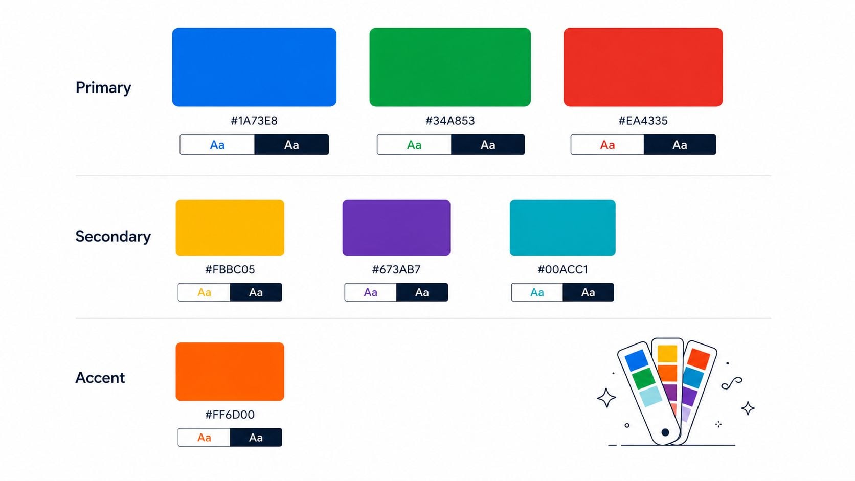
What to request in the handover
Ask for HEX, RGB, CMYK, and Pantone values where relevant. HEX and RGB are for screens. CMYK supports commercial print. Pantone matters when you need tighter colour matching on packaging, signage, uniforms, or merchandise.
Go one step further and ask for named roles, not just swatches. Which colour is the brand lead. Which one is for backgrounds. Which one is reserved for calls to action, highlights, or data visualisation. SMEs often receive a palette without any usage logic, then end up with inconsistent social posts, sales decks, and web pages because every designer interprets the colours differently.
The best handovers also include tints, shades, and rules for contrast. That matters in day-to-day work. A marketing team may need three acceptable background options, a web team may need hover and active states, and a printer may need a safe alternative if one bright digital colour will not reproduce well on uncoated stock. Those are practical trade-offs, not edge cases.
If your brand strategy involved emotional associations, connect that rationale to execution. DesignStack's guide to colour psychology in branding is a useful reference, but the handover still needs technical decisions your team can apply without debate.
Questions worth asking
- Which colours are approved for text, backgrounds, and buttons? These uses need fixed rules.
- Have contrast ratios been checked for accessibility? Some elegant combinations fail on real screens.
- What are the fallback options for print and merchandise? Certain colours shift badly depending on material and finish.
- Are there examples in context? Ask for website sections, social graphics, pitch slides, and print layouts, not only a colour chip page.
- Do we have colour tokens or style variables for digital use? This saves time if your site or product team works in Figma or a design system.
Colour choices also affect typography performance, especially on interfaces and content-heavy pages. If your team is building a wider system, this piece on advanced typography for design systems is a useful companion because colour and type have to work together, not as separate decisions.
A palette is only properly handed over when your designer, developer, printer, and in-house team can all reproduce it without guessing.
4. Typography System & Font Hierarchy
A common handover problem shows up a few weeks after launch. The website looks right, but the sales deck uses different fonts, proposal templates break the hierarchy, and someone swaps in Canva defaults because the approved typeface is not available. The brand has not changed on paper, but it has started to drift in daily use.
Typography needs to be handed over as an operating system, not a moodboard choice.
A useful typography package names the typefaces, weights, sizes, line heights, letter spacing, and fallback fonts. It also defines how those rules apply in real work. H1, H2, intro text, body copy, captions, buttons, pull quotes, tables, forms, and legal copy all need clear settings. If your team works across web, social, print, slides, and documents, ask for those specs in the tools you use, such as Figma styles, CSS tokens, Word templates, PowerPoint themes, or Canva-approved substitutes.
That last point matters more than many agencies admit. A beautiful font pairing can fail fast if your staff cannot access the files, the licence does not cover web use, or the brand relies on a typeface that renders badly in Microsoft 365. For SMEs, the best system is often the one that holds up in ordinary software, on small screens, and in rushed internal documents.
BBC and Google are useful references because they prioritise readability, consistency, and accessibility. That trade-off is often right for growing businesses too. Display fonts can add personality in campaigns or headlines, but the core brand type system has to carry long-form content, proposals, UI labels, PDFs, and email headers without becoming hard to read.
What to ask before sign-off
- Which fonts are approved for which jobs? Separate brand display fonts from everyday working fonts.
- What licences are included? Confirm desktop, web, app, and third-party platform use.
- What are the fallback fonts? If the main font is unavailable, the replacement should be chosen in advance.
- Do we have a hierarchy chart with actual sizes and spacing? Teams need more than font names.
- Does the system work in the software we already use? Check Microsoft 365, Google Workspace, Canva, PowerPoint, and your CMS.
- Has accessibility been tested? Readability at small sizes, on mobile, and in lower-contrast settings should be part of the handover.
Typography affects trust because it shapes nearly every brand touchpoint your audience reads. For many service businesses, people will meet your type system in a proposal, case study, landing page, or onboarding document long before they speak to your team. If those materials feel inconsistent or hard to scan, the brand starts to look less considered than it really is.
For deeper technical thinking, this piece on advanced typography for design systems is a useful read.
5. Photography & Imagery Style Guide
Brands rarely break because of the logo. They break because every image says something different.
One month the business uses warm candid team photography. The next month it posts cold stock imagery with perfect smiles and generic laptops. Then the website header adds moody editorial shots that don't match either. The logo survives, but the impression gets messy.
What belongs in the guide
A photography and imagery guide should define mood, lighting, subject matter, crop style, backgrounds, colour treatment, and composition. If illustration is part of the mix, it should explain where photos end and illustrations begin. Airbnb and Patagonia are good examples because their imagery feels intentional even before you notice the logo.
For a Dorset hospitality brand, for instance, the imagery might need natural light, local texture, honest food photography, and restrained editing. For a professional services firm, it might mean documentary-style team images, uncluttered workspaces, and credible environmental portraits. Those decisions should be written down.
A useful handover often includes sample image selections, references, and editing notes. It may also list approved stock libraries if original photography won't cover everything. That saves time when your team needs to source campaign visuals later.
Questions to ask before handover
- What should we avoid: Ask for a clear “not this” section covering clichés, filters, stock-photo styles, and visual tropes.
- Do we have crop guidance: Website banners, square posts, stories, and print brochures need different framing.
- Has this been tested on mobile: A wide hero image can lose its focal point on a phone if nobody plans for it.
The fastest way to dilute a premium-looking brand is to mix carefully art-directed design with random stock photography.
This deliverable matters more than many owners expect because first impressions are often visual. If your imagery feels inconsistent, your brand feels less reliable even when the underlying service is strong.
6. Voice & Tone Guidelines
A common handover problem shows up a few weeks after launch. The website sounds sharp and considered, then the first sales email goes out, a support reply lands in someone's inbox, and the brand suddenly feels like three different businesses.
That usually happens because the visual work is finished but the writing rules were never made practical. A useful voice and tone document tells your team how the brand sounds in real situations, not just what adjectives sit on a workshop slide.
The best versions define a small set of voice traits in plain English, then translate them into decisions people can apply under pressure. “Clear, warm, expert” is a start. What matters more is what that means on the page. Does “expert” mean short sentences and plain terms, or a more technical style for specialist buyers? Does “warm” mean conversational, or polite and human without jokes? Those trade-offs need to be settled before different people start writing in different directions.
Context matters just as much as personality. A homepage headline, a proposal email, a delivery-delay message, and a complaints response should not all sound identical. They should still feel like the same brand. Good guidelines show where the tone stays consistent and where it flexes. That is what stops a brand from sounding stiff in customer service or too casual in a high-value sales conversation.
Mailchimp and Innocent Drinks get mentioned often because their writing is recognisable. Government Digital Service is useful for a different reason. It shows how clarity, restraint, and direct language can build trust without sounding cold.
What to ask your agency or copy partner before handover
- Do we have examples for real use cases: Ask for sample homepage copy, CTA buttons, enquiry confirmations, service descriptions, sales emails, and support replies.
- Where does the tone flex, and where does it not: Complaint handling, pricing conversations, and delays usually need specific rules.
- Do we have a do and don't section: This should show preferred phrases, banned wording, punctuation choices, and how formal the brand should be.
- Who signs off future copy: If nobody owns the voice internally, the document will sit in a folder while the brand drifts.
For SMEs, this deliverable often gets underestimated because it feels less tangible than a logo pack or colour palette. In practice, your voice shows up more often than any other part of the identity. Prospects read it, customers judge it, and staff copy it.
If the handover only says “friendly but professional,” push for more. Ask for examples, edge cases, and channel-specific guidance. That is the difference between a document that sounds good in a presentation and one your team can use.
7. Logo Lock-ups & Brand Configurations
A common handover problem shows up on Monday morning, not in the presentation. The website header needs a logo that fits. A sponsorship banner needs a version with the descriptor. LinkedIn needs a square mark. If the agency only hands over one master logo, your team starts rebuilding the brand in Canva, PowerPoint, and email signatures.
Logo lock-ups are the approved combinations of your logo with supporting elements such as a strapline, descriptor, location name, or symbol. Brand configurations cover the contexts those combinations are built for. They stop small layout decisions from turning into visible inconsistency across sales decks, signage, social profiles, invoices, and packaging.
This deliverable matters most for SMEs with lean teams. People are working fast, often without a designer in the room.
What a useful lock-up pack should include
A strong pack usually includes a primary horizontal lock-up, a stacked option, an icon-only or monogram version, and reversed artwork for dark backgrounds. Some businesses also need a descriptor lock-up if the company name does not clearly explain the offer, or a regional version if different locations need named branding.
The important point is approval. These should be supplied as finished, fixed artwork with clear spacing and size rules, not loose parts for staff to assemble themselves. That is how you avoid stretched symbols, mismatched text, and taglines drifting too close to the mark.
File types should match real use, not just design software. Ask for SVG for web and digital products, EPS or print-ready PDF for signage and print suppliers, and transparent PNGs for day-to-day use in office tools. If your team relies on Word, PowerPoint, Canva, or proposal software, say that before sign-off. It determines what “usable handover” means.
A proper brand identity development process should define these configurations early, because they affect everything from responsive web headers to van graphics.
Questions to ask your agency before approval
- Which lock-up is the default for the website header, email signature, and proposal deck: These three uses often need different versions.
- What is the minimum size for each version: Some lock-ups fail once they get small, especially if a descriptor is included.
- Do we have simplified assets for favicon, social avatars, and app icons: These nearly always need their own artwork.
- Are the spacing rules and incorrect-use examples shown in the guidelines: Teams need visual proof, not just file names in a folder.
- Which files are editable, and which should stay fixed: Your internal team should know what they can adapt and what should never be rebuilt.
The trade-off is simple. More lock-ups give your team flexibility, but too many versions create confusion and misuse. For most SMEs, the right answer is a tight set of approved configurations tied to real applications. If a version does not solve a specific use case, it probably does not need to be in the pack.
8. Brand Personality & Brand Archetype Document
Some agencies make this part sound more mystical than it needs to be. It isn't. A personality or archetype document is useful when it helps people make better decisions. It becomes fluff when it stays at the level of workshop language.
The point is simple. Your brand should have a consistent character. That character should influence visuals, copy, customer experience, and the feel of the website.
What makes this useful rather than fluffy
Archetypes can help if they sharpen choices. Harley-Davidson has long leaned into a rebellious personality. Disney often expresses wonder and transformation. Patagonia presents conviction and environmental responsibility. You don't need to force your business into a neat label, but you do need a clear sense of how the brand behaves.
A useful document usually defines values, personality traits, audience expectations, emotional territory, and practical implications. If the brand is “expert but approachable”, what does that mean for homepage copy, photography, proposal decks, and customer support?
For businesses building from scratch or reworking a tired identity, DesignStack's approach to brand identity development is the kind of process that makes this strategic layer more grounded.
Questions to ask before approval
- Can this be explained easily: If your team can't describe the brand personality in plain English, it's too abstract.
- Does it affect decisions: Ask for examples of how the personality shaped colour, imagery, tone, or layout.
- Will it still fit in two years: The document should guide evolution, not trap you in a gimmick.
This kind of strategic work sits inside a healthy market. IBISWorld projects that the UK brand consultancy industry will reach £2.0 billion in 2026, with 2,195 active businesses and compound annual growth of 3.5% through 2025 to 2026, according to IBISWorld's UK brand consultancy industry data. Businesses keep investing here because clarity makes execution easier.
9. Brand Application Mockups & Usage Examples
At this stage, a branding project either becomes usable or stays theoretical.
Mockups and usage examples show your identity in context. Not just on a polished presentation board, but on the things your business uses. Website headers, landing pages, social tiles, proposal covers, business cards, packaging, labels, menus, email signatures, signage, uniforms, vehicle graphics, app screens.
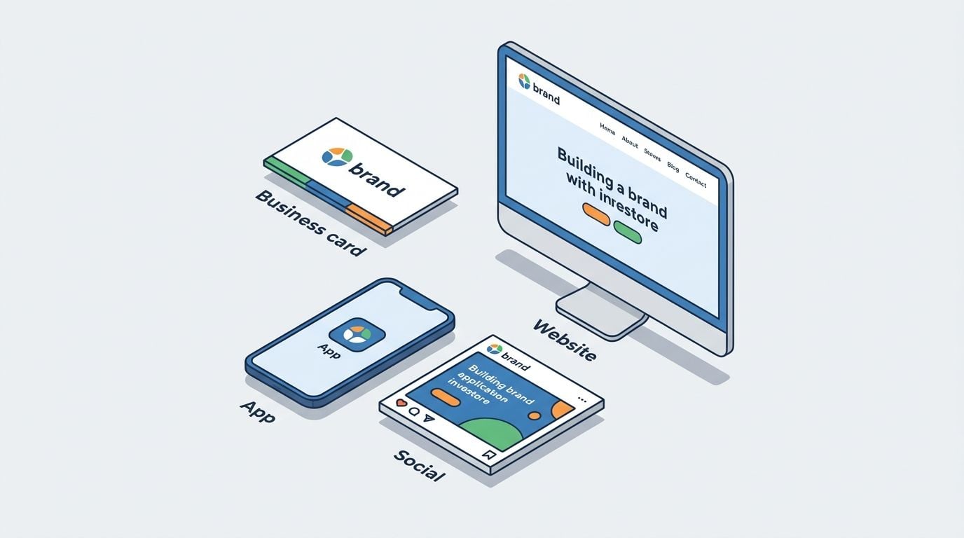
What good usage examples actually solve
A strong application pack bridges the gap between brand strategy and day-to-day use. It gives your internal team and outside suppliers a visual reference point. Mailchimp, Uber, Airbnb, and the UK Government Digital Service all show how powerful this can be. The identity becomes easier to repeat because people can see it working.
For SMEs, I'd rather receive five relevant examples than fifteen generic mockups. A restaurant may need menu layouts, takeaway packaging, window vinyl, and Instagram story frames. A professional services firm may need service pages, LinkedIn graphics, pitch decks, and report templates.
That practical bridge matters because implementation is where many rebrands struggle. According to Britwealth's UK business branding article, 73% of UK small businesses report struggling with brand consistency after rebranding due to limited internal resources, and 61% operate without dedicated marketing staff. That's exactly why examples and templates matter.
The activation gap to close before sign-off
Ask for editable assets where possible. Figma templates, Canva kits, social post formats, email signature files, presentation templates, and starter page layouts are often more useful than polished static visuals.
“The handover isn't complete when the PDF is delivered. It's complete when the client can apply the brand next Monday without guessing.”
A short visual walkthrough also helps teams use the system properly. This video gives a useful example of brand application thinking in practice.
10. Iconography System & Icon Library
Icons often arrive late in a project, which is why they often feel bolted on. That's a mistake. On a website or app, icons carry a lot of everyday communication. They help users scan services, spot features, understand navigation, and interpret actions quickly.
If they don't match the brand, the interface feels pieced together.
What to request in the asset pack
A proper icon system has consistent stroke weight, corner treatment, spacing, proportions, and sizing grid. It should include the core set you'll use, not a giant library filled with random concepts. For most SMEs, that means service icons, contact icons, social icons, UI icons, and perhaps product category icons.
SVG is the format to insist on for digital use because it stays crisp at any size. If your developer needs additional exports, those can be generated later. Naming also matters. “icon-service-consulting.svg” is far more useful than “final-final-3.svg”.
For brands extending into payments, bookings, member areas, or dashboards, custom iconography can improve trust because the interface feels cohesive rather than assembled from mixed third-party packs. DesignStack's work around credit card and icon design is a good example of how even small interface details need intentional styling.
Questions to ask before dev starts
- Are these custom or adapted: If they're adapted from an existing library, check the licence and consistency.
- Do we have active and inactive states: Some interfaces need filled, outline, hover, or selected versions.
- Has legibility been tested at small sizes: Thin-line icons often fail on mobile.
The wider identity picture matters too. The UK digital identity sector generated £2.05 billion in annual revenue in 2023 to 2024, with £858 million in Gross Value Added, according to the UK government's digital identity sector analysis. In digital environments, clear and consistent visual systems support credibility. Icons are part of that.
Top 10 Brand Identity Deliverables Comparison
| Deliverable | Implementation Complexity (🔄) | Resource Requirements (💡) | Speed / Efficiency (⚡) | Effectiveness & Impact (⭐📊) | Ideal Use Cases |
|---|---|---|---|---|---|
| Brand Style Guide / Brand Guidelines Document | High, comprehensive, cross-disciplinary process 🔄 | Significant: design lead, stakeholder time, asset audit 💡 | Slow to produce; accelerates future work ⚡ | Very high consistency & recognition ⭐⭐⭐⭐📊 | Rebrands, multi-channel organisations, agency handoffs |
| Logo Design & Logo Variations Suite | Medium, focused design iterations and testing 🔄 | Designer expertise, revisions, vector files & formats 💡 | Moderate creation time; highly reusable once complete ⚡ | High brand recognition & recall ⭐⭐⭐⭐📊 | New brands, apps, websites, product packaging |
| Colour Palette & Colour System | Medium, research, accessibility & print/digital mapping 🔄 | Designer input, contrast testing tools, Pantone/print checks 💡 | Fast to implement after selection; requires testing for print ⚡ | Strong visual identity and conversion influence ⭐⭐⭐📊 | eCommerce CTAs, responsive sites, print collateral |
| Typography System & Font Hierarchy | Medium, type scale, pairing, responsive rules 🔄 | Font licenses, design + dev testing, fallback strategies 💡 | Moderate; can affect page load if not optimised ⚡ | Improves readability, hierarchy, credibility ⭐⭐⭐⭐📊 | Content-heavy sites, professional services, apps |
| Photography & Imagery Style Guide | Medium–High, art direction and curation required 🔄 | Photographers, editing, curated libraries or subscriptions 💡 | Ongoing investment; library speeds content creation ⚡ | High engagement and perceived value ⭐⭐⭐📊 | eCommerce, hospitality, social campaigns, headers |
| Voice & Tone Guidelines | Medium, workshops and example writing needed 🔄 | Copywriters, stakeholder interviews, training resources 💡 | Quick to adopt; enforcement requires ongoing review ⚡ | High messaging consistency and customer trust ⭐⭐⭐⭐📊 | Customer communications, email, social, UX copy |
| Logo Lock-ups & Brand Configurations | Medium, proportioning and multiple outputs 🔄 | Designer time, file variants, grid documentation 💡 | Moderate setup time; ensures fast correct use later ⚡ | Preserves logo integrity across platforms ⭐⭐⭐📊 | App icons, headers, social avatars, print assets |
| Brand Personality & Brand Archetype Document | High, strategic research and workshops 🔄 | Brand strategist, stakeholder interviews, competitive analysis 💡 | Slower to create; streamlines future strategy decisions ⚡ | Strong strategic alignment and differentiation ⭐⭐⭐⭐📊 | Rebrands, startups, positioning and messaging exercises |
| Brand Application Mockups & Usage Examples | Medium, many touchpoints to mock up 🔄 | Design time, realistic templates, editable files (Figma) 💡 | Time‑intensive to build; reduces revisions during rollout ⚡ | Practical clarity for teams; faster execution ⭐⭐⭐📊 | Launch assets, client handoffs, campaign templates |
| Iconography System & Icon Library | Medium, consistent grid and style rules 🔄 | Icon designer, SVG exports, naming & accessibility docs 💡 | Fast to use once built; improves load and UX ⚡⚡ | Enhances UI clarity and international usability ⭐⭐⭐📊 | Apps, dashboards, web UI, eCommerce filters |
Your Handover Checklist Turning Deliverables into Assets
Receiving your files isn't the finish line. It's the point where your brand either becomes usable or starts slipping into inconsistency.
The first thing to check is completeness. You should have your master guidelines document, logo suite, colour specs, font details, imagery direction, voice guidance, lock-ups, personality notes, application examples, and icon library. Those assets should be organised in a way that makes sense to non-designers, not just to the agency that created them. Folder names should be obvious. File names should be human. “Primary-logo-dark-bg.svg” is helpful. “Version-7-final-use-this-one” isn't.
Then check usability. Can your website developer identify which logo file belongs in the header? Can your printer find the CMYK or Pantone values without emailing for help? Can your team open a social template and publish something on-brand without rebuilding it from scratch? If the answer is no, your handover needs another pass.
I'd also review ownership and licensing before launch. Ask who owns the logo artwork, whether font licences are included or merely recommended, whether stock imagery has usage limits, and whether any templates rely on paid software or subscriptions. Many businesses discover at this point that the brand looks complete but isn't fully deployable.
Training matters more than people expect. A short recorded walkthrough or live handover session can save months of confusion. Someone should explain which files are for print, which are for web, which logos should never be stretched or recoloured, and how to use the templates properly. That small step closes the gap between delivery and implementation, especially for SMEs without an internal marketing team.
It also helps to decide who will guard the brand day to day. In a smaller business, that may be the owner, office manager, marketing lead, or web partner. The role doesn't need a grand title. It just needs clear responsibility. One person should know where the files live, which guidelines are current, and when to push back on off-brand work.
From there, rollout becomes much easier. Update the website first. Then your social profiles, email signatures, proposal templates, invoices, signage, printed materials, and packaging. Tackle the touchpoints customers see, not the ones that feel easiest internally. That sequence creates momentum and stops the business from operating with old and new branding side by side for too long.
If you're planning a rebrand or a new website and want a partner that handles the practical side of brand identity deliverables as well as the creative side, DesignStack is one option to consider. Their published service information covers logo suites, colour specifications, typography rules, brand guidelines, and application examples, which is the kind of handover structure most SMEs need.
A good identity system should make future work easier. It should shorten briefs, reduce rework, and help every new page, campaign, sign, or document feel like it belongs to the same business. When that happens, your deliverables stop being a folder on a drive and start becoming real assets.
If you want help turning a rebrand into a practical, usable handover, DesignStack works with businesses in Dorset and across the UK on branding, web design, and the asset systems that support both.
Leave a Reply