
What Is Responsive Web Design Your Complete Guide
In simple terms, responsive web design is a way of building a website so that it automatically changes its layout to look good on any screen. It doesn't matter if someone is browsing on a massive desktop monitor, a tablet, or their phone – the content rearranges itself to give them the best view without any awkward pinching, zooming, or sideways scrolling.
Understanding The Core Idea Of Responsive Design

Think of it like pouring water into different containers. You don't need a special type of water for a tall glass and another for a wide bowl; the same water simply adapts to the shape of whatever holds it. A responsive website does the same thing. You build one site with one set of content, and the design fluidly reshuffles itself for every visitor.
This approach has become the industry standard, replacing the old, clunky method of creating separate "mobile versions" of a website. Instead of juggling two or more sites, you have a single, smart one that does all the work.
Why It Became The Standard
The shift to responsive design wasn't just another trend. It was a direct response to the massive change in how we all started using the internet. When smartphones took off in the early 2010s, businesses had to completely rethink their online strategy. Up until then, websites were built for just one screen size: a desktop computer.
This user-first approach solves a lot of the old problems that used to annoy mobile users, making sure everyone gets a smooth, consistent experience. You can learn more by exploring our detailed guide on the https://designstack.co.uk/the-art-of-crafting-digital-experiences-understanding-web-design/.
A non-responsive site creates friction. It frustrates visitors and gives them a perfect reason to abandon your page for a competitor's. Understanding what responsive web design is and why it matters is the first step toward building an online presence that works for everyone.
An Actionable Look At What Responsive Design Fixes
To really get why it's so important, let's look at the real-world problems a responsive site solves for your visitors. This isn't just about making things look pretty; it's about fixing genuine usability issues that can make or break someone's impression of your brand.
Here’s a breakdown of what a responsive website actively corrects:
- Improved Readability: Text is always clear and easy to read. No one should ever have to pinch and zoom just to make out a sentence.
- Effortless Navigation: Buttons and links are properly sized for fingertips, making them easy to tap without hitting the wrong thing by mistake.
- Complete Accessibility: All your important content is there and works perfectly, no matter the device. Nothing gets cut off, hidden, or broken on a smaller screen.
- Brand Consistency: Your brand’s look and feel stay the same across every platform, which helps reinforce your identity and build trust.
At its core, a responsive approach is an acknowledgement that people will find you from a huge variety of devices. It makes sure your website is ready to welcome them, wherever they are, without compromise.
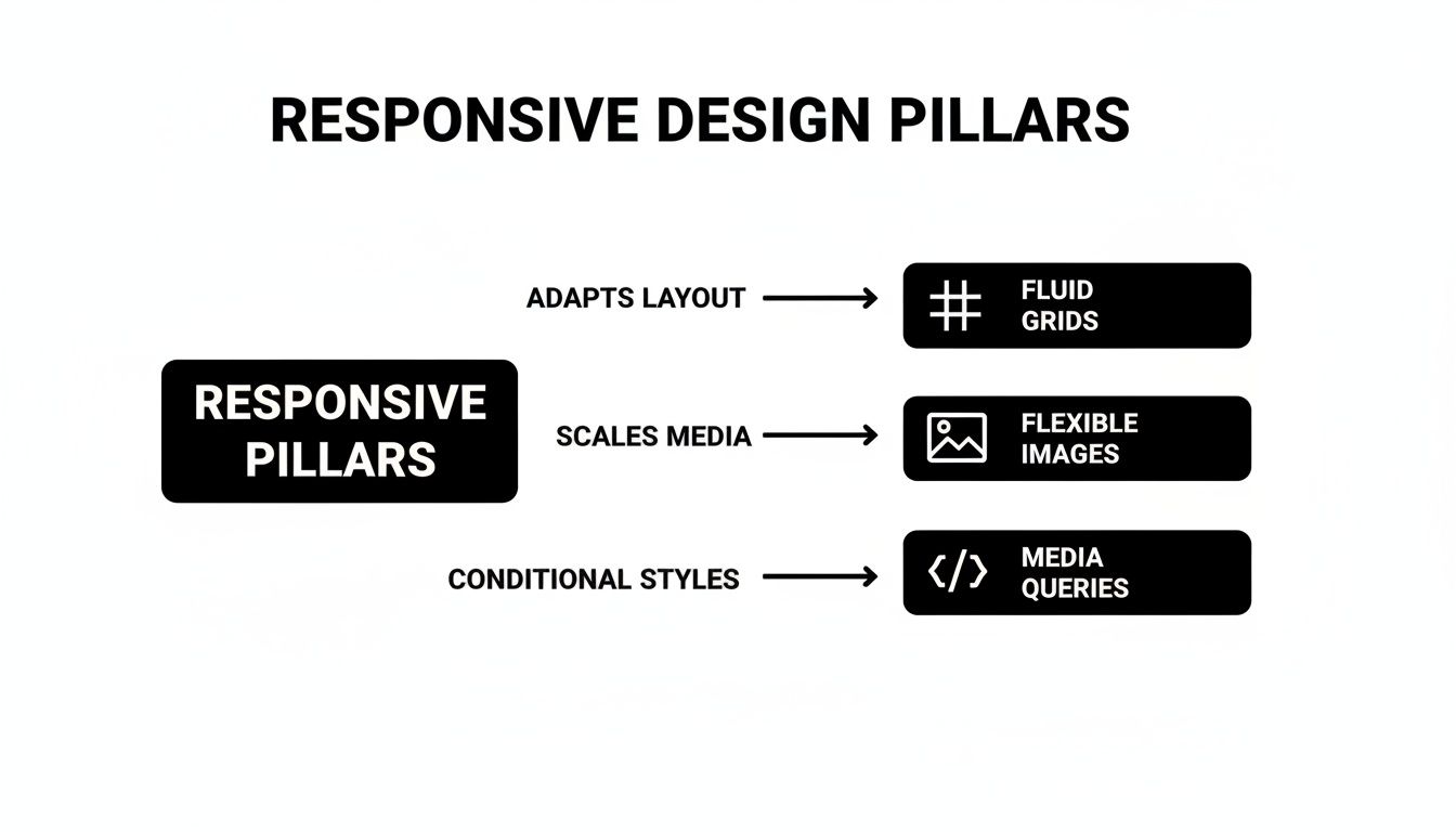
Understanding The Three Pillars Of Responsiveness
Responsive web design can feel like a bit of digital wizardry, but it’s actually built on three core technical ideas working together. Once you get your head around these, the whole concept clicks into place. Let's ignore the complex code for a moment and look at how one website can so elegantly adapt to any screen.
These aren't just passing trends; they are the absolute foundations that make a website truly responsive. They are the fluid grid, flexible images, and media queries. Together, they form the technical backbone of modern web design.
Pillar One: Fluid Grids
First up, we have fluid grids. Picture your website's layout like a modular shelving unit. With an old, rigid website, those shelves are nailed together with fixed measurements. If you try to shove that unit into a smaller space, it just won’t fit. The structure is unyielding.
A fluid grid, however, is more like a modern shelving system held together with elastic. As you move it from a wide wall (a desktop monitor) to a narrow one (a smartphone screen), the entire structure smoothly compresses to fit the available space. This works because developers use percentages for widths instead of fixed pixels, so columns and other elements always keep their proportional relationship. The layout feels consistent but is sized perfectly for the screen.
Pillar Two: Flexible Images
Next, there are flexible images. Think of a standard image on an old-fashioned site as a big, framed photograph. If you try to cram that large frame into a tiny box, you either have to chop off the edges of the picture or put up with the frame breaking the layout and forcing you to scroll sideways. It's a clumsy mess.
Flexible images, on the other hand, act like smart digital picture frames. They are coded to automatically resize themselves to fit neatly inside their container—the 'shelf' from our fluid grid analogy. They scale up or down without ever distorting, spilling over the edges, or slowing the page down.
This ensures your visuals always look sharp and are properly scaled, eliminating the frustrating user experience of content being cut off. It’s a simple rule: the image should never be wider than the container it sits in.
This technique is vital for both looks and performance. Properly scaled images protect your brand's visual identity and help your pages load faster on mobile devices, which is a huge factor for keeping visitors engaged and for SEO.
Pillar Three: Media Queries
Finally, we get to the third and arguably most important pillar: media queries. These are the directors of the whole performance. A media query is a little rule in the website's code (CSS, to be specific) that tells it how to behave at specific screen sizes, which we call breakpoints.
Think of a media query as a set of "if-then" instructions for the browser:
- IF the screen is less than 768 pixels wide (a typical tablet), THEN tuck the navigation menu into a compact 'hamburger' icon.
- IF the screen is wider than 1200 pixels (a desktop), THEN show the content in a three-column layout.
- IF the screen is narrower than 480 pixels (a smartphone), THEN stack all the content into a single, easy-to-scroll column.
These rules allow a designer to make smart, deliberate changes to the layout, not just shrink everything down. They actively rearrange and optimise the design for the best possible experience on that specific device. For really effective responsive design, you have to know how to apply these principles with care. On more complex projects, companies often hire UX/UI experts to ensure every breakpoint delivers a flawless user experience.
When you combine these three pillars, the "magic" of responsive web design reveals itself as a logical and incredibly powerful process.
Why Responsive Design Is Crucial For Business Growth
Knowing the nuts and bolts of responsive design is one thing, but seeing how it actually drives business growth is where the magic happens. For any UK business today, a responsive website isn't just a 'nice-to-have' feature; it's a core part of your growth engine. It fundamentally shapes how potential customers see your brand and, ultimately, whether they decide to stick around or click away.
Think about it: a clunky, frustrating mobile experience is the quickest way to kill a sale. When someone has to constantly pinch, zoom, or aim for tiny buttons on their phone, they don't blame their device—they blame your business. That initial friction can do real damage to your reputation and sends valuable customers straight into the arms of your competitors.
Enhance User Experience and Reduce Bounce Rates
A great user experience (UX) is the bedrock of any successful website. Responsive design is all about making sure that every single visitor, no matter what device they’re on, has a smooth and intuitive journey. When your site just works, it keeps people engaged and encourages them to explore what you have to offer.
This seamless experience builds trust. On the flip side, a poor one drives people away. In fact, a staggering 73% of web designers in the UK point to non-responsiveness as the number one reason visitors abandon a website. A fluid, easy-to-use site signals to search engines that your content is valuable, which is a huge win.
A responsive website isn’t just about looking good; it's about making it effortless for people to do business with you. Every barrier removed is a step closer to a conversion.
This is all made possible by a few core principles working together in harmony.
As you can see, it's the combination of a flexible structure, scalable images, and smart layout rules that creates a website that truly works for everyone.
Boost Your SEO with Mobile-First Indexing
Search engine optimisation (SEO) is another area where responsive design gives you a massive edge. Google now uses "mobile-first indexing," which is just a technical way of saying it primarily looks at the mobile version of your site to decide how to rank you. If your website is a mess on a smartphone, your search visibility will take a hit across the board.
A single responsive site is the gold standard for meeting Google's criteria. By using one URL and one set of code that adapts to all screens, you consolidate all your SEO power in one place. It creates a consistent, high-quality experience that search engines love to reward with higher rankings, more organic traffic, and better visibility in a crowded market.
Drive Conversions and Increase Sales
At the end of the day, a business website needs to turn visitors into customers. Better UX and stronger SEO are the one-two punch that leads directly to higher conversion rates. For UK businesses, especially start-ups and eCommerce brands in places like Dorset, the results speak for themselves. A huge 62% of companies saw a direct increase in sales after making their site responsive.
Responsive websites don't just feel better to use; they perform better, delivering 20% higher user engagement and achieving 37% better conversion rates than their outdated counterparts. Often, the problem lies where it hurts most—on checkout or contact pages where the forms not mobile responsive enough, killing potential leads and sales right at the final hurdle.
To make sure your website is a genuine growth tool, here’s a simple checklist to get you started:
- Prioritise Mobile Navigation: Your menu needs to be a breeze to use on a small screen. A clean 'hamburger' icon is a must, and make sure links and buttons are big enough for a thumb to tap easily.
- Optimise Page Speed: Mobile users are impatient. Compress your images and clean up your code to ensure your site loads in a flash, even on a patchy mobile connection.
- Simplify Forms: Nobody wants to fill out a massive form on their phone. Cut your forms down to the absolute essentials to reduce friction and keep users moving forward.
- Test on Real Devices: Simulators on your desktop are useful, but they're no substitute for the real thing. Grab an iPhone and an Android phone to see exactly how your site feels and functions in the real world.
By focusing on these practical steps, you can transform your website from a simple online brochure into a powerful asset that delivers tangible results.
Your Actionable Responsive Design Checklist
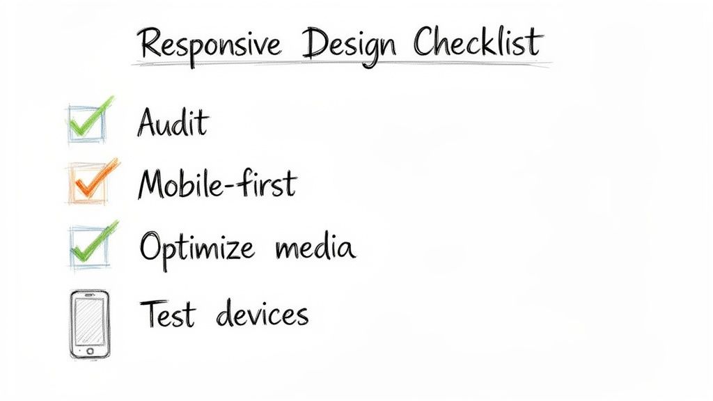
Knowing the theory behind responsive web design is one thing, but actually putting it into practice is where you see the results. To help you bridge that gap, we’ve put together a practical checklist to guide your strategy.
Think of this as a roadmap, whether you're building a brand-new website or giving an existing one a much-needed upgrade. It’s about asking the right questions and taking the right actions to create a site that works brilliantly for everyone, no matter what device they’re using.
Phase 1: Initial Strategy And Planning
Before you even think about code or design mock-ups, a great responsive project starts with understanding your audience and your current performance. This phase is all about setting clear goals and adopting the right mindset from day one. Here are some actionable steps:
- Audit Your Current Performance: Use a free tool like Google's PageSpeed Insights to get a clear picture of where you are right now. This will flag issues like slow load times or text that’s hard to read on a phone.
- Define User Journeys: Map out what a typical customer does on a smartphone versus a desktop. Are they trying to find your contact details on the go? Or are they reading long-form content at their desk? Use this to prioritise what matters most on different screens.
- Adopt a Mobile-First Mindset: Shift your thinking. Instead of designing a complex desktop site and then trying to shrink it, start by designing for the smallest screen. This forces you to focus on the essentials, leading to a cleaner, faster experience for everyone.
Phase 2: Design And Development Essentials
With a solid strategy in hand, it’s time to get into the nuts and bolts of the user experience. This is where your plans become a tangible, working design that looks and feels great everywhere.
Your top priority should be touch-friendly navigation. People use their thumbs on a phone, not a precise mouse pointer.
Make sure all your buttons, links, and interactive elements are big enough to be tapped easily without hitting the wrong thing. A good rule of thumb is to make touch targets at least 44×44 pixels.
Just as crucial is the need to optimise media for speed. Giant, uncompressed images are the number one killer of mobile site speed. Always compress your images before you upload them, use modern file formats like WebP, and think about using "lazy loading" so images lower down the page only load when a user scrolls to them. This makes a massive difference to performance.
And of course, choose a responsive-ready platform. You'll make your life a lot easier by starting with a solid foundation. A Content Management System (CMS) like WordPress is built with responsiveness in mind. You can even learn how to revolutionize your website with these top WordPress plugins of 2023 to make it even more powerful.
Phase 3: Testing And Refinement
The final phase is probably the most important of all: thorough testing. A design isn't truly responsive until it’s been tested in the real world, on real devices, by real people.
The golden rule here is to test across multiple devices. Browser simulators are handy for a quick check, but they can’t truly replicate the experience of using a physical phone or tablet. Get your hands on actual iPhones, Androids, and iPads. See how the site performs, how the touch controls feel, and how the layout looks in both portrait and landscape mode.
This hands-on testing is where you'll spot the little issues that a simulator would miss, ensuring every single visitor gets a polished, professional experience.
Partnering With The Right People For A Future-Proof Website
Understanding the theory behind responsive design is one thing. Actually translating it into a high-performing website that stands the test of time? That takes real, hands-on expertise.
The gap between a site that just shrinks to fit a screen and one that offers a genuinely brilliant user experience on every device is huge. It's a gap that's closed by the skill of the team building it, which is where a seasoned agency like DesignStack comes in.
We don’t just build websites; we create digital experiences for UK businesses that are designed to get results. A great project is about so much more than just making content fit on a smaller screen. It requires a proper grasp of user behaviour, conversion rate optimisation, and the nitty-gritty technical side of SEO.
A Process Honed by Experience
With over 20 years in the industry, our approach is built on a solid foundation. We always start by getting to know your business inside and out – who your audience is, what your commercial goals are, and what makes your brand tick. This initial work is crucial; it ensures the final website isn't just responsive, but a powerful engine for your business's growth.
We're big believers in transparency. That’s why we give you fixed-cost pricing right from the start, so you know exactly where you stand with no nasty surprises down the line. To make sure you’re completely happy, our process also includes plenty of design revisions, giving you the confidence that what we build will be a perfect fit for your vision. If you want to know more about what makes a great partnership, have a look at our guide on finding a website designer who understands your vision.
How We Work With You
Choosing the right digital partner is a serious business decision. To give you a clear idea of what to expect, here’s a look at how we get a professional responsive web design project off the ground.
- Strategic Discovery: It all starts with us listening. We dig into your customer base, your competitors, and your objectives to shape a strategy that makes sure the final design works towards your business goals.
- Transparent Quoting: You’ll get a detailed, fixed-cost proposal. This clarity means you can plan your budget with confidence, without worrying about costs creeping up.
- Collaborative Design Revisions: We’ll present the initial designs and then work closely with you through a series of revisions. Your feedback is at the heart of the process, ensuring we craft a site you’ll be proud of.
- Expert Development and SEO: Our team builds your responsive WordPress site using clean code and with SEO best practices baked in from the very beginning. It's built to perform in search rankings from day one.
- Comprehensive Launch Support: We handle everything from social media integration to setting you up with secure, reliable hosting. Once you go live, we also provide a month of updates to make sure everything runs smoothly.
When you partner with an expert team, you're not just buying a service; you're investing in a long-term digital asset. A professionally built responsive site is a crucial part of your growth strategy, designed to attract and convert customers for years to come.
This expert-led approach delivers real, measurable results. Across the UK, particularly for businesses in areas like Dorset, a responsive website has become essential. We've seen non-responsive sites suffer from bounce rates soaring by up to 22%, while their responsive counterparts enjoy 32% higher page views per visit.
For eCommerce businesses in Weymouth using the kind of responsive WordPress sites we specialise in, it's not uncommon to see 11% higher conversion rates. In fact, a recent study found that 53.8% of UK website designers say a lack of responsiveness is one of the biggest reasons for a full website redesign. You can find more of these web design statistics on hostinger.com.
Common Questions About Responsive Web Design
As you get to grips with what your business needs online, a few questions always seem to pop up. Getting clear answers is vital before you decide on your website's future, so my aim here is to cut through the jargon and give you some straightforward responses.
Let’s tackle some of the most frequent queries I hear about responsive web design.
Is Responsive Design The Same As A Mobile-Friendly Site?
This is a classic point of confusion, but no, they aren’t the same. While both are trying to solve the problem of mobile viewing, they go about it in completely different ways.
A mobile-friendly site is usually a separate, scaled-down version of your main website, often living on a different address (like m.yourwebsite.co.uk). Think of it like having a main house and then building a smaller, separate bungalow in the garden for guests. It works, but now you have two properties to maintain, update, and furnish.
Responsive design, on the other hand, is the modern, smarter approach. You have one single website that cleverly adapts its layout to fit any screen it's viewed on. It’s like having one brilliant, modular building that can reconfigure its rooms instantly for any event. This single URL and unified content is massively better for SEO and gives every visitor a consistent, on-brand experience.
Google has been clear on this for years: they strongly recommend responsive web design. It makes their job of crawling and indexing your content far more efficient. One site, one URL, one set of content—it’s simply the cleanest and most effective way to do things.
How Much Does A Responsive Website Cost?
This is a bit like asking "how much does a car cost?"—it really depends on the size, features, and complexity involved. The key thing to understand, however, is that responsive design isn't a luxury "add-on" anymore. It's a fundamental, non-negotiable part of any professional web build today.
If an agency gives you a quote and lists responsiveness as an optional extra, it's a huge red flag that their methods are outdated. Instead, you should be looking for a partner who offers transparent, fixed-cost pricing where responsiveness is baked in from the very beginning. It shows they're following modern best practices.
Think of it this way: investing in a properly executed responsive website is a direct investment in your business’s growth. You see the returns in better search rankings, more mobile traffic, and, crucially, higher conversion rates from people who aren't frustrated by a clunky experience.
How Can I Test If My Current Website Is Responsive?
Good news—you don't need any technical skills to check this. There are a couple of dead-simple ways to get a quick answer.
The first is what I call the "browser window test":
- Open your website on a desktop or laptop.
- Click and grab the corner of your browser window.
- Slowly drag it inwards to make the window narrower, as if you're squashing it down to the size of a phone screen.
If the layout magically re-shuffles itself—columns stacking neatly, the menu changing, and text flowing to fit—then congratulations, your site is responsive. If things just get chopped off or a dreaded horizontal scrollbar appears at the bottom, it's not.
For a more official verdict, use Google’s free Mobile-Friendly Test tool. Just pop your website’s address in, and it will give you a clear pass or fail, even highlighting specific problems it finds.
Does Responsive Design Impact Website Speed?
When it’s done right, responsive design has a hugely positive impact on speed, especially for mobile users. A core principle of professional responsive development—particularly the "mobile-first" approach—is to build for performance from the ground up.
This means a well-built responsive site is engineered to be fast by default. Here’s how a professional developer makes sure a responsive site is also a fast site:
- Image Optimisation: We serve smaller, lighter image files to mobile devices. This is one of the biggest wins for cutting down load times.
- Conditional Loading: We use clever techniques to stop heavy scripts, big fonts, or complex features from even loading on smaller screens where they aren't needed.
- Efficient Code: A mobile-first build starts with a lean, clean foundation. Complexity is only added as the screen size increases, which is far more efficient than trying to slim down a bloated desktop site.
A fast, slick website is essential for keeping visitors engaged and for ranking well in search engines. A badly built site might just shrink big desktop images, which would be disastrous for mobile speed. But a professionally constructed responsive site is intentionally designed for peak performance everywhere.
Ready to make sure your website delivers a flawless experience on every device? The team at DesignStack specialises in creating professional, responsive websites that drive growth for UK businesses. With our fixed-cost pricing and results-led approach, we build digital platforms that are future-proof.
Discover how we can help your business stand out online. Learn more about our services at designstack.co.uk.


Leave a Reply