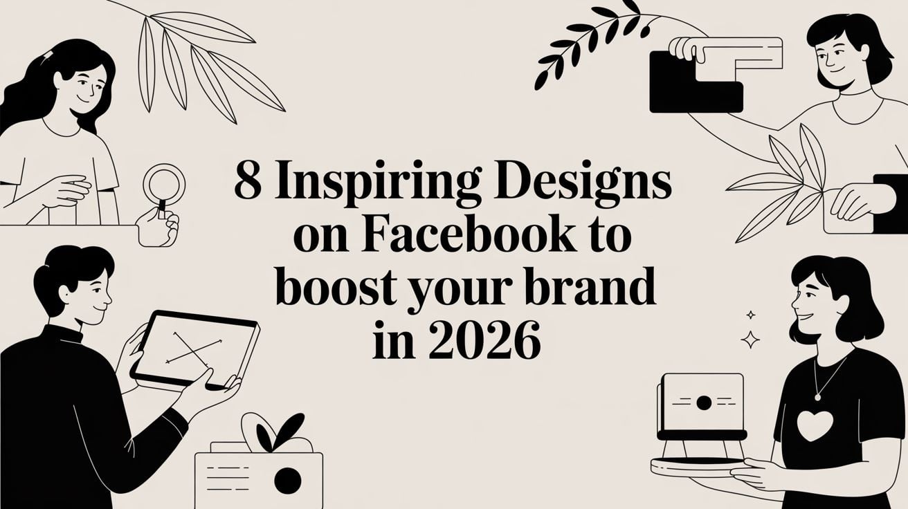
8 Inspiring Designs on Facebook to Boost Your Brand in 2026
In the crowded digital marketplace, simply posting on Facebook is not enough to capture attention, especially for small and medium-sized businesses in competitive regions like Dorset. Your audience is visually driven, making snap judgements based on the quality and professionalism of your page. Effective designs on Facebook are no longer a 'nice-to-have'; they are a critical component of your brand's credibility and marketing success.
From the first impression of your cover photo to the compelling call-to-action in an ad, every visual element works to build trust, communicate value, and drive engagement. To ensure your Facebook presence goes beyond mere words, you must learn how to create engaging social media content that truly resonates with your audience. This guide moves beyond generic advice to provide a strategic breakdown of eight essential Facebook design formats.
We will dissect high-quality examples, explaining not just what they are, but why they work and how you can replicate their success. You will get actionable tips for each design, including:
- Technical specifications and safe zones.
- Copywriting and call-to-action strategies.
- Adaptation tips for your unique brand.
These are the insights we use to help UK businesses stand out, turning their Facebook pages into powerful conversion tools.
1. Facebook Cover/Banner Design
Your Facebook cover photo is the large banner image at the top of your business page. It acts as a digital billboard and is often the first visual element a visitor sees. For any business, especially service-based ones like agencies or local retailers, this space is prime real estate to establish brand identity, highlight key services, or announce current promotions. A well-executed cover is a powerful tool in your social media marketing, instantly communicating your professionalism and value proposition.
Strategic Breakdown
Effective designs on Facebook go beyond just looking good; they must be strategic. Agencies like DesignStack use their cover to showcase a mini-portfolio of recent work, immediately demonstrating their expertise. A local organisation such as the Weymouth & Portland Chamber of Commerce might display logos of its members, fostering a sense of community. Meanwhile, a fitness brand like Crossfit Durnovaria could use dynamic action shots overlaid with their branding to convey energy and results. The goal is to make this space work for your specific business objectives.
Key Insight: Treat your cover photo as a flexible marketing asset, not a static image. Update it quarterly or to align with specific campaigns to keep your page fresh and relevant for returning visitors.
Actionable Tips for Your Cover Design
To create a banner that performs well, follow this actionable list:
- Mind the Mobile Crop: Place your most critical elements—your logo, main text, or call to action—in the centre safe zone. This ensures they remain visible and are not cropped out on mobile devices, where most users will see your page.
- Prioritise Clarity: Use high-contrast colours and bold, legible typography. Your message should be understood in seconds.
- Maintain Brand Consistency: Your cover must feel like an extension of your website and other marketing materials. Use the same brand colours, fonts, and overall visual style. This consistency builds brand recognition and trust.
- Include a Call to Action (CTA): Guide visitors on what to do next. Simple text like "View Our Services" or "Shop Our New Collection" can direct traffic effectively.
If you need professional support to align your social media presence with your brand, exploring a dedicated graphic design service can provide the expertise to create cohesive and impactful visuals across all platforms.
2. Facebook Post Image (Portfolio & Case Study)
Your Facebook timeline is where you build relationships and demonstrate ongoing value. High-quality post images, often sized at 1200×628 pixels, are your primary tool for capturing attention in a busy feed. For any service-based business, particularly a design agency, these posts become mini-portfolio pieces or visual case studies. They offer tangible proof of your expertise, turning abstract services into concrete, desirable results.
Strategic Breakdown
Strategic designs on Facebook for timeline posts focus on storytelling and results. For example, a post by DesignStack could show a before-and-after comparison of the Crossfit Durnovaria rebrand, visually communicating the transformation. A local Weymouth restaurant like The Lobster Pot might share a screenshot of its new website, highlighting the seamless booking integration. The objective is to stop the scroll with compelling evidence of your work's impact, whether that’s a brand refresh or a clear improvement in website performance.
Key Insight: Don't just show the finished product; show the result. A post announcing a new website is good, but a post showing how it increased online bookings by 40% is far more powerful. Use quantifiable data whenever possible.
Actionable Tips for Your Post Design
To create post images that drive engagement and build credibility, implement these practical tips:
- Develop a Visual Template: Create a consistent layout for your case study and portfolio posts. Using the same brand colours, fonts, and logo placement helps your content become instantly recognisable in your followers' feeds.
- Showcase Metrics: Numbers add weight to your claims. Include metrics like "2x faster load times" or "50% increase in conversions" directly on the graphic using clean typography.
- Prioritise Visual Hierarchy: Your image should be easy to scan. Use white space to avoid clutter and guide the viewer's eye to the most important information, such as the client's logo or the key result.
- Write a Compelling Caption: Your image needs context. Start the accompanying text with a strong hook that summarises the problem, your solution, and the successful outcome. This encourages people to stop and absorb the details in your visual.
By consistently sharing these proof-of-work posts, you build a powerful visual library of your successes. To see how these principles are applied in a real-world context, you can browse a full design and web development portfolio for inspiration.
3. Facebook Ad Creative (Conversion-Focused)
Paid advertising creatives on Facebook are visual assets specifically designed to achieve a business goal, such as generating leads, driving sales, or encouraging app installs. Unlike organic posts, these ads are placed directly into user Feeds, Stories, Reels, and Messenger through precise audience targeting. For a service-based business like DesignStack, ad creatives are crucial for promoting web design services, offering free consultations, or showcasing specialist skills like building high-performance eCommerce sites.

Strategic Breakdown
Successful designs on Facebook for advertising are built on a clear value exchange. For example, a 'Free Website Audit' ad targets Dorset-based small businesses with a tangible offer that solves a problem. Another effective approach is using case study statistics, such as an ad showing the sales increase a client achieved after a WordPress eCommerce build. This builds credibility and makes the benefit concrete. Retargeting ads can also guide interested visitors through a sequence, from a simple brand reminder to a direct call to book a strategy session.
Key Insight: Your ad creative's job is to stop the scroll and create an immediate connection. Focus on a single, compelling message and a clear call to action, directing users to a dedicated landing page that continues the conversation without distractions.
Actionable Tips for Your Ad Creative
To develop ad creatives that deliver a strong return on investment, follow this actionable list:
- Lead with the Benefit: Focus your headline and primary text on the emotional outcome for the customer, not just the features you offer. Instead of "We Build Websites," try "Get a Website That Wins You Customers."
- Use High-Contrast Visuals: Your image or video must stand out. Avoid generic stock photos and use professional, brand-aligned imagery or short, captioned videos (15-30 seconds) that capture attention even with the sound off.
- Build Trust Instantly: Incorporate trust signals directly into your creative. This could include award logos, client testimonials, or key performance stats.
- Test and Refine: Create 3-5 variations of an ad to A/B test one variable at a time, such as the headline, image, or call-to-action button. This data-driven approach is key to optimising your ad spend.
4. Facebook Story Template (Behind-the-Scenes & Process)
Facebook Stories are full-screen, vertical images or videos that disappear after 24 hours, offering a raw and immediate way to connect with your audience. For creative and service-based businesses, Stories are an excellent tool to showcase authenticity. They allow you to pull back the curtain on your design process, team culture, or client projects in progress, building brand personality and a genuine connection that polished posts sometimes miss.
Strategic Breakdown
Effective designs on Facebook Stories move beyond promotion and into relationship-building. A creative agency could use a time-lapse to show a WordPress website build from wireframe to launch, giving potential clients a tangible look at the work involved. A local business might run a team member spotlight across several Story frames, humanising the brand and showing the faces behind the service. This behind-the-scenes content often performs better than perfectly curated ads because it feels more authentic and less sales-focused.
Key Insight: Treat your Stories as a daily conversation with your audience. Use interactive elements like polls and question stickers to invite participation and gather valuable feedback directly from your followers.
Actionable Tips for Your Story Design
To create Stories that capture attention and build community, follow this actionable list:
- Establish a Branded Template: Create a consistent look for your Stories using your brand colours, fonts, and logo overlays. This ensures brand recognition even in this fast-paced format.
- Prioritise Readability: Use large, bold fonts and high-contrast colours for any text overlays. Many users watch Stories without sound, so clear, concise captions are essential for conveying your message.
- Drive Engagement with Stickers: Use interactive stickers like polls, quizzes, and sliders. Asking your audience to vote on a design choice or answer a question is a simple way to boost engagement and make them feel involved.
- Archive Your Best Content: Save your most valuable or popular Stories to your page’s Highlights. This turns ephemeral content into an evergreen resource for new visitors, perfect for FAQs, service showcases, or team introductions.
5. Facebook Carousel Ad / Slide (Multi-Product Showcase)
A Facebook Carousel ad is an interactive format that lets you display between two and ten images or videos, each with its own headline, description, and link, within a single ad unit. Users can swipe horizontally to browse through the "cards." For businesses with multiple offerings, like an agency or a retail store, this format is ideal for showcasing a range of services, products, or case studies without overwhelming the user. It effectively turns a single ad into a mini-catalogue or portfolio.
Strategic Breakdown
Effective designs on Facebook often need to tell a story or present multiple options, and the carousel excels at this. An agency like DesignStack can use a carousel to feature its core services: one card for WordPress, another for Branding, and a third for eCommerce, guiding users to the most relevant solution. A retailer could display different products from a new collection, while a B2B company might walk a user through a customer's journey, showing a problem, the solution, and the result across several slides. The goal is to provide depth and choice in a single, engaging ad experience.
Key Insight: Structure your carousel slides to tell a cohesive story. Start with your most compelling offer or visual and guide the user on a logical journey, whether it's from problem to solution or from a broad category to a specific product.
Actionable Tips for Your Carousel Design
To build a carousel ad that captures attention and drives clicks, follow this actionable list:
- Lead with Your Strongest Card: Your first image and headline must grab attention immediately. Place your most popular service, best-selling product, or most impressive "before/after" shot first to encourage users to swipe.
- Maintain Visual Consistency: While each card can be distinct, they should feel like part of the same campaign. Use consistent brand colours, fonts, and image styles across all slides to create a professional and unified look.
- Tell a Sequential Story: Order your slides to guide the user. For a service, this could be: 1. The Problem, 2. Your Solution, 3. The Result/Testimonial. For products, it could be a complete outfit or a step-by-step guide.
- Vary Your Copy and CTAs: Test different benefit-focused headlines on each card to see what resonates. You can also stagger your calls to action, starting with a soft CTA like "Learn More" and ending with a harder one like "Get a Quote."
6. Facebook Event Banner / Cover Image
Your Facebook event banner is the prominent cover image at the top of an event page, designed to grab attention and communicate key details instantly. For businesses and organisations, it's the first impression for any workshop, webinar, networking event, or product launch. A compelling event cover is crucial for driving RSVPs and conveying the value of attending, acting as a digital poster for your audience.
Strategic Breakdown
Effective event banners are more than just pretty pictures; they are functional designs on Facebook that serve a clear purpose. An agency like DesignStack might use a banner for a 'Free Web Design Strategy Session' that features clean laptop imagery and a bold date/time overlay to signal professionalism and urgency. In contrast, the Weymouth Chamber might use a photo of the event venue combined with sponsor logos for a networking event, fostering community recognition. The goal is to distil the most important event information into a single, impactful visual.
Key Insight: Treat your event banner as the primary advertisement for your event. It must answer three questions in seconds: What is the event? When is it? And why should I care?
Actionable Tips for Your Event Banner
To create a banner that converts attendees, follow this actionable list:
- Focus on the Safe Zone: Centre your most important text, like the event title and date, in the middle 60% of the image. This ensures vital details are not cut off on different devices, especially mobile phones.
- Emphasise Readability: Use high-contrast colours and a clear, bold font for your main headline. The event title should be readable even at a small size in the news feed.
- Include Essential Information: Always display the event date and time directly on the graphic. This saves users a click and makes the information easy to screenshot and share.
- Maintain Brand Alignment: The banner's visual style, including colours and fonts, must match your other promotional materials and overall brand identity. This consistency builds trust and recognition.
- Keep Text Minimalist: Use a short, punchy headline (3-4 words is ideal) to capture attention. Let the event description field provide the finer details.
7. Facebook Group Cover Image
A Facebook Group cover is the prominent banner image at the top of a group page, serving as the visual identity for your community. For businesses that foster communities, such as membership organisations or those with exclusive customer access, this cover is vital. It sets the tone, communicates the group's purpose, and creates a sense of belonging for members, whether it's a professional networking hub, a peer support community, or a customer advocacy forum.
Strategic Breakdown
Effective designs on Facebook group covers go beyond simple branding; they cultivate a community atmosphere. For instance, a 'Dorset Digital Business Community' group might feature images of local entrepreneurs collaborating, immediately signalling its focus on connection and local enterprise. A group for 'WordPress Web Designers UK' could use imagery of code snippets or popular design tools, resonating instantly with its target audience. Similarly, a members-only group for the Weymouth & Portland Chamber of Commerce could display a local landmark, reinforcing a shared sense of place.
Key Insight: Your group cover is the first signal of your community's culture. Ensure it visually answers the question, "Is this group for me?" for any prospective member, making the purpose and value clear at a glance.
Actionable Tips for Your Group Cover Design
To create a group cover that attracts the right members and builds community, follow this actionable list:
- Centre Your Core Message: Place the group name and its primary benefit in the centre safe zone. This prevents crucial information from being cropped on mobile devices and ensures clarity.
- Reflect the Community: Use imagery that speaks to your members' interests and aspirations. This could be action shots, professional tools, or local scenery, depending on your group's focus.
- Test the Thumbnail View: Your group cover appears as a small thumbnail in search results and suggestions. Check that your design is still recognisable and compelling at this reduced size.
- Stay Brand-Consistent: While the feel might be more community-focused, your cover should still use your brand's colours and fonts. This maintains a professional and cohesive presence across all your Facebook assets.
8. Facebook Shop / Product Image (eCommerce Showcase)
Facebook Shop product images are your digital storefront's window display. These are the catalogue photos that showcase your merchandise in the Shop tab and Facebook Marketplace. For any eCommerce business, these visuals are not just decorative; they directly influence conversions. High-quality product images that provide clarity, context, and detail build buyer confidence and reduce purchase friction, making them a cornerstone of successful social selling.
Strategic Breakdown
Effective designs on Facebook for eCommerce focus on creating a comprehensive visual story for each product. A food business like The Lobster Pot uses lifestyle shots of seafood platters to sell an experience, not just a meal. A Dorset craft business might pair a clean hero shot with close-up images to highlight handmade details. Even digital products, like the design templates offered in DesignStack's own shop, use professional mockups to make the intangible tangible. The strategy is to anticipate and answer a customer's questions visually.
Key Insight: Your product gallery should function as a virtual "try-on". Use a mix of image types to show the product in use, highlight its quality, and display all available variations to create a complete picture for the buyer.
Actionable Tips for Your Product Images
To ensure your product photos drive sales, follow this actionable list:
- Provide a Complete View: Upload 3-5 images for each item. Start with a clear hero shot on a white or neutral background, then add a lifestyle photo showing it in context, a detail shot for texture, and images showing all colour or style variants.
- Maintain Visual Consistency: All photos in your shop should share consistent lighting and colour grading. This creates a professional, organised, and trustworthy brand appearance.
- Show Scale and Dimensions: For items where size is important, include a photo with a common object for scale reference or use a graphic overlay with dimensions. This helps manage customer expectations and reduces returns.
- Optimise for Performance and Accessibility: Keep image files under 2MB to ensure they load quickly on mobile. Also, write descriptive alt text for each image to improve accessibility and boost your product's discoverability in Shop searches.
Mastering your product visuals is a key step in maximising your eCommerce potential and turning your Facebook Page into a genuine sales channel.
Bringing Your Facebook Design Strategy to Life
Mastering the various designs on Facebook is a journey of continuous improvement, not a one-time task. Throughout this guide, we've dissected everything from the foundational cover banner and engaging post templates to conversion-focused ads and dynamic Story graphics. Each format serves a unique, strategic purpose within your marketing efforts.
The most critical takeaway is the principle of integration. Your Facebook visuals must be a direct and cohesive extension of your overall brand identity. They should never exist in a silo, disconnected from your website, your physical shop in Dorset, or your other marketing materials. This consistency in colour, typography, and tone is what builds the brand recognition and professional trust necessary to turn casual followers into loyal customers and clients.
From Inspiration to Implementation
Understanding what makes a design effective is only the first step. The real growth happens when you translate that knowledge into a consistent, manageable workflow. The strategic breakdowns and replicable methods we've covered provide the blueprint. Your next steps should be focused on building a system that works for your business.
To put these principles into practice, follow this actionable plan:
- Conduct a Visual Audit: Review your current Facebook page against the examples in this article. Identify the biggest gaps. Is your cover image static and uninformative? Are your post visuals inconsistent? Start with the area that needs the most immediate attention.
- Prioritise and Template: You don't need to perfect every design at once. Begin by creating a set of core templates for your most-used formats, such as standard post images, case study showcases, and Story updates. This ensures brand alignment and dramatically speeds up your content creation process.
- Schedule for Success: Great design means little if it's not seen. To effectively bring your Facebook design strategy to life and ensure consistent, high-quality visual content, using a robust social media calendar template can be invaluable. Planning your visual content in advance helps you align posts with business goals, seasonal promotions, and your broader marketing campaigns.
- Test, Measure, and Refine: Treat your designs as a living part of your strategy. Use Facebook's native analytics to see which visuals get the most engagement, clicks, or conversions. Test different calls to action, imagery, and layouts, then double down on what works.
By adopting this structured approach, you move from reactive posting to proactive brand-building. Each graphic becomes a calculated asset, designed not just to look good, but to achieve a specific business objective. For small businesses, from local Weymouth retailers to professional services firms, this strategic visual communication is what separates you from the competition and establishes your credibility in the market.
Ready to elevate your online presence but lack the time or tools to create professional designs on Facebook? The experienced team at DesignStack specialises in crafting cohesive brand identities and conversion-focused visuals for businesses across Dorset and the UK. Let us help you translate your vision into a powerful visual strategy that gets results.


Leave a Reply